
HOLLOW KNIGHT: INTERFACE DESIGN ANALYSIS
“Hollow Knight”, a video game that combines gothic ornaments with bugs to achieve great logo and interface design. Therefore, it is worth talking about it!
“Hollow Knight”, a video game that combines gothic ornaments with bugs to achieve great logo and interface design. Therefore, it is worth talking about it!
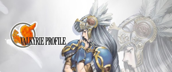
“Valkyrie Profile” is a series of role-playing video games inspired by Norse mythology, where the story revolves around a Valkyrie. So, let’s discuss how with this information the designers managed to create a great logo for this game.
Designing a video game logo is a difficult task, especially when there are requirements that go beyond the representation of the game itself. One of them is when the same logo needs to work for sequels or spin-offs. To achieve this, designers must implement various methods. One of them is used in the logo of the otome “Ephemeral” and that is why this post will analyze it.
The sources of ideas to create a video game logo are diverse. These should be closely related to the game to provide an idea of what to expect. To prove it, this time let’s analyze the logo of “Code: Realize”, where the protagonist is the main inspiration.
Since Castlevania is an action-adventure, gothic horror video game, its logos have the features of some “Gothic” script or typeface, reminiscent of the video game genre. This makes it interesting to do an analysis of these logos.
Let’s analyze how a logotype can communicate a little about the protagonist, the game mechanics and the story. All this in just one image!
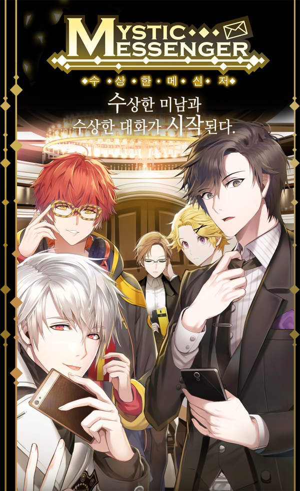
For this occasion I decided to take a little break from the series about the characters of “Code: Realize” and talk about the game that is somehow the culprit that I start writing this blog: “Mystic Messenger”
For this article I decided to write about the interface design of the Otome “Bad Apple Wars”, considering how it was made on the basis of the logotype.