

My lack of skill in action platform video games is impressive, despite this, I enjoy playing them no matter that I hate them at times (especially when I’m going for the thousandth attempt). One of the first games of this genre I played and still adore is Mega Man X4.
I never tried a Mega Man before because when I was younger, I was even clumsier than now when playing and also a little coward to accept new challenges. Besides, I fell in love with Zero until Mega Man X4 since I didn’t have Mega Man X1 to X3 on my hands sooner. Anyhow, this wasn’t an obstacle to appreciate the character design that I saw in an Art Special of the magazine Club Nintendo my brother had. It’s now that I realized I loved to contemplate these drawings because I unconsciously appreciate the way all the personages had similar features, to show how they belonged to the same word, but at the same time they had a lot of colorful and creative particularities that gave them a unique personality. However, it was until my brother arrived one day with the Mega Man X4, and I was in the mood to try it (or maybe just because I liked Zero… I don’t know…) that I understand all the care the creators put to each element in the video game to achieve a homogenous series. The most basic, and still a fundamental detail that shows this effort, is the logotypes.
Analyzing it, one can see how they communicate a little about the protagonist, the game mechanics and the story. All this in just one image! This is why this post will focus on the design and the evolution of the logotype of the Mega Man X series, counting from X1 to X8.
Sorry for leaving the last part of the characters of Code: Realize in standby, but I wanted to let you rest a little of topics about the past and go a little in a more futurist atmosphere. So, let’s begin!!
WE CAN’T FORGET THE CONTEXT: ABOUT MEGA MAN X
Mega Man X is a series of action platform video games released by Capcom and which plot is a continuation of the preceding series, Mega Man.
The story takes place after Dr. Light’s death, who had decided to seal the completed X in a capsule for revising his reliability and his logic systems. This was done to eliminate any probability of X to injure a human considering he was a new type of robot with the ability to make his own decisions. It’s assumed that Dr. Light died before the diagnostic experiments ended in view that 100 years later the archeologist Dr. Cain discovered the capsule and, disregarded Dr. Light’s warnings, created a legion of new robots that replicated X’s free will. These Robots were called “Reploids” (shortened form Replica Android).
The chaos the game describes begins when a Reploid called Sigma is infected with a virus created by Dr. Willy while fighting with Zero. This provokes Sigma to start seeing humans as inferior beings whom he has to eliminate. To achieve this, he assumes the leadership of the Mavericks, Reploids that are a threat to humans and other Reploids for the cause of software bugs, viruses, reprogramming or even by their own free will upon deciding that the humans don’t deserve to live because they are inferior and weak existences. All this provokes the Maverick War and that X took it upon himself to join the Maverick Hunters, under the new leader Zero, to fight against these enemies and save Earth.
The idea for this series was to introduce new elements to the Mega Man franchise, including the ability to dash and climb walls. Also is possible to locate capsules that permanently upgrade a part of X armor, such as his helmet, boots, chest plate or arm cannon.
WHY TO TALK ABOUT THE LOGOTYPE?
To work in the character design is a very important task to reach a good game, nevertheless one can’t play down the logotype design since it’s the first visual reference that the buyer and player have about a product. One case of the mentioned, it’s the logo of “Mystic Messenger” already mentioned in this blog in the January post. When one sees it, the themes that come to mind are: text messages, emails and chats, which are precisely fundamental aspects of this Otome. Another perfect example is the logos of the Final Fantasy series where the symbol or illustration accompanying the name has a close relation with the story. I promise to talk about this subject at another time.
So, as a well-designed video game, Mega Man X series can’t be an exception to follow this same dynamic, and that’s why the logotypes pretend to communicate not just information related to the protagonists and the mechanics, but also about the singularity of each number of the series.
Having said this, this post will touch on topics such as the design of the protagonists of Mega Man X, its mechanics, the story and the logo and other details of its precursor (Mega Man). It’s necessary to emphasize this post is focused on the American version of the game, that’s means the name is Mega Man and not Rockman, as in the Japanese version and in the logotypes appearing in the title screen of the original game (not remakes).
MEGA MAN X 1-3: WHEN EVERYTHING BEGAN
The first Mega Man X made its appearance in 1993, giving the opportunity to introduce new features that its predecessor didn’t have like the dash ability, which is the most remarkable. To know more about this ability, let’s take some words of the Official Art Book. Here it’s explained that at the time of the boom of RPGs, the experience points, the additional powers according to the character’s level and “new weapons by defeating enemies” system became popular, creating the perfect moment to introduce something similar in Mega Man X. This is how the Armor Parts born, providing X with new attributes depending on the part. In this section the foot parts, which precisely contain the Dash Program, are the most relevant.
Taking as reference the sketch Keiji Inafune did of X dashing with the Foot Parts, it’s possible to note how the logotype designer takes various elements of this drawing as inspiration.


In the first place, the letters inclinations and the serifs in the two “M” and in the “N” serve to simulate the dash movement and to emphasize the increasing of dynamism this game want to achieve in comparison with its precursor. To continue, the shades of blue come from the protagonist: X. A curious detail about the choice of this hue came from the creation of the character of Mega Man in 1987 where the color palette was limited. The simple reason to choose blue was that on the Famicon or NES the color palette of blue was a larger variety than other color, making possible to be more descriptive with the character design. Keeping with the logo, the yellow color of the big X is taken from the trail left by the legs.
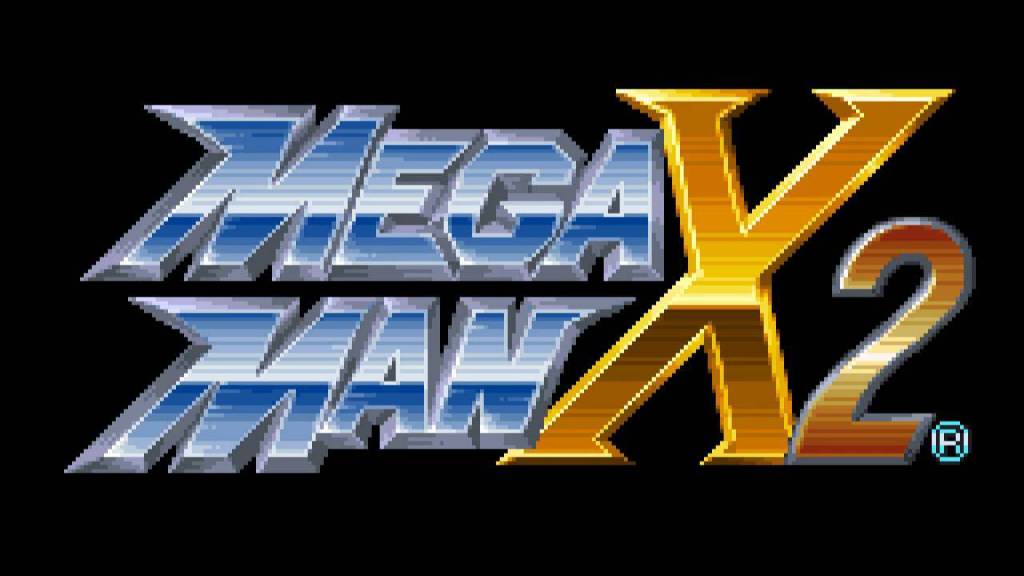
The same design is followed for the Mega Man X 2 logotype, adding number 2 on a gradient from orange to yellow to distinguish it from the X.
Unlike the previous one, the number in Mega Man X3 shows a more drastic change of color. To understand why, let’s recall that although Zero has appeared since the first Mega Man X, it’s in the third where he became a playable character. Then, the logo reflects the above giving the number 3 the colors the Beam Sword of Zero, that’s mean, green and blue.


Maybe this is not about the logotype design, but just to end this section I found very interesting to talk about how in Mega Man X2, Capcom ask to use the “CX4”, Capcom’s DSP chip. This inserted into Super NES cartridges allows for rotations, enlarging, shrinking and other graphical processing. Despite the difficulty, the creators use it even in the letter “X” of the title.

MEGA MAN X4 – X6: NOW ONE WORD WITH A TECH BACKGROUND
Searching a little, I found there is a lot of confusion about whether the correct term is Mega Man o Megaman due to, as the title says, since Mega Man X4 the cover shows just one word. To avoid to entering a topic with no much relation with the written in this post, I clarify I’m using the separate words as the Official Art Book do however, as a design, from this section I’m going to use it as a single element. So, this change brings the challenge to do a new logo with the same essence as the first three, but now thinking in just one line of text.
Talking about the general structure, this new logo occupied more horizontal space, the inclination is greater and the colors are brighter. Despite this, the base colors blue and yellow prevail, the serif in the top part of the first “M” and in the “N” are still there, and the form of the “X” has a similar form of the one used in Mega Man X1 to X3.
Because the union of “Mega”, “Man” and the number results in a larger logotype, it was required to gain space in some way. Then the “X” is put at the back instead of an aside. Its size and shape permit to distinguish it although it’s been covered, so it was the best solution. As a finishing touch, a background that looks like a fissure showing circuits is added. Maybe the reason behind these circuits it’s that the game has always been centered in robots.
The design of the logotype of Mega Man X4 to X6 is very similar just varying shades and the width of the letters. The idea is to maintain the same visual sensation yet giving particularities to distinguish one game from another.
MEGA MAN X7: AXL IS HERE!
The logotype of Mega Man X7 maintains the same characteristics of the previous ones by having the same structure and the same colors of base in the name and in the “X”. Nevertheless, this logo has the responsibility to communicate the introduction of the new protagonist: Axl. Then, the illustration in the back is the perfect to for the task.

Firstly, the base of this illustration is a mechanic circle very common in the design of the characters in this video game. For example: in ears part of the helmet, in the busters, in the chest, etc. My theory is that in the interior of the circle there is energy and that this is purple to refer to the Sigma virus that has been talked about since the first game.
The Axl representation comes with the blue circle at the bottom right part that is the same Axl wears on the head and in the chest.
The same happens with the screw at the top right part that has the same shape as the ones Axl uses the wrist.
Of course, Zero can’t miss in this new logo so, the number 7 is green like the saber of Zero.
It’s possible to note this is the first time a red triangle appears behind and these elements becomes the official one for the next games originals and remakes.
MEGA MAN X8: NOT SO GOOD BUT… LET’S TALK ABOUT THE LOGO
The concept that was sought for this logo was simplicity, but maintaining dynamism. This is why there is not a texture or an elaborate element behind, however the general structure remains to maintain the same idea of the series.
Here the main thing was to communicate the integration of the three main characters, so the colors are the key to do this: light blue and red for “X”; red, black and yellow for “Zero”; and dark blue, yellow and red for Axl.
Finally, as said before, the red triangle becomes the master piece from now on.
As you can see, there is a lot behind a logo. If you think I’m missing something, please comment, since everything written here is my analysis and it’s not information from the creators.
Well, I hope you liked this post! In the next one I promise to finish the Code: Realize design analysis. See you in my next post!!
BIBLIOGRAPHY
- Capcom, Mega Man X: Official Complete Works Hc. Udon Entertainment, 2019.
- “Axl,” MMKB. [Online]. Available: https://megaman.fandom.com/wiki/Axl. [Accessed: 10-Apr-2020]
- “Dash,” MMKB. [Online]. Available: https://megaman.fandom.com/wiki/Dash. [Accessed: 09-Apr-2020]
- “Maverick,” MMKB. [Online]. Available: https://megaman.fandom.com/wiki/Maverick. [Accessed: 09-Apr-2020]
- “Mega Man X,” Wikipedia. 11-Feb-2020 [Online]. Available: https://en.wikipedia.org/w/index.php?title=Mega_Man_X&oldid=940325025. [Accessed: 26-Mar-2020]
- “Mega Man X (serie),” Wikipedia, la enciclopedia libre. 23-Mar-2020 [Online]. Available: https://es.wikipedia.org/w/index.php?title=Mega_Man_X_(serie)&oldid=124490177. [Accessed: 26-Mar-2020]
- Mega Man X2 – Opening & Title. [Online]. Available: https://www.youtube.com/watch?v=rbuNEifcc1g. [Accessed: 09-Apr-2020]
- “Mega Man X6,” Wikipédia. 28-Jun-2018 [Online]. Available: https://fr.wikipedia.org/w/index.php?title=Mega_Man_X6&oldid=149924044. [Accessed: 09-Apr-2020]
- “Mega Man X7,” Wikipédia. 28-Jun-2018 [Online]. Available: https://fr.wikipedia.org/w/index.php?title=Mega_Man_X7&oldid=149924047. [Accessed: 09-Apr-2020]
- “Mega Man X8,” Wikipédia. 29-Feb-2020 [Online]. Available: https://fr.wikipedia.org/w/index.php?title=Mega_Man_X8&oldid=167942798. [Accessed: 09-Apr-2020]
- “Sable Z,” Mega Man HQ. [Online]. Available: https://megaman.fandom.com/es/wiki/Sable_Z. [Accessed: 09-Apr-2020]
- “The Story Of Mega Man And Why Keiji Inafune Made Him Blue – Siliconera.” [Online]. Available: https://www.siliconera.com/the-story-of-mega-man-and-why-keiji-inafune-made-him-blue/. [Accessed: 09-Apr-2020]

One thought on “MEGA MAN X: LOGO DESIGN AND ITS EVOLUTION”