Recently I started playing a new video game genre: the Otome. I commenced the day I came across the anime adaptation of “Amnesia (アムネシア Amuneshia)” and fell in love with the drawing and with the premise of the story. When I bought this video game at Steam, I realized its illustrations were much better than those of the anime, as well as the story. Since then, I play all the Otomes that attract my attention because of its illustrations. While playing them, I evaluate the story and all the visual elements that create the identity of the game.
For this article I decided to write about the interface design of the Otome “Bad Apple Wars”, considering how it was made on the basis of the logotype. Then, let’s begin!!
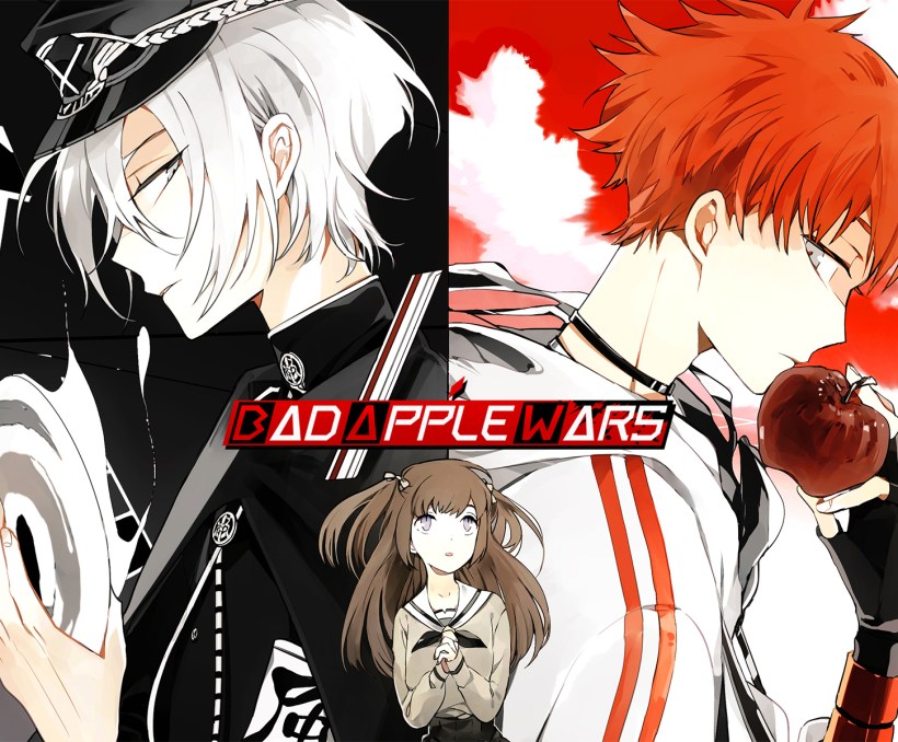
FIRST THINGS FIRST: ABOUT “BAD APPLE WARS”
“Bad Apple Wars” is a video game developed by Otomate. It was released in Japan in 2015 by Factory Co., Ltd. and in 2017 Aksys Games brought the English version. The story begins when the heroine is involved in an automobile accident on the first day she was to enter high school. After this, she suddenly found herself inside an unknown school: the NEVAEH academy. In here, a man with a rabbit head informs her about her death and how she has to follow the rules for graduate and be able to resume her life.
However, she founds that there are people who defy the school’s rules, the BAD APPLES, who are in war with the members of the DISCIPLINARY COMMITTEE. This leads her to wonder if following the rules it’s really the best.
THE LOGOTYPE
I will use the term “logotype” to refer to the figurative mark of “Bad Apple Wars” in view that its composition only involves text without any other symbol accompanying it.
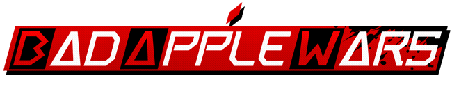
Since the logotype represents the base of the design of all the interface’s visual elements, it’s necessary to do its analysis first.
- Envelope: Consisting of a red rhomboidal, the envelope assumes his role of an apple with the help of a little diamond at the top-middle part, which represents the fruit’s stalk. To continue, difficult to distinguish but very important for the interface design, it’s the texture of diagonal line for the background. I imagine the intention was to go on with the rhomboidal concept and use its minimum expression: the diagonal.
Finally, the black elements which are: the stains at the right corner that I believe are to give the idea of mess or, more precisely, of “war”. And a drop shadow with hard edges to match how the borders in the characters’ illustrations are applied.
- Typography: The name is written in a geometric sans serif typography based in the fact that the “A” is like a triangle and the other letters have a rhomboidal form. There are only two exceptions, the “B” and the “W”. I think this is because the designer wanted to focus the rhomboidal on the envelope instead of the letter. Finally, but not least important, the font is presented in white color, excluding the first letter of each word, where the red is the chosen color.
THE INTERFACE DESIGN
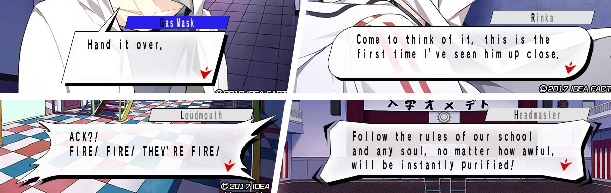
Taking up the rhomboidal form of the logotype’s envelope, it’s visible how this element is very recurrent. In first place, it works as a container for the name of the character who is speaking or thinking. The background color used for this figure is the one that represents the person whose name is inside, for example, red for Alma or blue for Higa.
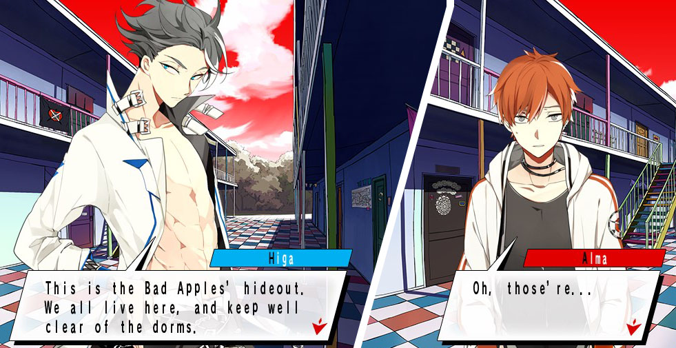
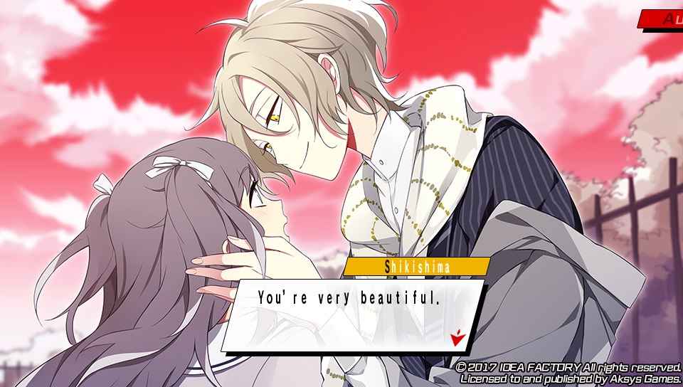
For the Heroine and the generic characters, a very light gray is applied. I really like this color management in a visual novel because it’s a way to easily identify the character that is talking and more when the speech balloon doesn’t have a tail as it happens in the CGs.
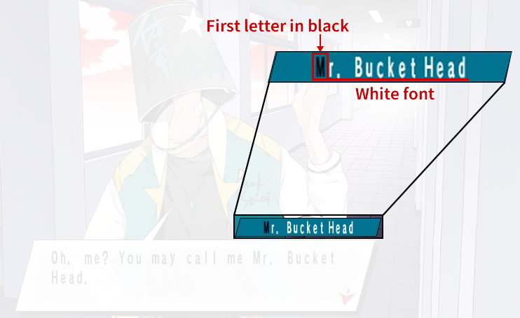
Continuing with the logotype idea, the employ of a different color for the first type of the name is a resource employed in most part of the interface elements. In this case, the name is written in white and the first character in black.
The rhomboidal base remains present in the speech bubbles maintaining the straight corners, rounding them a bit or distorting them to change the content intention.
To give a trustworthy review, I had to compare which elements, especially text, maintain the same appearance in both, English (the one I have) and Japanese version. I discovered that the font for the rōmaji is the same for the two languages. In the case of the hiragana, katakana and kanjis, I’m not going to make comments.
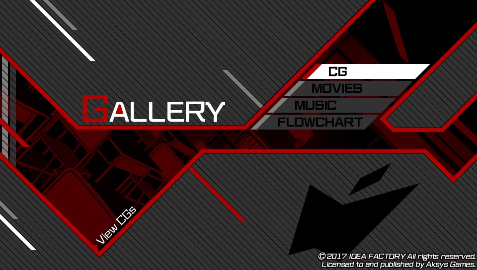
The font for the words in rōmaji seems to be a no-italic version of the one of the logotype but with some modification for better readability. An adding I note, particularly in the option titles outside de initial menu, is the filling red in the counter of letters as the “A”, “O” and P”. I imagine this is a way to provoke the same sensation the logotype gives with the envelope of the first letters.
Overall, the interfaces apply rhomboidal forms, textures of diagonal lines such as the one in the logotype, the color red for empathize, and four neutral color to shape the interface: white and 100%, 80% and 50% black.
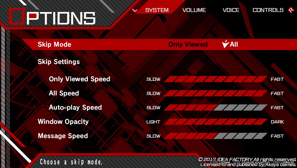
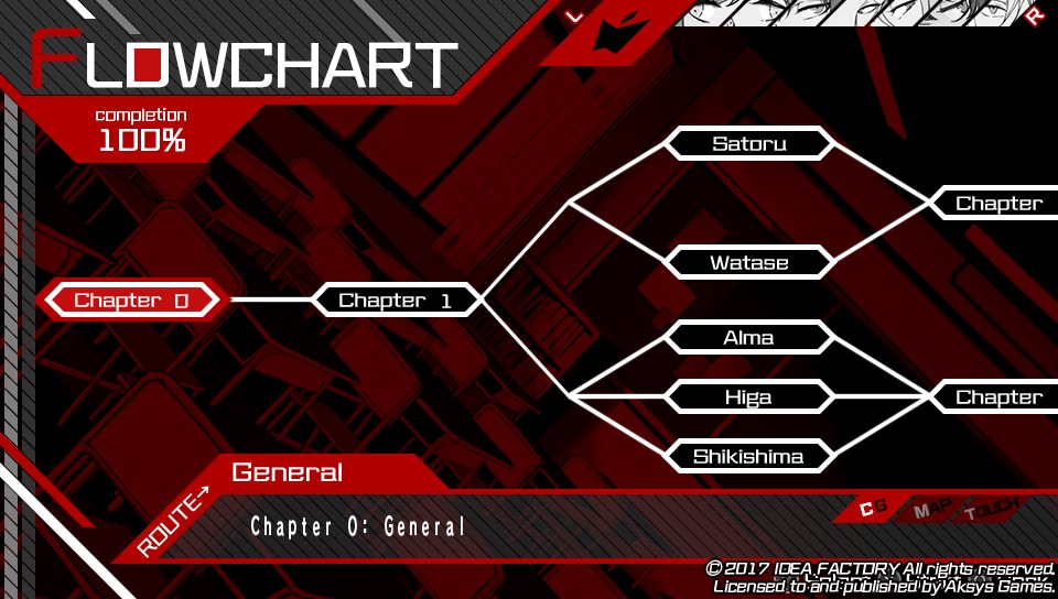
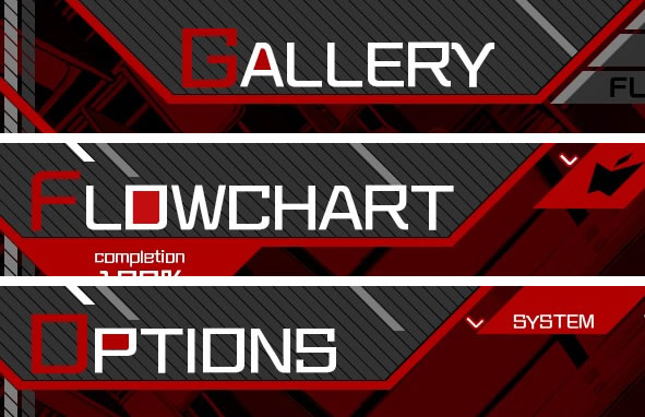
In some cases, the words are presented in vertical or diagonal way. One of them, which I love the design, it’s the internal or pop-up menu. Here, inside a line conformed by many rhomboidal, six of them have the initial letter of the submenu: S (Save), L (Load), O (Options), F (Flowchart), T (Title) and B (Back). When you chose one, I like how it arose of this little rhomboidal.
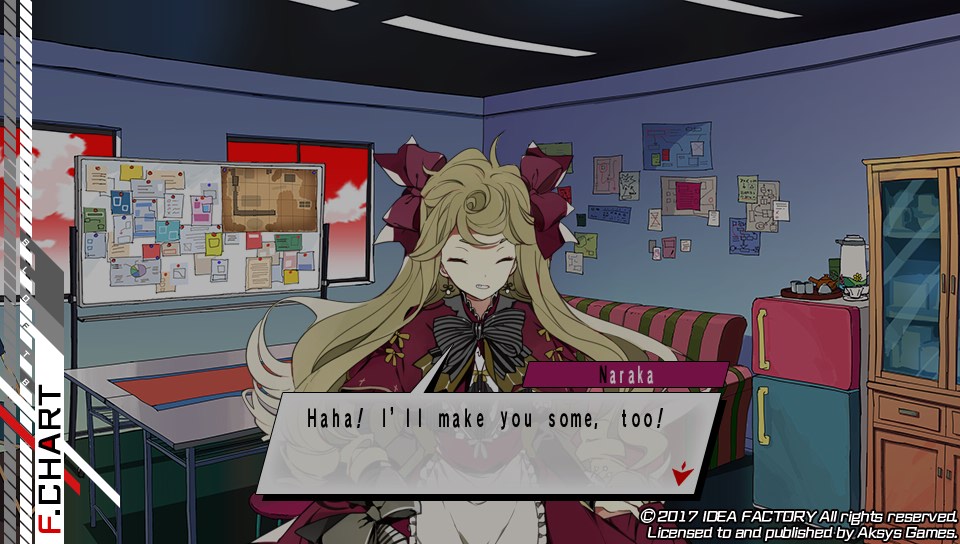
Finally, the nicer and indispensable detail is the little arrow with “apple” shape that serves to indicate the selected option or the end of the dialog to press the button to continue. In my opinion, this element is an example of a well-done abstraction. I believe this since with two simple forms, a slightly inclined arrow and a little rhomboidal at the top, the hint of “apple” is clear.

Well, this is the end of my first post. I hope you enjoyed! And you? What do you think about the design of this game? I’ll be waiting for your comments!! For now, see you until my next post!!

One thought on “BAD APPLE WARS: INTERFACE DESIGN ANALYSIS”