

Cover image by tinbapakk on SteamGridDB
“Valkyrie Profile” is a series of role-playing video games inspired by Norse mythology, where the story revolves around a Valkyrie, one of a host of female figures who collect the souls of slain heroes. These serve either as Einherjar or her personal companions for Ragnarok – the battle to decide the fate of all creation – and trains them by fighting monsters and performing additional quests.
Reading this description may lead to think that the research work to be done to create this logo is easy, since it is only about investigating one subject: Norse mythology. However, let us remember that this topic is very extensive, so a deep and time-consuming investigation must be carried out. Furthermore, from all this information, the designers have to choose essential elements to abstract and communicate what is needed, which requires not only more time but also creativity. Nonetheless, despite all these chores, the creators of the “Valkyrie Profile” logo did their homework and came up with a great logo.
The above makes it worth looking at the possible sources of inspiration and what the designers may have had in mind when creating this work of art. So, let’s have fun analyzing a logo where the central concept comes from Norse mythology.
LET’S KNOW A LITTLE MORE ABOUT “VALKYRIE PROFILE”
“Valkyrie Profile” is a video game series created by Yoshiharu Gotanda, developed by tri-Ace and published by Square Enix (formerly Enix).
The first game in the series was released on December 22, 1999 in Japan and on August 29, 2000 in North America. It follows the titular Lenneth as she travels through Midgar and learns more about her original human life, erased from her memory upon becoming a Valkyrie.
Critical and commercial success led to the creation of an enhanced version released for the PlayStation Portable in 2006 under the name “Valkyrie Profile: Lenneth”. In addition, two prequels to the series were developed: one for PlayStation 2 entitled “Valkyrie Profile 2: Silmeria” released in 2006 in Japan and North America and in 2007 in Europe; and another titled “Valkyrie Profile: Covenant of the Plume”, released for Nintendo DS in Japan in 2008, March 17, 2009 in North America and on April 3, 2009 in all PAL regions.
Finally, seven years later, Lenneth returned first with “Valkyrie Anatomia: The Origin (JP2016 / ww2019)”, a prequel to the original “Valkyrie Profile” story; and soon after with the improved version of PlayStation Portable for iOS and Android.
TO AVOID PROBLEMS WITH THE TERMS
Before continuing, it is necessary to clarify that in this post the term “logo” will be used for the graphic element by which the public can identify a brand or, in this case, a video game. In the case of “Valkyrie Profile”, the logo is formed by two components: the “logotype”, a term that is utilized in this post when talking about the graphical item that represents the title; and the “logomark” which is the picture or image.
Image by Blitztank on SteamGridDB
RUNES TO ROMAN SCRIPT??
“Valkyrie Profile” employs the same logotype in all the games of the series, thus it will be the first component to be analyzed. This consists of two words in the same line of text, where the letters are condensed and serif. The main feature of the condensed font, also known as narrow, is that its characters have narrow widths, which at the same time make them appear taller.

tri-Ace, Public domain, via Wikimedia Commons

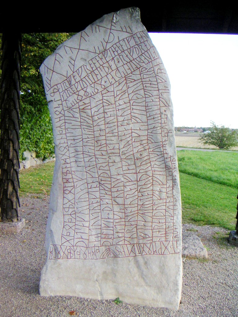
The narrow characteristic of the characters of this logotype could be inspired by the form of the runic alphabet applied in runestones, mainly the one from the beginning of the 9th century where the Valkyries are mentioned for the first time. This is the Rök Runestone in Östergötland, Sweden, where a kenning involving a Valkyrie riding a wolf as her steed is employed:
That we tell the twelfth, where the horse of the Valkyrie [literally “the horse of Gunnr”] sees food on the battlefield, where twenty kings are lying.
Andrén, 2006 [1]
Bengt Olof ÅRADSSON, CC BY 1.0, via Wikimedia Commons
Looking at the Rök Runestone, one can notice how the runes were drawn occupying the space of a long, narrow rectangle, recalling the shape of the font applied in the “Valkyrie Profile” logotype, which has already been described as condensed.

Achird, CC BY-SA 3.0, via Wikimedia Commons
Another element that was taken as inspiration from this runestone to create the feel of a Norse font, was the lines. Although, it is feasible to think that these lines are guides that the writers utilized to easily distribute the text, the fact that they were well-marked and not straight suggests that they were part of the design of the runestone. This may be true as if one looks at the runestones at Vaksala or Lingberg, the lines really create very interesting shapes in the stones. So, in the “Valkyrie Profile” logotype, these lines are translated as serifs of the letters, also achieving the mystical and elegant sensation that one feels when thinking of Valkyries.


Image from Berloga Workshop

I, Berig, CC BY-SA 3.0, via Wikimedia Commons
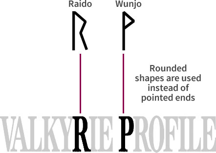
Finally, it is curious how the designers avoided using pointed ends that are distinctive of the runic alphabet. For example, when comparing the “Raido” and “Wunjo” which are like “R” and “P” respectively in Roman script, one can see how the tops of R and P are rounded and not pointed. This is probably to soften the logotype as the video game has a melancholic but not aggressive vibe, even though it talks about battles and wars.
As a last detail, the logotype of “Valkyrie Anatomia: The Origin” is different, but this is because the text changes, that is, the “PROFILE” is replaced by “ANATOMIA”. However, the letter forms come from the same source of inspiration, so the same font is employed.

Image from Valkyrie Profile Wiki Fandom
LITERALLY THE PROFILE OF A VALKYRIE
The second shape that forms this logo is the logomark which, in this case, is the profile of a Valkyrie looking down and within a circular outline with a double line. Choosing the profile of a Valkyrie is obviously because of the name and theme. The first thing that can come to mind is to use the profile of the protagonist as a symbol of the logo, Lenneth being the one picked for the first installment, but it was not like that.
Observing, Lennet has very long and braided hair, unlike the Valkyrie of the logomark that has it loose and medium long since it is viable to see it complete when it is curved inside the circle. Also, Lenneth’s helmet has four feathers per side, and the logomark’s has one on each side.

Image of Lenneth from Creative Uncut
Logomark from Video Game Music
Apparently, the symbol was inspired rather by illustrations made by some painters, who visualized the Valkyries as women with long hair and helmets with a feather on each side. Examples of this are the works of Emil Doepler and Lorenz Frølich.

Emil Doeple, Public domain, via Wikimedia Commons
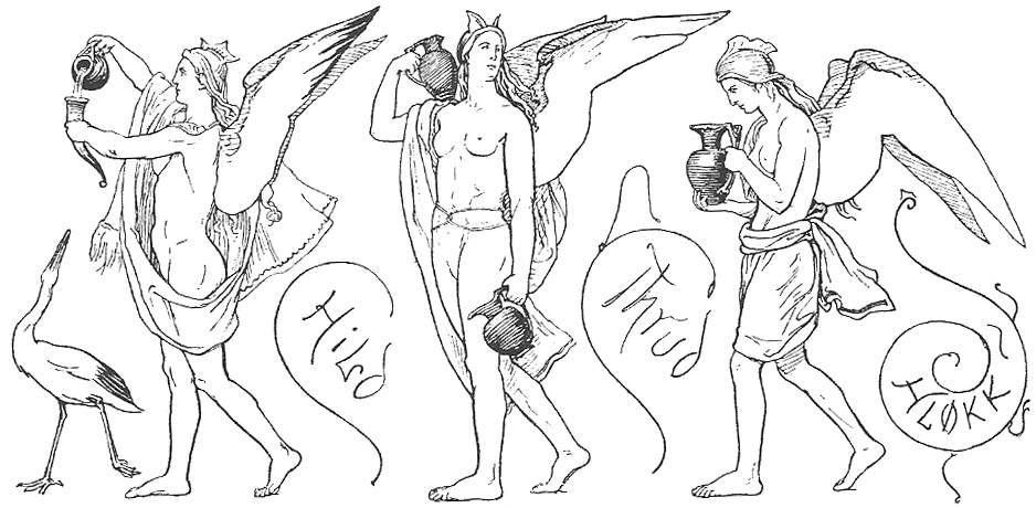
Lorenz Frølich, Public domain, via Wikimedia Commons
The same logomark was applied in all the series that had Lenneth as the main Valkyrie, protagonist or not. This means that only “Valkyrie Profile: Silmeria” is different, as it shows a face looking up and wearing a helmet with three feathers per side. This shape respects more the image of the main Valkyrie, that is, of Silmeria.
The second game’s logomark bears a greater resemblance to Silmeria, the Valkyrie the plot revolves around.
Silmeria’s image from Valkyrie Profile Wiki Fandom
Logotype from VGMdb
This could mean that the intention of the designers with the second game was to change the logomark according to the protagonist Valkyrie, considering that for a while it was rumored that a third installment was going to be created with Hrist as the main character. In the end, this rumor never came true, still the rule of the shape of the logomark according to the Valkyrie remained. This is why “Valkyrie Profile: Covenant of the Plume” and “Valkyrie Anatomia: The Origin” have the same logomark as the first game in the series, only changing some details such as background color.
An interesting detail: even though the logo is always the same where Lenneth is the main topic, the designers always add a representative element. In “Valkyrie Profile: Covenant of the Plume” it was a plume, and in “Valkyrie Anatomia: The Origin” it was text both below the logotype and around the circle of the logomark.

Image from Valkyrie Profile Wiki Fandom
Well, this is the end of the analysis, and it was amusing to discover how some sources of inspiration can come from items of the past, such as runestones. Likewise, it is interesting how a series of video games can employ the same logo to keep the user in the same context, but changing some details to give each installment a personality.
I hope you like this post, and please comment what you think of this Nordic logo. But until then, see you in my next post!
REFERENCES
[1] Andrén, A.; Jennbert, K.; Raudvere, C. (2006) “Old Norse Religion: Some Problems and Prospects” in Old Norse Religion in Long Term Perspectives: Origins, Changes and Interactions, an International Conference in Lund, Sweden, 3–7 June 2004. Nordic Academic Press. ISBN 91-89116-81-X
BIBLIOGRAPHY
- “Raido,” Wikipedia. Aug. 29, 2021 [Online]. Available: https://en.wikipedia.org/w/index.php?title=Raido&oldid=1041290273. [Accessed: Feb. 05, 2022]
- “Rök runestone,” Wikipedia. Jan. 23, 2022 [Online]. Available: https://en.wikipedia.org/w/index.php?title=R%C3%B6k_runestone&oldid=1067341040. [Accessed: Jan. 25, 2022]
- “Runes,” Wikipedia. Jan. 21, 2022 [Online]. Available: https://en.wikipedia.org/w/index.php?title=Runes&oldid=1066973208. [Accessed: Feb. 05, 2022]
- “Runestone,” Wikipedia. Jul. 22, 2021 [Online]. Available: https://en.wikipedia.org/w/index.php?title=Runestone&oldid=1034976265. [Accessed: Jan. 25, 2022]
- “Valkyrie,” Wikipedia. Jan. 17, 2022 [Online]. Available: https://en.wikipedia.org/w/index.php?title=Valkyrie&oldid=1066244374. [Accessed: Jan. 25, 2022]
- “Valkyrie Anatomia: The Origin,” Wikipedia. Jul. 06, 2021 [Online]. Available: https://en.wikipedia.org/w/index.php?title=Valkyrie_Anatomia:_The_Origin&oldid=1032340424. [Accessed: Jan. 17, 2022]
- “Valkyrie Profile,” Wikipedia. Nov. 27, 2021 [Online]. Available: https://en.wikipedia.org/w/index.php?title=Valkyrie_Profile&oldid=1057451149. [Accessed: Jan. 22, 2022]
- “Valkyrie Profile (video game),” Wikipedia. Nov. 24, 2021 [Online]. Available: https://en.wikipedia.org/w/index.php?title=Valkyrie_Profile_(video_game)&oldid=1057002784. [Accessed: Jan. 17, 2022]
- “Valkyrie Profile 2: Silmeria,” Wikipedia. Nov. 24, 2021 [Online]. Available: https://en.wikipedia.org/w/index.php?title=Valkyrie_Profile_2:_Silmeria&oldid=1057003472. [Accessed: Jan. 17, 2022]
- “Valkyrie Profile: Covenant of the Plume,” Wikipedia. Jul. 30, 2021 [Online]. Available: https://en.wikipedia.org/w/index.php?title=Valkyrie_Profile:_Covenant_of_the_Plume&oldid=1036338527. [Accessed: Jan. 17, 2022]
- “Wynn,” Wikipedia. Jan. 26, 2022 [Online]. Available: https://en.wikipedia.org/w/index.php?title=Wynn&oldid=1068005753. [Accessed: Feb. 05, 2022]

Fantastic analysis! First time I’m interested in understanding more about logotypes and logomarks in video games and it seemed like a really fun subject.
I agree that the image of the valkyrie from the first game would hardly be Lenneth portrayed, but I think the arrangement of the hair (which resembles flames) the color of the logomark (which resembles fire) and the circle around it (the fire wall) could be references to Brünnhilde from The Ring of the Nibelung
LikeLike
Yeah! Logotypes and logomarks in video games are a really fun subject, it is one of my favorites! And it is true, I had not noticed what you say about The Ring of the Nibelung, it makes a lot of sense. Thank you for that information! 😀 And tell me Kayuusha, do you have a video game logotype that is your favorite?
LikeLike
Hey! I think all logotypes from Final Fantasy main serie. I recently realized there’s color on the number of the FFIX logotype, I don’t know why on this moment, but sounds like interesting 🤔
LikeLike
Oh yeah! I love those logotypes and the idea behind each one. I am guessing that the color in the number FFIX is to continue with the idea of the gradient of the crystal of the center.
I have the idea to write about these logos at some point but… it is a very extensive topic. But I have them in my “to do” list 😛
LikeLiked by 1 person
That’s easy to understand, The number of feathers on the helmet depends on the Divine Ranking. Lenneth is the main character both In Valkyrie profile Lenneth and Valkyrie Profile: Covenant of the Plume, so It appeared to be on feather on the icon. Silmeria is the 3rd ranking among 3 Valkyries so it appeared to be 3 feathers in the game Valkyrie Profile Silmeria. Hrist is the second ranking among 3 Valkyries but she never be published as the main character.
LikeLiked by 1 person
Oh! I see!! Now it has sense!! Thank you for this contribution, it is very important to me! 😀
LikeLike