

Cover image from Hyperhype
To talk about a game that mixes fantastic hand-drawn art, a huge cast of cute but creepy characters, classic-scrolling action, and fantastic traditional 2D frame-by-frame animation is to talk about “Hollow Knight”.
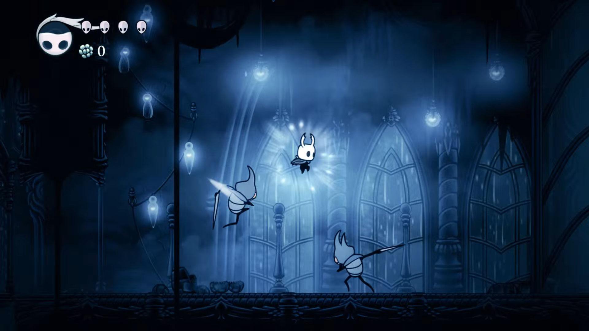
“Hollow Knight” is a metroidvania action-adventure game that allows the player to explore twisted caverns, ancient cities, and deadly wastes. Additionally, it is possible to battle tainted creatures, befriend bizarre bugs, and solve ancient mysteries in the heart of a kingdom. Taking inspiration from older platform games, Team Cherry developed and published it in 2017.
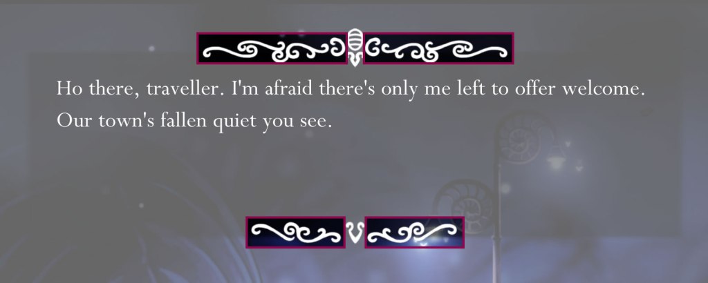
Despite the tenderness caused by its characters, the atmosphere of the game is aims to provoke that feeling of melancholy, loneliness and mystery because the story has as its protagonist a nameless warrior uncertain of his identity or origin and who explores an almost deserted kingdom, where an inhabitant is rarely found.
To achieve the above, the game takes advantage of the music, the monotonous dark palette and especially the settings that seem to be inspired by Gothic architecture since there are sweeping windows, pointed or ogival arches and piers and columns that support them.
It should be noted that Gothic architecture is characteristic of the castles of Europe from the 12th century AD, which began to be used in stories to develop the feeling of fear and terror. This is how the literary genre called Gothic was born. In general terms, this genre can be defined as writing that employs dark and picturesque settings, surprising and melodramatic narrative devices, and an atmosphere of exoticism, mystery, fear and dread. All of the above is precisely what “Hollow Knight” is intended to reflect, and that is why the components of Gothic architecture are used in its settings.


Images from Riot Pixels, STEAM, CloudFall Studios and RAWG respectively
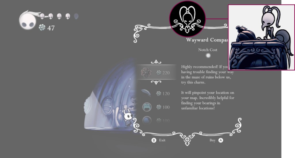
Taking this into account, the logo and the interface design could not leave this style aside, so it was decided that they contain gothic ornaments, but with some particularities to maintain the idea of bugs and the aesthetic of handmade. So, let’s talk a little bit about this.
HAND-DRAWN SPIRALS AND WAVES
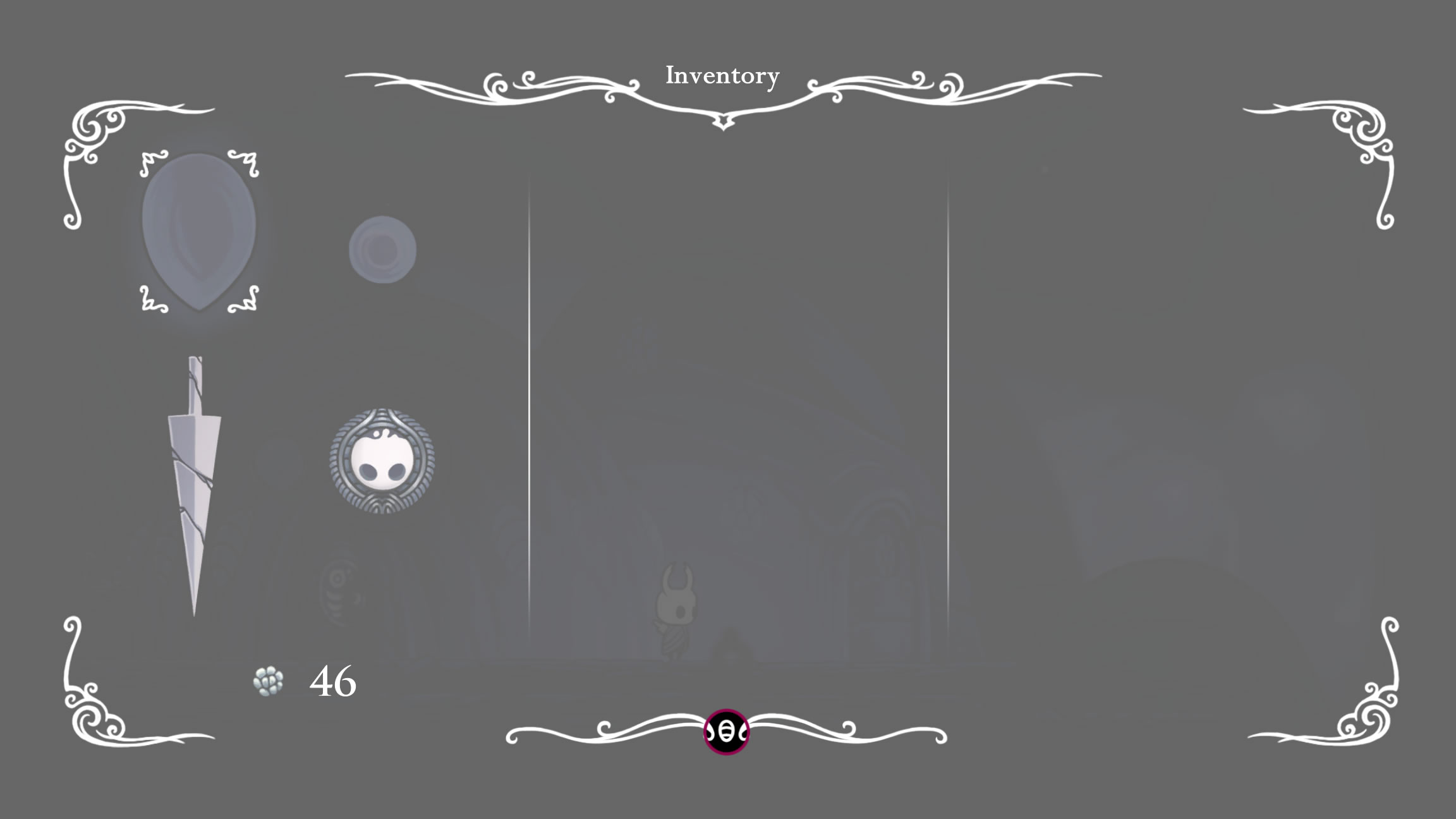
The main feature of this game is the clean, simple and like hand-drawn design. Therefore, this is also reflected in the logo and in the interfaces, such as dialog boxes and menus, as they use hand-drawn abstractions of ornaments seen in gothic architecture.
The predominant influence on the logo and interface components are the decorations seen on the gables of some French buildings, where the lines are curved with spiral endings, some giving the impression of waves.

Wooden gable (Marketplace, Abbeville) [1]

Ornaments (1, 3: stone spandrels, Winchester Cathedral; 2, 4: wooden ornaments, Henry VII Chapel, Westminster Abbey) [1]
By having this pattern, it can be employed multiple times by changing the size, direction, and angle to create new designs that can be applied in different ways. For example, in the logo, it is used horizontally changing sizes and with the spiral endings going up or down to achieve an elegant frame for the title.
Logo from FANDOM
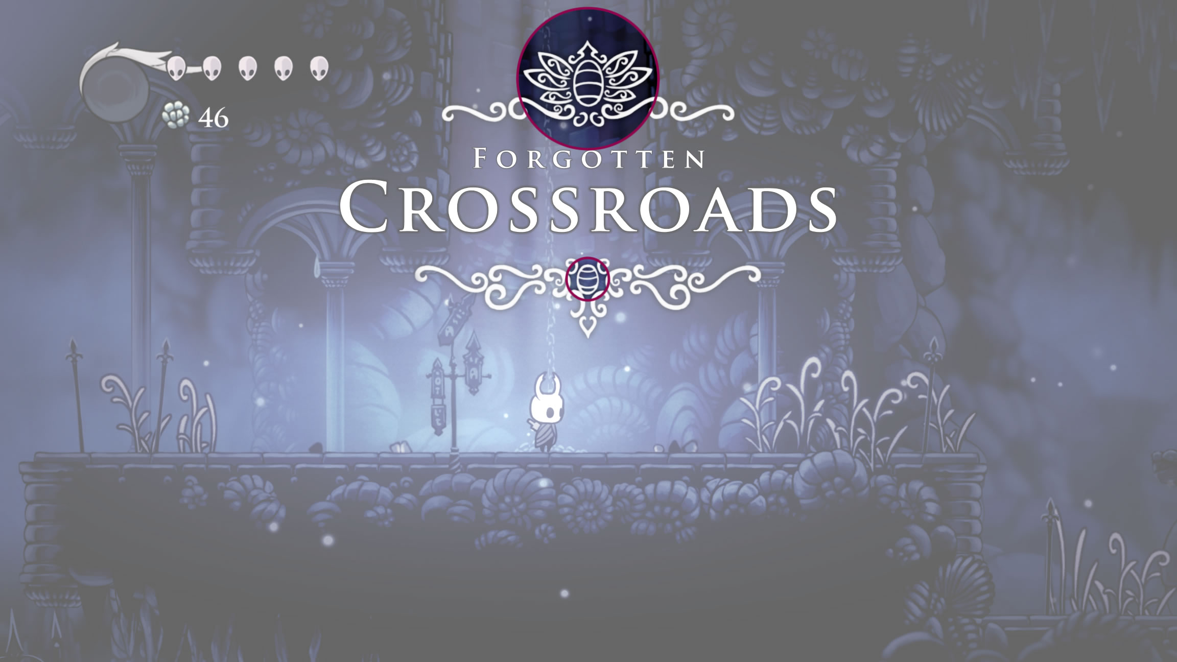
The same happens in the decoration of dialog boxes, menus, instructions and even in the names of towns and areas where different angles are noted.


ELEGANT ARROWS
An essential icon for this video game is the arrow, since it serves to communicate to the player the continuation of a dialogue or to point to the objects with which one can interact. The inspiration for these arrows came from the stone finials of some cathedrals.
Stone finials (Cathedral) [1]
Oak panels (Beddington Manor House, Surrey) [1]
BUGS EVERYWHERE!
A detail that can be considered one of the most curious is the inclusion of the protagonists of this video game, that is, the bugs, in the design of the logo and the interfaces.
Analyzing all the elements that work as adornment that accompany those already explained, most of them are like abstractions of shells. This is probably because a common representation of an insect is a drawing of a beetle. The reason for the above is that these are bugs of the Coleoptera order that has around 400,000 described species, being the largest of all orders, constituting almost 40% of the described insects and 25% of all known animal life-forms. That’s why the shells are the first thing one think of when hearing “insect” and why this one, with and without wings, appears in many parts of the game.


Although the shells are not the only thing that can be seen in insect form. In fact, in shops, the head of the store manager is used as a decoration.
Screenshot from Polygon
Iselda from FANDOM

Screenshot from Riot Pixels
Iselda from FANDOM
This analysis helps to demonstrate how a clean and simple design can result in an all-round beautiful video game like “Hollow Knight”.
Also, something beautiful about this video game is the handling of contrasts since it combines insects and a gothic aesthetic to create an atmosphere that is depressing and creepy as well as relaxing and cute. This shows how the creators did a great job.
Well, I hope you liked this post and write in the comments section what you think of the design of this game. Until then, see you in my next post!
REFERENCES
[1] A. C. Pugin, Pugin’s Gothic Ornament: The Classic Sourcebook of Decorative Motifs with 100 Plates. 2012.
BIBLIOGRAPHY
- artincontext, “Gothic Architecture – An Overview of Gothic-Style Architecture,” artincontext.org, Oct. 27, 2021. [Online]. Available: https://artincontext.org/gothic-architecture/. [Accessed: Mar. 04, 2022]
- “Beetle,” Wikipedia. Feb. 18, 2022 [Online]. Available: https://en.wikipedia.org/w/index.php?title=Beetle&oldid=1072636595. [Accessed: Mar. 14, 2022]
- D. Milner, “The Making Of Hollow Knight,” Game Informer. [Online]. Available: https://www.gameinformer.com/2018/10/16/the-making-of-hollow-knight. [Accessed: Mar. 04, 2022]
- “Gothic Castles: How Gothic Architecture and Fiction Created Truly Spooky Places,” Exploring Castles. [Online]. Available: https://www.exploring-castles.com/castle_designs/gothic_castles/. [Accessed: Mar. 16, 2022]
- “Gothic fiction,” Wikipedia. Feb. 27, 2022 [Online]. Available: https://en.wikipedia.org/w/index.php?title=Gothic_fiction&oldid=1074203159. [Accessed: Mar. 04, 2022]
- “Hollow Knight,” Wikipedia. Feb. 28, 2022 [Online]. Available: https://en.wikipedia.org/w/index.php?title=Hollow_Knight&oldid=1074532428. [Accessed: Mar. 04, 2022]
- “Hollow Knight for Nintendo Switch – Nintendo.” [Online]. Available: https://www.nintendo.com/store/products/hollow-knight-switch/. [Accessed: Mar. 02, 2022]
- mossbag, The Real Life Bugs of Hollow Knight. (May 14, 2021) [Online]. Available: https://www.youtube.com/watch?v=QwJRU69nTdo. [Accessed: Mar. 14, 2022]
- T. M. published, “Hollow Knight’s charming art sets the bar for hand drawn games,” PC Gamer, Mar. 06, 2017 [Online]. Available: https://www.pcgamer.com/hollow-knights-charming-art-sets-the-bar-for-hand-drawn-games/. [Accessed: Mar. 04, 2022]
- “What Is Gothic Literature?,” ThoughtCo. [Online]. Available: https://www.thoughtco.com/gothic-literature-2207825. [Accessed: Mar. 04, 2022]
- “What We Can Learn From the Exquisite History and Ornate Aesthetic of Gothic Architecture,” My Modern Met, Feb. 12, 2022. [Online]. Available: https://mymodernmet.com/gothic-architecture-characteristics/. [Accessed: Mar. 04, 2022]

Before reading this post I saw these aspects of the UI curves and the logo just as an aspect of elegance and handwriting to reinforce a good part of the graphic design of this game that was made by hand drawing. But as you showed us, there are also many references to gothic art that perfectly fit the tone of the game, showing how conscious the choices made for this game were. Another great analysis, keep going with more of them!
LikeLike
Thank you! And yeah, I really love how the gothic art is employed in this game!
LikeLike