
2020 is here and to start with the right foot, the post of the first month can’t miss. For this occasion I decided to take a little break from the series about the characters of “Code: Realize” and talk about the game that is somehow the culprit that I start writing this blog: “Mystic Messenger”. If you want to know why I’m saying this, you can read the introduction of my July post.
When I reflect on this game, I really find a lot of topics to write about, however the best is to approach one by one to achieve posts worth reading and that honor the game and its creators. Then, this time I’m going to describe the logo, which is the best beginning in view this is related to a large part of the game’s visual design. So, let’s begin!!
BECAUSE I HAVEN’T TALKED ABOUT MYSTIC MESSENGER YET
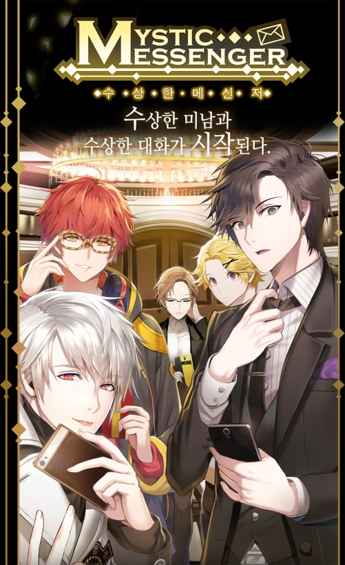
Mystic Messenger (수상한메신저; RR: Susanghan Mesinjeo) is a mobile game described as a “storytelling messenger game”, but also it can be classified as Otome since it’s a female-oriented visual novel. It was released on 8, 2016 for Android and August 18, 2016 for iOS and it was developed by Cheritz, an independent company based in South Korea. It’s worth to say that Mystic Messenger was awarded Best Indie Game at the 2017 Korean Game Awards.
In this mobile game, the player takes the role of the female protagonist who downloads a mysterious app that leads her into living in two different locations depending on the route chosen. The first place is a closed, secured apartment owned by Rika, the founder of a charity organization known as RFA (Rika’s Fundraising Association). The second one is the Mint Eye HQ. In both cases, the main character tasked to organize the third party of the RFA by inviting guests. There are seven available character routes so far and each one last 11 days. The game is played in real time, where the player can receive text messages, calls and join chats in a special messenger. As a classic Otome, there are bad, normal and good endings for each route that depends on the player’s answers and actions.
LOGO DESIGN
To explain the Mystic Messenger’s logo design, the best is to divide it into three units. Firstly the text, consisting by the words “Mystic” and “Messenger”, which share the starting letter “M” that works then as a drop cap. Secondly, the forms that surround the text which are lines, diamonds and the envelope icon. And lastly, the color.
WHY AN ENVELOPE? WHY DIAMONDS?! WHY LINES?!!
To begin with, let’s take the forms that surround the text: the envelope, the diamonds and the straight lines. This is due to the fact that this way the explication of the other components listed above will be easier.
If the logo shown earlier is observed, it’s noted that the most distinctive figure is the envelope in the upper right corner. It works like the abstract representation of “messenger” or “message”. Considering that in the game the communication occurs not just through messages sent by chat, but also emails, the use of an envelope icon is a better option that a speech bubble icon, because the last one can be understood more like just chat or instant message.
At the same time, the envelope allows to give the idea of a message being sent when it’s placed inclined along with the diamonds on his left that are like the trail the message leaves when going to its destination.
Already explained the envelope icon and with the diamonds coming up, let’s see their origin.
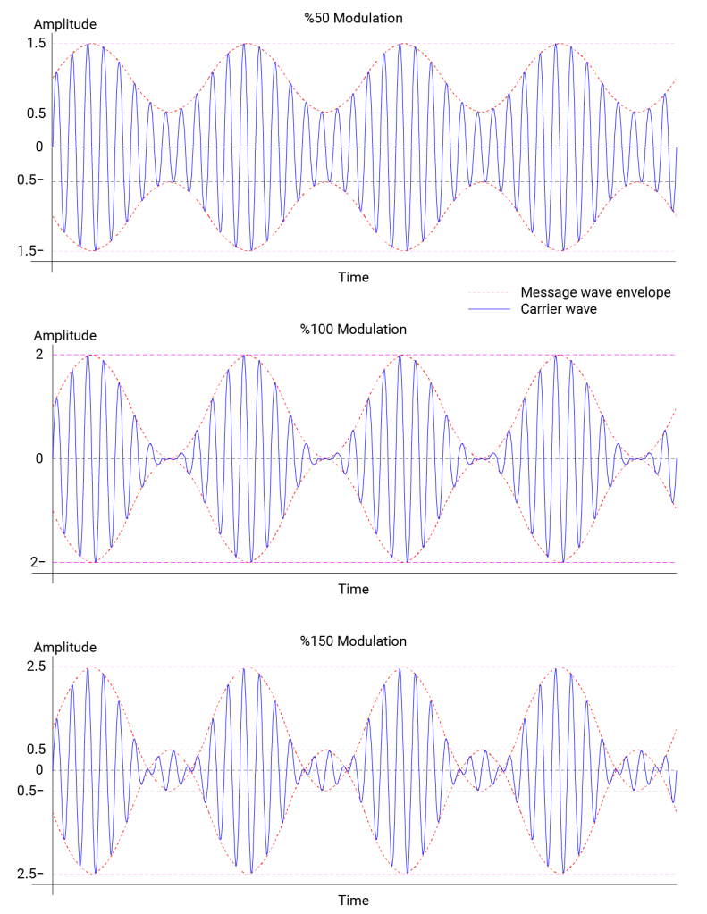
This Otome centralizes principally on the communication through chat, instant messages, emails and calls. Thus, to find visual material that supports the logo, it’s necessary to search concepts that summarize what was described above. These can be Wi-Fi and mobile technology, which in turn are included in the term “wireless communication”.
Jianwei Huang and Lin Gao define the wireless communication as the transfer between two or more points that are not connected by electrical conductor. They also mention that the most common wireless technologies, like mobile cellular networks, wireless LAN (Wi-Fi) along with others, use radio waves [1]. These last words, “radio waves”, involve a lot of terms that can be illustrated such as electromagnetic radiation, wavelengths, frequency, signal and modulation.
So, with these little educational references, the visual research provides the next images:

Chetvorno [CC0]


Berserkerus [CC BY-SA]
Д.Ильин [CC BY-SA]
Having this graphic repertory, let’s observe how changing the ”message wave envelope” in the amplitude modulation of the last figure from curved to straight lines, the result is a series of diamonds formed next to each other and that also can be united by a line.

Once in the logo, these diamonds are placed in a certain way to create a harmonious composition.
The first group of diamonds serves to indicate a start and an end. There are a small one and a large one in each extreme of the upper line. On each edge of the line below, there is a little one too.
The second group of diamonds, located in the upper line, are accommodated below the characters that have a space between the stems or legs. In this case, the “M”, the “N” and the “R”.
The third group, also in the upper line, is based on the second one. This is because their diamonds are almost in the middle of the ones of the second group. This “almost” is to avoid the letters and the figure overlap, so it was necessary to move them in the space amid types.
Lastly, the fourth group, positioned in the inferior line, use as reference the “M” and the envelope.
DRESS FOR THE OCCASION: FONT AND COLOR
From the beginning, the player knows that the reason of her/his participation is to organize a charity party. The official game’s cover, still prevailing in the site web, shows a very elegant hall, so it seems the celebration is formal. This would be the explanation of the use of a serif font, since this type of typography works best in “formal” situations. The same idea is followed by the color, because the golden tones give the same sensation as the cover atmosphere.
And this is how I finish the analysis of the “Mystic Messenger” logo design. I have to mention that what is written here is just guesswork because I don’t know exactly what the designer thought when making this design, however I hope I have done a good job. And what do you think about it? Do you have other guesses about this design? Please tell me in the comments.
For now, see you in my next post, where I will continue talking about the characters of “Code: Realize”. Bye!!
REFERENCES
[1] J. Huang and L. Gao, Wireless Network Pricing. Morgan & Claypool Publishers, 2013.
BILIOGRAPHY
- “Mystic Messenger.” [Online]. Available: http://msg.cheritz.com/. [Accessed: 14-Jan-2020]
- “Mystic Messenger,” Wikipedia. 20-Dec-2019 [Online]. Available: https://en.wikipedia.org/w/index.php?title=Mystic_Messenger&oldid=931650946. [Accessed: 10-Jan-2020]
- “Radio wave,” Wikipedia. 27-Dec-2019 [Online]. Available: https://en.wikipedia.org/w/index.php?title=Radio_wave&oldid=932721192. [Accessed: 09-Jan-2020]

Online games nowadays are trending topics not just from youngsters but also for the adult who’s finding their way to enjoy their leisure time. Different games were blasted online and I found it very exciting. I loved mystic messenger emails as this game lets me not just play but enjoy making my own story and ending. Life is full of changes and while playing this game my mind works and fulfilled with being in another world for some time.
LikeLiked by 1 person
What I love about this game is the concept. It’s the first game where I feel more involved.
LikeLike
This is an amazing analysis!! You made it interesting to read but also factual with what you found out. Mystic Messenger is an amazing game too.
LikeLiked by 1 person
Thank you very much!! 😀 I’m so glad you enjoyed it!!
LikeLike