
The sources of inspiration for creating a video game logo can be diverse, even so it must always be remembered that they must have a close relationship with the game. This is to achieve the purpose of giving the player an idea of what to expect. For example, a very common source of ideas is the general theme, as in the case of “Mystic Messenger” or “Bad Apple Wars”, already analyzed in this blog. Another can be the genre and the time in which the story of the game passes as in “Castlevania”; or the costumes, weapons, techniques or general design of the main characters as in “Mega Man X”. And like these, there are an infinity of resources within a video game that can be taken into account to design a logo.
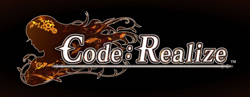
With the aforementioned, it’s possible to see all the curiosities that a logo can hide and how it can be amusing to discover them. So, let’s have fun doing a logo analysis where the central concept comes from the main character’s design, but in a different way than “Mega Man X”. Let’s talk about the logo of the otome “Code: Realize”, where the silhouette of the female protagonist is the principal component.
A PROFILE THAT SAYS A LOT
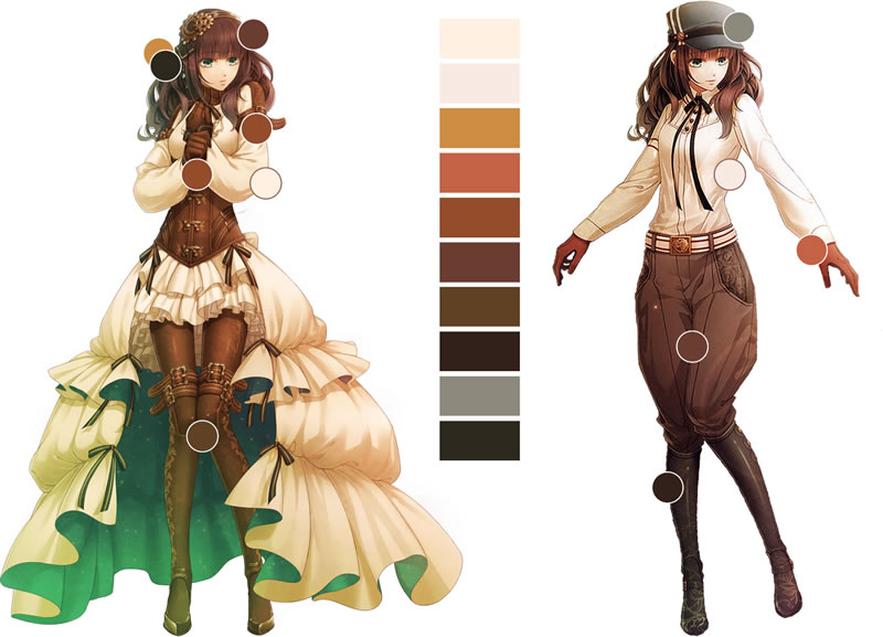
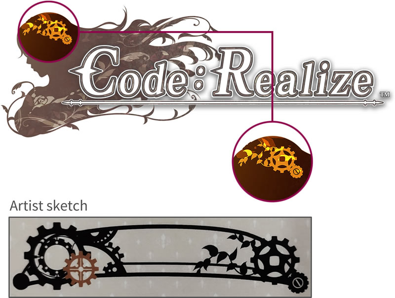
Cardia Beckford is the story’s protagonist of “Code: Realize”. She’s a cute, petite and flawless pale-skinned girl with chest-length glossy chocolate brown hair. Due to her role in the game and her drawing, the logomark (picture or image of a logo) takes her profile silhouette, showing her face, shoulders, bust and her hair.

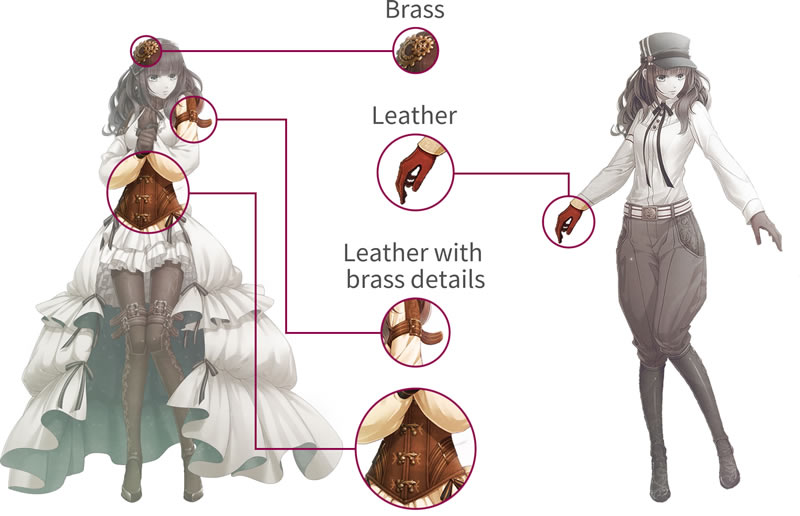
This shape is filled with brown and has yellow details since the color palette applied in the overall Cardia design is mainly formed of these colors. These shades are mostly seen on the items made of leather and brass such as gloves, corset, boots and some decorative straps. Just to remember, this otome is inspired in the Steampunk aesthetic, in which these materials are very common as discussed in the post about Viktor Frankenstein, another important character in this game.
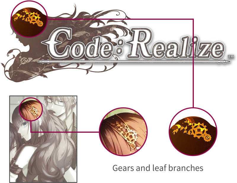
Having the background that serves as basis, it’s time to add the details. The most notorious and representatives are the headband and the flower in the chest. The headband in the logomark is like the one that adorns the protagonist’s head. This accessory has, to continue the idea of Steampunk, two gears of different sizes. They are accompanied by branches of leaves that are ornaments that lean more towards the Victorian esthetic. This doesn’t break with the concept of Steampunk, as its works are often set in an alternate fictional history from the Victorian era. Consequently, Steampunk is also inspired by the Victorian era.
Besides the headband, the flower on the chest is another element that couldn’t be missing in the protagonist’s abstraction. In the story, this is made from “Horologium”, a mysterious stone embedded in Cardia’s chest. By detailing the logomark and Cardia’s drawing, it can be seen that the figure is the same and is like a heart-shaped rose.
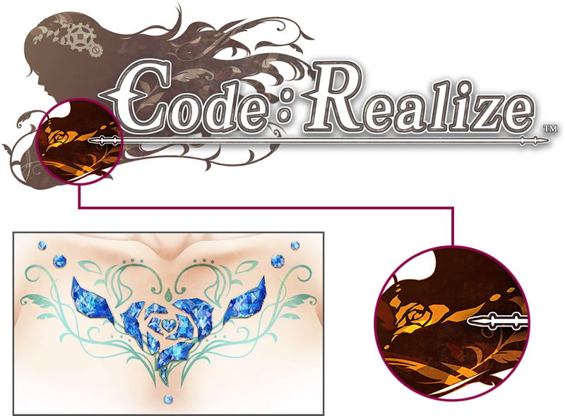
Around the “Horologium” are some green branches and leaves to add some organic elements to the heart of stone. These ornaments are used as a finishing touch on the symbol of the logo, but they aren’t placed around the flower on the chest but rather fluttering in and out of the silhouette. This decision was probably made to reinforce the feeling of a wind that also causes hair to flap.

When looking at the silhouette, the headband and the flower on the chest, it’s logical why the designer chose the image of Cardia as the basis for the logomark. This is because the female protagonist is designed with elements that communicate the overall theme of the video game: Cardia’s profile indicates the main character, the headband the Steampunk influence, and the flower is the central and mysterious object of the story.
NOW THE LETTERS!!
The steam engine was one of the most important technologies of the Industrial Revolution and took place in Europe and the United States in the period from 1760 to sometime between 1820 and 1840. However, in England steam power reached its greatest potential in Victorian times with the ships and locomotives. So, since the steam engine is essential for Steampunk, everything made in the mid-17th and early 18th centuries has an important role in this culture and, for the same reason, in the otome “Code: Realize”. This was possibly the line of thought behind choosing the typeface for the logotype for this video game, this being the transitional serif.
The transitional serif is a typeface that appeared in the mid-18th century and is a transition from Old Style to Modern. It was established by John Baskerville and is characterized by having the angle stress of the curved strokes barely inclined or more vertical than diagonal. In addition, the contrast between thick and thin strokes is moderate.
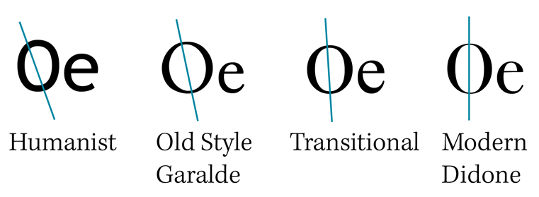
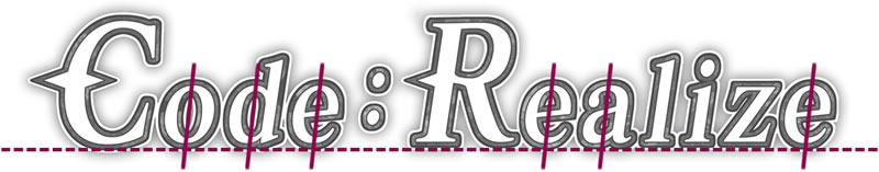
The serifs are symmetrical, flat and with slightly rounded brackets. Also, these brackets, which are between the serifs and the stem, are smaller than in the Old Style. This is noticeable in the “R”, “l” and “i”.
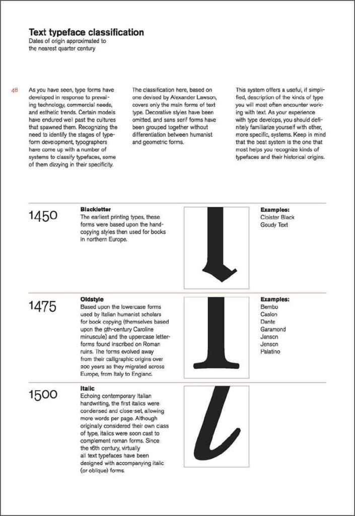
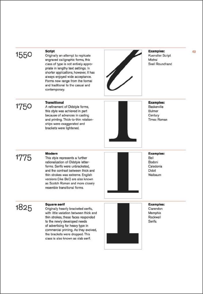
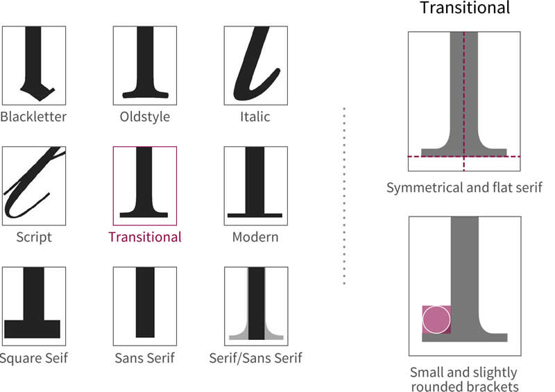
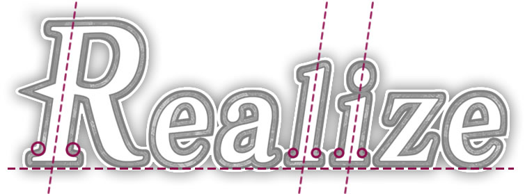
In the case of the head serifs, the inclination presented in the transitional typeface is less than in the Old Style. This can be seen in the “d”, “l” and “i”.


Finally, this type of fonts introduced the bulbous terminal as it’s possible to see in the “a”.
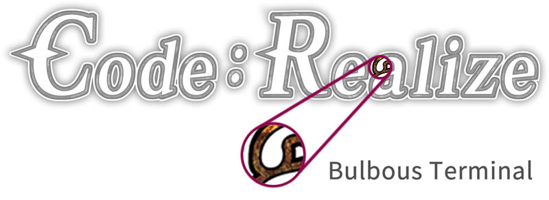
The final touch to reinforce the idea of Steampunk is to add a thick outline with a texture like rusty brass.
A logo hides a world of ideas since behind its design there are many sources of inspiration. In the first instance, for the one of “Code: Realize”, the protagonist and the Steampunk are the main sources, however these, in turn, mean more things. For example, Steampunk is a culture and that entails particulars aesthetic, ideas, technology, etc., forcing the designer to do a deep research and then take the representative elements to show them in the logo. The same thing happens when taking the main character and using her for the logo in view of one have to make an abstraction of Cardia’s design. For a good abstraction, one has to simplify and preserve the most representative of the image, which is not exactly an easy task. This makes one realize that the logo designer is another important member of the team of creators of a video game.
So, with this last paragraph I applaud the work of all logo creators (yes, all, not just video game ones) and finish my post. I hope you liked it and let me know your opinion in the comments section. But for now, take care and see you in my next post!!!!
BIBLIOGRAPHY
- “Cardia Beckford,” Code: Realize Wikia. [Online]. Available: https://code-realize.fandom.com/wiki/Cardia_Beckford. [Accessed: 29-Dec-2020]
- “Classification in typography – Key features for identification,” b creative branding, 23-Aug-2016. [Online]. Available: http://www.bcreativebranding.co.uk/typography-3-classification-features/. [Accessed: 29-Dec-2020]
- “Classification of typefaces with descriptions and images,” b creative branding, 05-Aug-2016. [Online]. Available: http://www.bcreativebranding.co.uk/typography-2-classification/. [Accessed: 17-Dec-2020]
- “Code Realize | Official Portal Site |.” [Online]. Available: http://coderealize.us/. [Accessed: 29-Dec-2020]
- “Families of Type.” [Online]. Available: https://graphicdesign.sfcc.spokane.edu/dzine/tutorials/process/type_basics/transitional.htm. [Accessed: 29-Dec-2020]
- “Industrial Revolution,” Wikipedia. 28-Dec-2020 [Online]. Available: https://en.wikipedia.org/w/index.php?title=Industrial_Revolution&oldid=996793907. [Accessed: 29-Dec-2020]
- “Introducing Typographic Families | Type & Music.” [Online]. Available: https://typeandmusic.com/an-introduction-to-typographic-families/. [Accessed: 29-Dec-2020]
- J. Kane, A Type Primer, 2nd Edition. 2020.
- S. Coles and E. Spiekermann, The Anatomy of Type: A Graphic Guide to 100 Typefaces. New York, 2012.
- S. Design, “The Complete Guide to Serifs (and How to Draw Them!),” Amber Share Design. [Online]. Available: https://ambersharedesign.com/blogs/blog/complete-guide-serifs-draw. [Accessed: 29-Dec-2020]
- “Serifs: Tips & A Bit Of History,” Ray Mawst Lettering & Design. [Online]. Available: http://www.raymawst.com/blog/2016/7/8/serifs-tips-a-bit-of-history. [Accessed: 29-Dec-2020]
- “Steam engine,” Wikipedia. 18-Dec-2020 [Online]. Available: https://en.wikipedia.org/w/index.php?title=Steam_engine&oldid=994967583. [Accessed: 29-Dec-2020]
- “Steampunk,” Wikipedia. 25-Dec-2020 [Online]. Available: https://en.wikipedia.org/w/index.php?title=Steampunk&oldid=996202388. [Accessed: 29-Dec-2020]
- “Temple-of-Typefaces | DeviantArt.” [Online]. Available: https://www.deviantart.com/temple-of-typefaces. [Accessed: 29-Dec-2020]
- “Typeface or Font?,” Art Direction / Graphic Design / Education. [Online]. Available: http://www.ricardoeversley.com/creativezine-blog/2016/3/8/type-classifications-explained. [Accessed: 29-Dec-2020]
- “Victorian era,” Wikipedia. 28-Dec-2020 [Online]. Available: https://en.wikipedia.org/w/index.php?title=Victorian_era&oldid=996827193. [Accessed: 29-Dec-2020]

One thought on “CODE: REALIZE – LOGO DESIGN ANALYSIS”