Creating an RPG requires taking into account many components, including screens and interfaces for the different moments in the game. One of them is obviously the main menu screen that has already been mentioned in this blog when talking about the video game “Tales of the Abyss”. Besides this, another important screen with its respective interface is the one that is used mainly in Japanese RPGs and is the one that is needed when the characters enter a battle.
The battle screen is a separate area where characters are taken when they encounter and fight enemies. It can be presented in two different ways. One is when the manipulated character encounters an enemy and a transition occurs between the map and the battle area. In this case, the battle landscape resembles the place where the characters are. Grandia and the Tales Series are examples of this case. The other way appears in video games like Chrono Trigger and I am Setsuna where there is no transition, making the battle unfold directly in the area. In this situation, command interface emerges and the characters take positions to fight.
When creating the interface for the battle screen, the designer must remember that its design has to harmonize and be consistent with the other parts of the video game, for example, with the main menu. However, since the mechanics and the objectives of the main menu and the battle interfaces are not the same, there will be differences. For example, with the main menu, there is the possibility of covering the entire screen in view that the game goes into passive mode. Otherwise, the battle menu can’t be invasive, as the player has to keep an eye on many things at the same time: the HP and MP of the enemies and characters, their actions, their movement, etc. The previous gets complicated when the battle is in active mode, making it hard to think for a long time about what to do next. This adds another necessary feature to this type of menu: the possibility to access and choose actions in a few seconds.
The above-stated involves not only visual but also usability design. For this occasion, this post is going to focus on the analysis of the visual part of a video game, although of course, this will bring up some comments on usability. This time the chosen game is the remastered version of “Ni no Kuni: Wrath of the White Witch. The reason for this decision is the curious way in which speech balloons (also speech bubbles, dialogue bubbles, dialogue balloons or word balloons) are employed for more than conversations and dialogs. Perhaps this stems from the “familiars” (or Imajinn) battle mechanic in which the human character “gives orders” to them, considering it to be a type of dialogue. Whatever the case, it’s best to go step by step to understand the decision behind this design. So… let’s start the analysis!!
A LITTLE ABOUT “NI NO KUNI: WRATH OF THE WHITE WITCH”
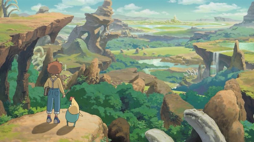
“Ni no Kuni: Wrath of the White Witch” is an RPG developed by Level-5 and first released for PlayStation 3 in Japan in November 2011. In Westerns regions it was published by Namco Bandai Games in January 2013. After 6 years, a remastered version is released for Nintendo Switch, Microsoft Windows and PlayStation 4. In fact, this Ni no Kuni is an enhanced version of “Ni no Kuni: Dominion of the Dark Djinn”, which was originally released for the Nintendo DS in Japan in December 2010. The art style of this video game is inspired by the productions by Studio Ghibli. For this reason, this studio was in charge of producing the animated sequences of the game. The original score was co-composed by Joe Hisaishi.
The game centers on Oliver, a 13-year-old child who resides in Motorville, a town modelled after an American town at the peak of the automotive industry during the 1950s and 1960s. However, after the death of his mother, Drippy, his doll that comes to life thanks to Oliver’s tears, reveals the existence of another world where he comes from. Drippy explains that each person in his world has a “soul mate”, a person who shares a link with someone in Oliver’s world. After this clarification, Drippy gives Oliver a glimmer of hope by telling him that his mother looks a lot like the great sage Alicia, who was captured by Shadar. This revelation makes Oliver decide to travel with Drippy to the other world to rescue Alicia in the hope that by doing so, he will bring his mother back in his world.
With this, Oliver enters a magical world full of fantastic characters with whom he will live unforgettable adventures.
BALLOONS TO GIVE ORDERS!
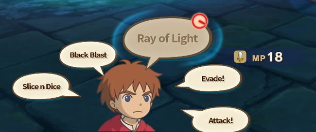
As stated above, Ni No Kuni consists of two worlds and most of the action occurs in the magical one, which follows a medieval concept. To maintain this idea, parchment colors are generally used in the design of the interfaces. The battle screen interface is no exception, displaying speech balloons in these shades. This last mentioned component is employed exclusively in battles. The dialogue bubbles are a resource present from before the match begins, containing the photo of the player’s options for the fighter, in this case, the human character and the familiars in his/her possession. They can be from one to three.

These balloons continue to be occupied during the battle to enclose the actions that can be performed. Here, the drawing of the human character’s face manipulated by the player occupies the lower left part of the screen. Around it there are dialogue bubbles that point it and these have the name of the actions that vary according to who is fighting. Focusing on the dynamic between a familiar and its owner, it seems that the choice of speech balloons derives from the fact that in battle the owner gives and “says” the orders.
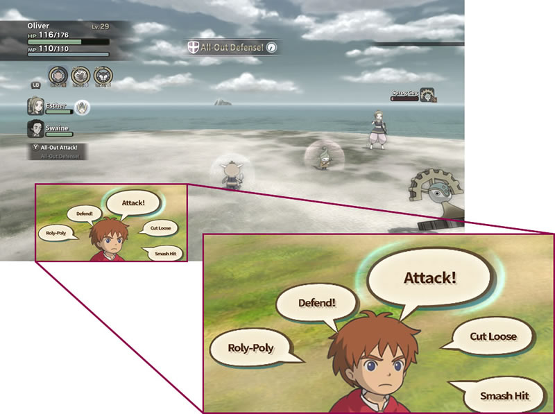
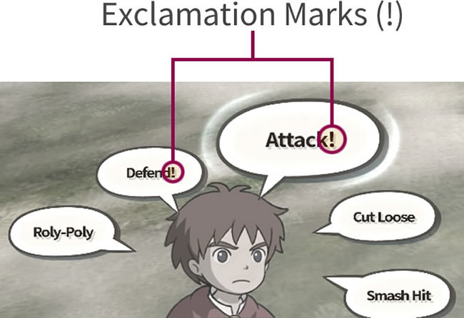
This idea is reinforced by observing the exclamation marks in the words “Attack” and “Defend”. It’s important to remember the adoption of these marks in terms of design to understand what will be explained later.
First, let’s remember that the situation described so far is when a familiar is picked. Nevertheless, the human personage can also enter into combat. In this condition, the general structure of the interface prevails, having only a few small visual differences. The commands change too.
Dialogue bubbles probably lose their meaning in this circumstance since the concept of “giving orders” is not applied, yet they still have to prevail for a simple reason: consistency. This attribute is essential because modifying the composition demands the user a change of thought that takes time. Maybe this “time” is only seconds, but in an active mode battle, they are very valuable in view the enemies are constantly attacking and the player has to do something about it quickly and efficiently. Furthermore, it can’t be forgotten that consistency is a rule of usability. So, to maintain this quality, it’s possible to see how the designers decide to focus on the concept that the owner/familiar mechanic gives to make the interface of the battle screen. This is due to this mechanic is a particularity of this video game.
Even so, applying small modifications between the human and the familiar commands helps the player not to forget who is fighting. Then, for this, a first change is made in the shape of the word balloons, which is to make it more round for the actions of familiars.

The second is the aforementioned exclamation point. In the case of the human character, options “Attack” and “Defend” don’t have it. This leads to believe that the designers wanted to give the impression that the character is talking to himself/herself rather than giving an order.

Another way to interpret dialogue balloons comes from the Spells menu. In this case, the list of Spells is inside a speech bubble. Perhaps, since the character makes a sound when performing a spell, the intention is to create the impression s/he is saying it out aloud. This same logic applies to the Provisions menu.

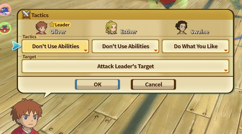
Finally, the actions of Run Away and Tactics follow the same concept of “order” considering that the character has to talk with the companions to execute the corresponding movements.
BUT WHY ARE THERE NO BALLOONS EVERYWHERE?
Although the speech bubbles are the essence of the battle screen interface, it’s not practical to use them for everything and that’s why other components are involved in the design.
To begin with, the informative elements should be presented differently to avoid being confused with those on which an action can be taken. In addition, the informative items must have the characteristic of being notorious but not invasive. This allows them to be found immediately when needed, but they don’t distract the player when s/he is focused on taking action. One way that this video game applied to attain the above is with a low transparency quadrilateral. For example, a blue rectangle can be seen as the background for the description of Provisions, Spells, Songs, etc. which is written in white letters with black border.

Only for Provisions that restore HP the letters are filled with blue, and for those that restore MP with green.

This same type of background also helps to give hierarchy, since the status of the character manipulated by the player has it.

Finally, a thin black rectangle with opacity works as a separator between the target enemy and the others.

KNOWN ELEMENTS: THE BARS
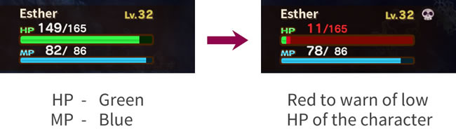
One of the most useful data on the battle screen is the HP and MP of both the characters and the enemies, considering that the objective in an encounter is to keep the controlled characters healthy and for the opponent’s HP to reach zero. HP and MP are displayed as brightly colored bars. When the HP and MP are low, the bars are accompanied by flashy tones.
Another type of bar adopted is the circled-shaped one. The intention of this component is to inform about the stamina of the familiar. This data is indispensable in Ni No Kuni because the time of a familiar in the field depends on this attribute. This form allows taking advantage of the space, leaving room to place the photo of the familiar in the center and avoid possible confusion if a bar such as the HP and MP is used. The circle-shaped bar is yellow and when it’s about to finish it turns red. When recharging, the red remains.

To reinforce the low stamina warning, a circle appears above the familiar indicating the time remaining.

This same circle is employed when a familiar is willing to be captured. Its initial color is pink and it turns red when the time to conquer it is over.

ICONS, AS ALWAYS, ARE VERY COMMUNICATIVE
In some post the benefit of icons was discussed, so it’s understandable why this video game opts to use them. On the battle screen, the icons help in three different cases. The first is to avoid utilizing text. In this way, it’s possible to take advantage of space and at the same time communicate something with the least number of elements. An example of this is the clock that marks the time remaining to be able to perform a certain trick.
Likewise, the icons let know which celestial sign the familiar has. These are the sun, the start, the moon and the planet.

Another use of icons is to show the condition of characters and enemies. That is, know if the character is silenced, poisoned, with increased attack or speed, etc.
Finally, the icons can save the player time by allowing to identify something only through an image rather than reading an entire line of text. This situation is presented in the Provisions and Spells lists.
This post helps to recognize that a video game needs various types of interfaces. The challenge for the creators of these is to make them harmonize not only with each other, but with all the elements of the video game. This is obtained taking into account the same aesthetic. However, it should also be noted that each interface has a specific purpose.
Although this post only talks about the interface on the battle screen in “Ni No Kuni: Wrath of the White Witch”, if an analysis of all the interfaces were made, it would be discovered that they all meet their respective objective and that their design shows that they belong to the same game thanks to the visual harmony that exists between them.
With this last paragraph, I end this post hoping you liked reading it as much as I loved writing it. Please let me know your opinions on this topic. Until then, see you in the next post!!!
BIBLIOGRAPHY
- “Ni no Kuni: Wrath of the White Witch,” Wikipedia. 22-Nov-2020 [Online]. Available: https://en.wikipedia.org/w/index.php?title=Ni_no_Kuni:_Wrath_of_the_White_Witch&oldid=990105531. [Accessed: 25-Nov-2020]
- W. L. in R.-B. U. Experience, “10 Usability Heuristics for User Interface Design,” Nielsen Norman Group. [Online]. Available: https://www.nngroup.com/articles/ten-usability-heuristics/. [Accessed: 25-Nov-2020]

I really love this analysis! Do more analysis of JRPG Battle UI, please!
LikeLike
I’m glad you like it! And of course! I’m gonna do more posts about Battle UI ;D
LikeLiked by 1 person