Cover image: Heart vector created by freepik
The dialog box in a video game is an important factor at least in the RPGs, since the narration of the story is a valuable part in these genres. The dialog box conveys what characters are saying in their world to the player so, it’s a UI element the player is going to see over and over again. All this creates the necessity to put special attention to the design of it.
Seeing this time the JRPGs where the characters’ sprites share screen with the dialog boxes, these last frequently respect a standard structure consisting of: a delimited container, the dialog text; a resource to point out the speaker (a portrait, the character’s name or a tail if it’s a speech bubble); and an indicator to show that there’s more text to read. This basic construction is to accomplish a functional dialog box, however this doesn’t prevent adding other elements to create different designs and thus improve the player’s experience.
So, with this in mind, let’s analyze how the dialog boxes have changed considering the pass of the time, the technological advances and the video games themselves.
LET’S OBSERVE THE BASIC OF THE FIRSTS YEARS
- FRAME, BACKGROUND AND AN INDICATOR TO CONTINUE
As said before, the video games that will be mentioned obey the characteristics of being JRPGs and that have the character sprites sharing the same screen of their dialogs. Then, the first video game that follows this description is “Dragon Warrior” (“Dragon Quest”) released firstly in Japan in 1986 and in North America in 1989. It presented the dialog box one layer above the images. It was black, written in white and framed by a white border. In the English version, the dialogue was divided into paragraphs enclosed in single quotes and there was no visual mark to indicate the speaker. It was until “Dragon Warrior II (JP1987 / NA1990)” that a centered white triangle was employed to communicate the presence of more text to read.
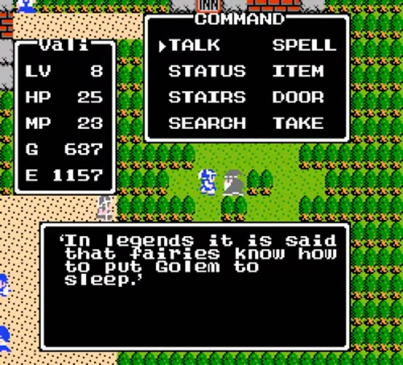
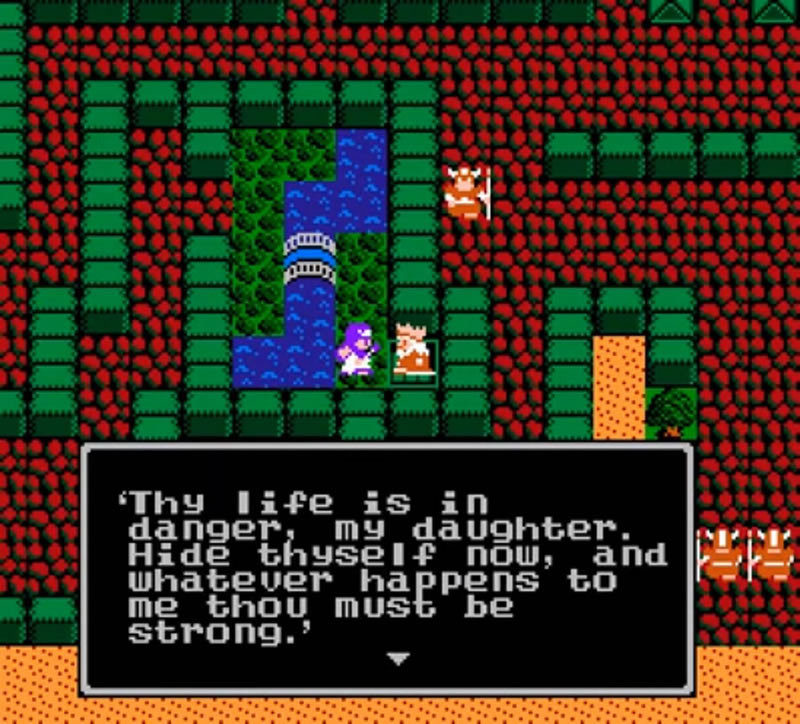
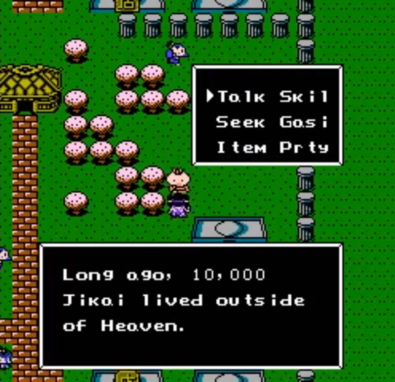
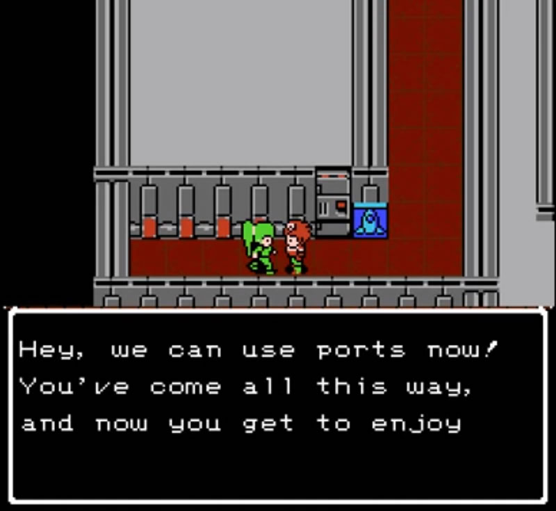
The border and text in white on a black background became a standard during more or less 4 years, so there were a lot of games that used it. For example: “Destiny of an Emperor (JP1989 / NA1990)”, “Ghost Lion (JP1989 / NA1992)”, “Bikkuriman World – Gekitou Sei Senshi (1990)”, or “Lagrange Point (1991)”.
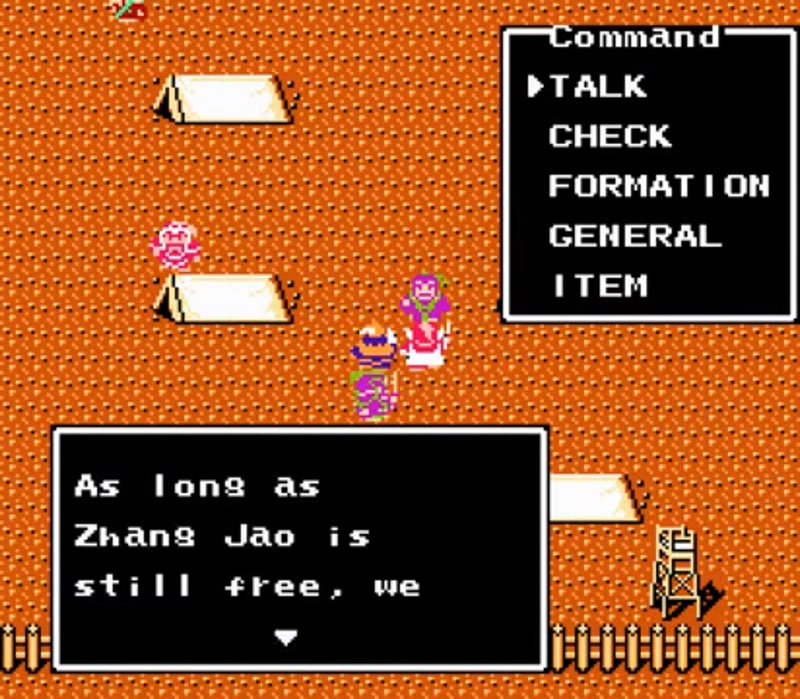
“Destiny of an Emperor (JP1989 / NA1990)”
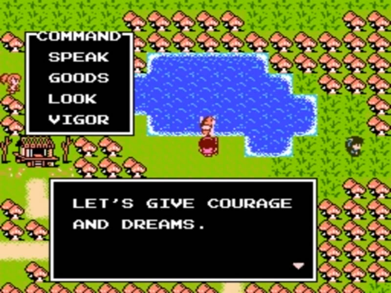
“Ghost Lion (JP1989 / NA1992)”
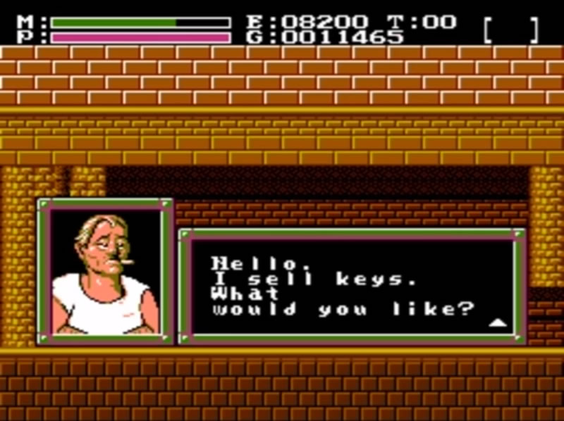
However, there were video games that decided to set aside this standard and experimented a little. Such is the case of “Faxanadu (JP1987 / NA1989)”, which utilized a green frame with pink details and squares with circles at the corners to give the idea of a metallic structure. Besides, it was one of the first games that employed illustrations to represent the sellers. A peculiarity of this game was that a down-pointing triangle meant there was more text, while an up-pointing triangle represented that the dialog had finished.
In 1987 “Final Fantasy” introduced another standard design: a blue box with a beveled edge gray with white. This composition was used by the “Final Fantasy” series until “FFVII (1997)”, “Brain Lord (1994)” and “Bahamut Lagoon (1996)”.
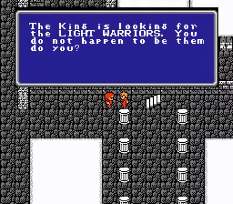
“Final Fantasy (JP1987 / NA1990)”
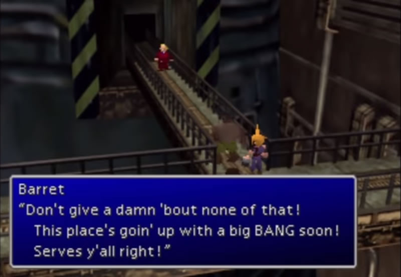
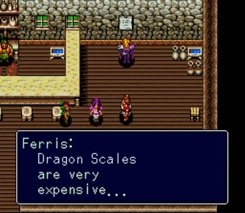
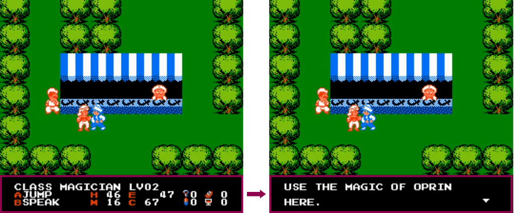
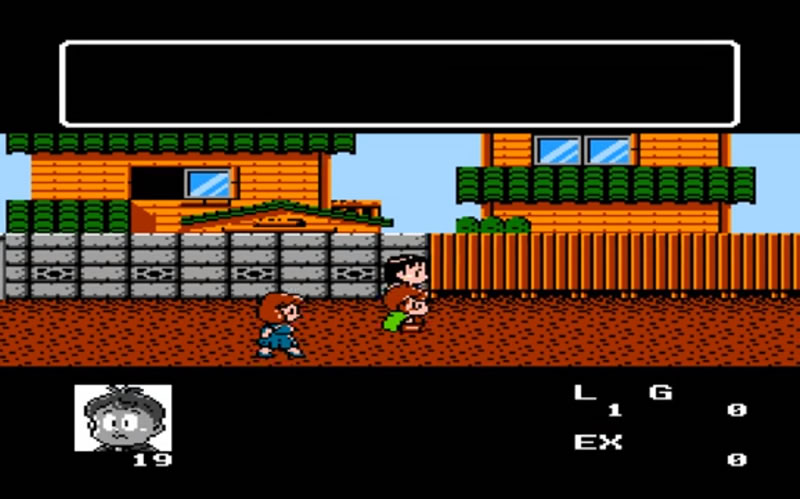
The video games referenced so far had dialog boxes that appeared one layer above the images and when the player was talking to a character. Nonetheless, there were video games that reserved a space for the dialogs such as “The Magic of Scheherazade (JP1987 / NA1990)”. This one had a black space at the bottom that always showed the status, except when talking to an NPC, where it was replaced by the dialog. In “Akuma Kun Makai no Wana (1990)” the inferior black space was for the status and there was a black space at the top saved for the dialog box that was always visible regardless of whether or not there was text to display.
- WHO’S SPEAKING?
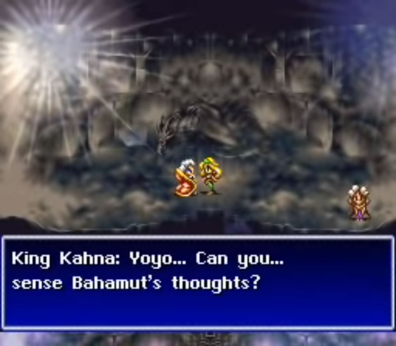
When a character is speaking, it’s important to have a way to identify him/her. This is why the video games had adopted diverse resources to achieve this. As said before, “Faxanadu” applied portraits, but they were just for the merchants. It was “Final Fantasy II (1988)” the first game that used a way to indicate which important character was speaking. What it did was place the name followed by a colon and, in the same line, continue with the dialogue. The paragraph had a hanging indentation.
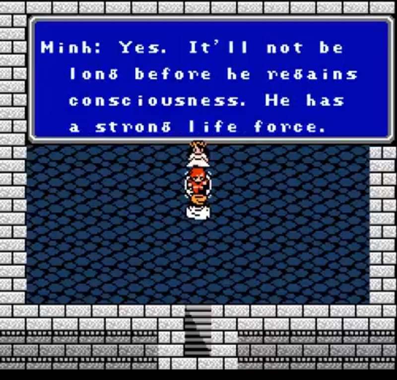
This method, just varying the indentation type, were employed for example by the “Final Fantasy” series until “FFVI (1994)”, “Bahamut Lagoon”, “Breath of Fire I (JP1993 / NA1994)” and “Chrono Trigger (1995)”.
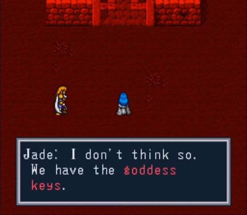
This practice changed a little in games like “Double Moon Densetsu (1992)” or “Brain Lord”, which add a line break after the colon. This approach resulted in keeping the names fixed to just scroll the dialog. The first game applying this was “Sweet Home (1989)” where the name was part of the frame of the dialog box.

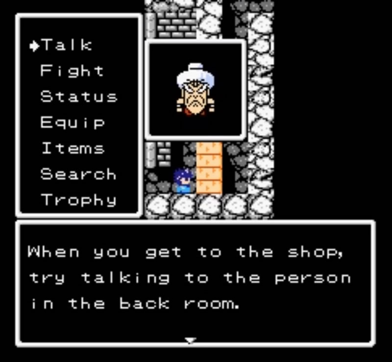
The combination of this practice with a portrait was featured in “Fire Emblem: Gaiden (1992)”, where the names were in square brackets, it was fixed, and the character’s photo was outside the dialog box, located above.
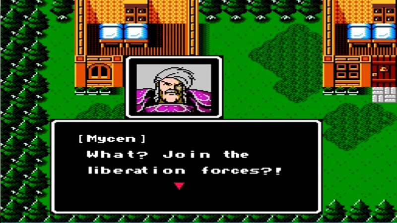
However, one of the first game employing the character picture was “Sansara Naga (1990)”.
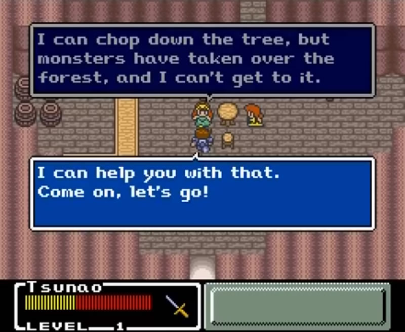
Finally, the third form to point the speaker was through a tail, what it meant the introduction of speech bubbles (also speech balloons, dialogue balloons or word balloons). One of the first video games that took advantage of this component was “Final Fantasy Mystic Quest (JP1993 / NA1992)”. The speech balloons were rectangles with a tail pointing the speaker. In this case, the brighter background color indicated the most recent dialog.
GIVING THE NEXT STEP
The previous sections served to stipulate the basics of the various types and structures that a dialog box can have. Therefore, it is time to observe the change in designs and styles that dialog boxes underwent thanks to the fact that with technological advances the number of colors, textures and effects that could be used increased.
- A LITTLE DESIGN FOR THE BACKGROUND
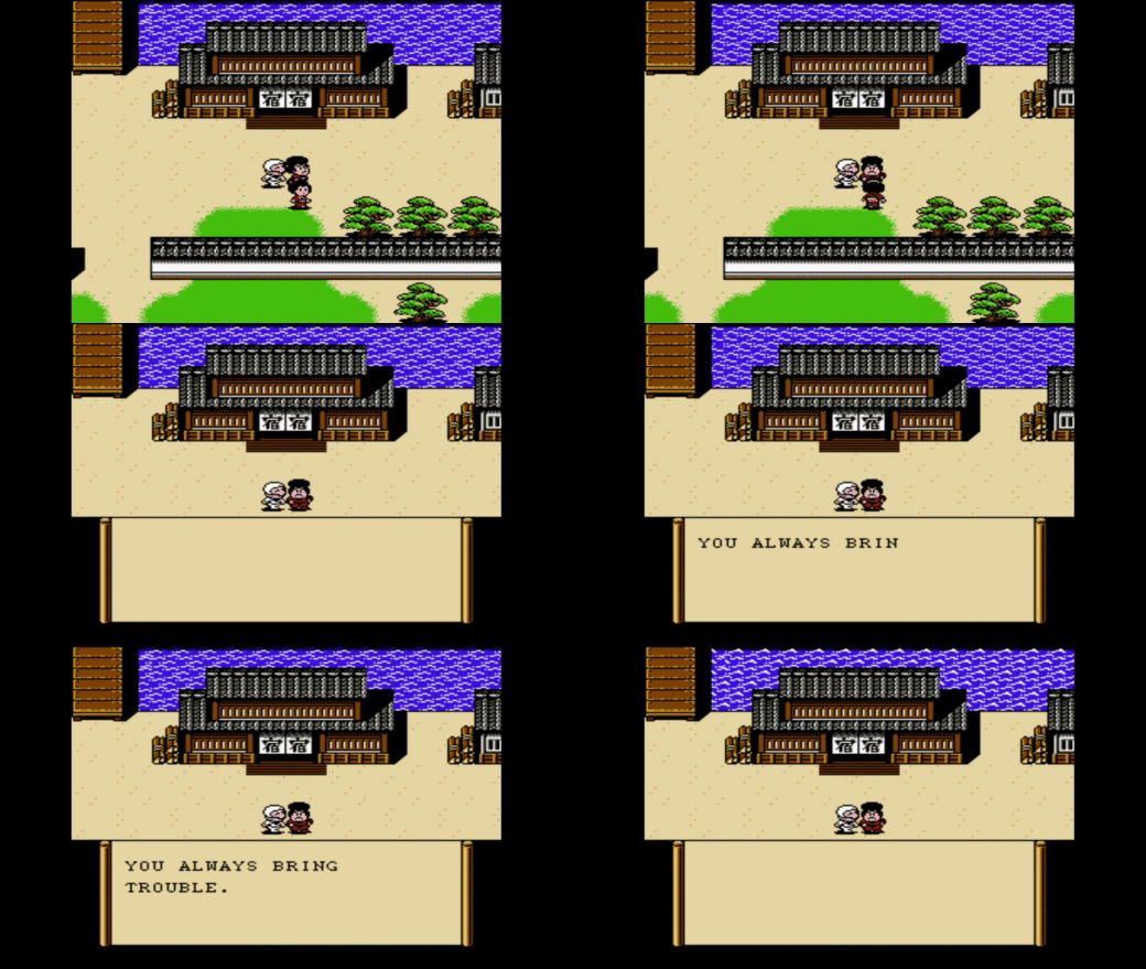
It was already described how, although the frame did have diverse designs, the background color of the dialog box had been frequently black or blue. A game that broke this aspect was “Ganbare Soemon Gaiden: Kieta Ougon Kiseru (1990)” which is based on a Japanese-style world view set in Japan, that’s why it wanted to offer a dialog box that harmonized with this concept. Its dialog box had the form of a Japanese scroll that, in fact, used an animation that tried to give the idea of a scroll unrolling.
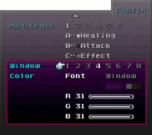
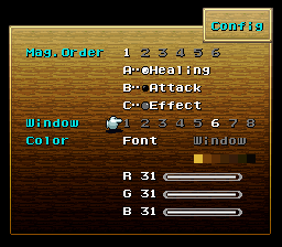
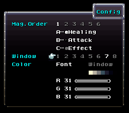
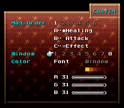
To talk about the next innovation in the background color of dialog boxes, let’s take into account that at until at least 1995 the style of the menu and the dialog box were linked, which means that changing the visual characteristics of the menu meant changing those of the dialog boxes. This was taken advantage of by some video games to incorporate an option to change the background color, affecting also the dialog boxes. Here, it was possible to obtain the color the player wanted by modifying the RGB values on the Config menu. Furthermore, there were even games that allow to use textures. “Final Fantasy VI (1994)” had both alternatives.
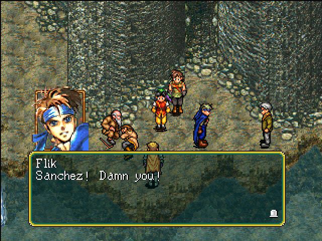
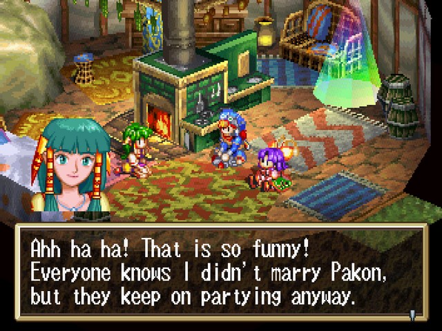
Adding low opacity to the background was another popular mode that allowed the player to enjoy the sceneries while reading the dialogs. “Lunar: The Silver Star (JP1992 / NA1993)”, “Suikoden (JP1995 / NA1996)”, and “Grandia (JP1997 / NA1999)”,” chose to use it.
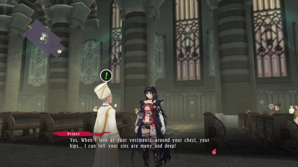
Some recent games use opacity and avoid the border to create a less invasive dialog box. “Tales of Berseria (JP2016 / NA2017)” is an example.
- GOOD BYE TRIANGLES, HELLO TO OTHER ICONS
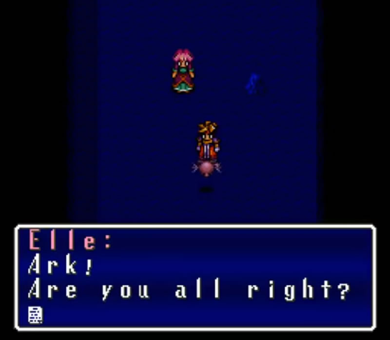
The generic symbol for telling the player to press a button to continue the dialog was a triangle. This could vary in color, border or direction, but it was a triangle and was the most used figure in the video games. An exception was “Sweet Home” that utilized a circle, however the real innovation came in 1995 with “Terranigma”, which changed the popular triangle for the icon of a page with its corner flipping.
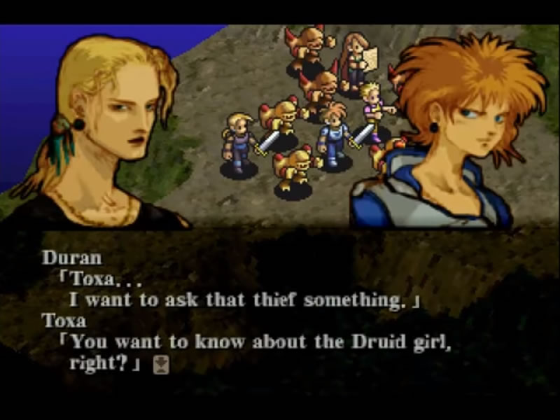
From here, video games took different inspirations to create unique icons that worked to instruct the player to press a button to continue. For example, in “Kartia (1998)” the story included magical cards, so the indicator was an arrow within a spinning card.
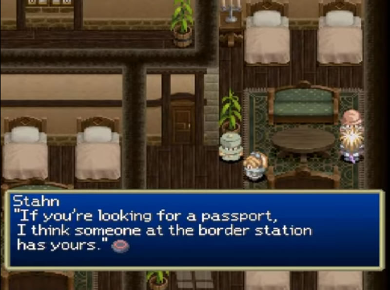
In “Thousand Arms (JP1998 / NA1999)” it’s a hammer, the protagonist’s weapon.
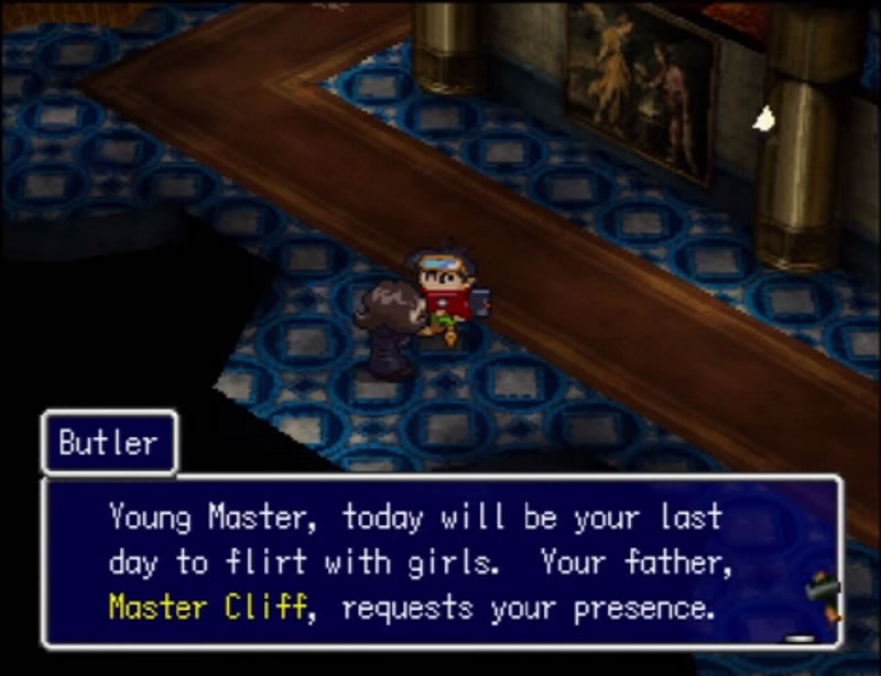
Or in “Tales of Destiny (JP1997 / NA1998)” it’s possible to appreciate the shape the circle button of the Play Station control because it was a literal way of informing the player which button to press to continue.
- MULTI-TASK SPEECH BALLOON
The speech bubble for dialogues was already mentioned, but over time it was exploited in others ways.
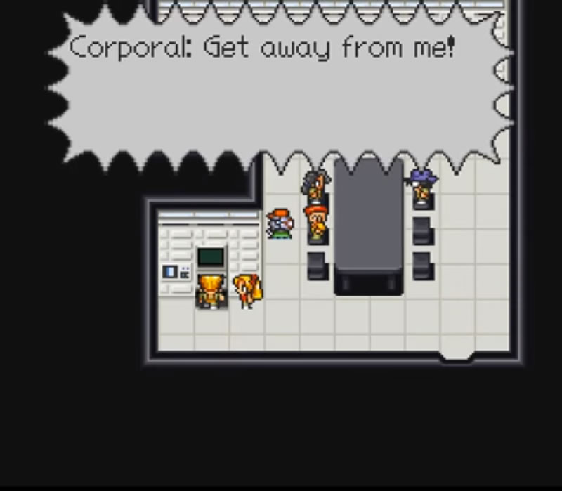
The word balloons have the characteristic that depends on the form it can refer to a speech, whisper, thought or scream. This flexibility was favorable for video games due to, instead of using capital letters for the screams, they preferred the jagged outline. Or it was possible to avoid the parenthesis to communicate thoughts employing the chain thought bubble and the “fuzzy” bubble.
“Live A Live (1994)” used the normal rectangle and the “scream” form. It also put icons and even characters inside.
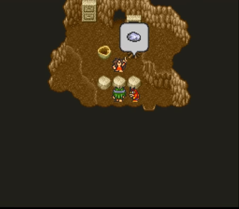
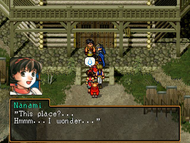
Suikoden II (JP1998 / NA1999)” simply used the speech bubble for icons that expressed some sentiment. For example, a heart for love or a sweat drop for stress or concern.
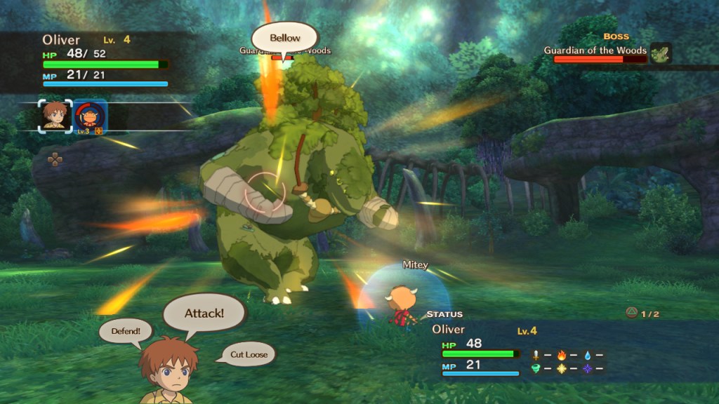
Or more recently, in “Ni no Kuni: Wrath of the White Witch (JP2011 / NA2013)” the bubbles are to enclose the actions within a battle and the name of the spells and techniques performed by allies or enemies.
OH! THERE ARE A LOT OF STYLES!
Analyzing the dialog boxes employed since the JRPGs began, there are many styles and these have been increasing thanks to technological advances and, of course, the creativity of designers. It can be noted how, regardless of the limited resources, the dialog boxes creators did a great job and laid the groundwork and inspired the designers who followed them. That’s why in recent video games, it’s possible to observe retro designs, experimentation, or combinations of structures and styles discussed here. In the end, what counts is that the main objective is to obtain readable dialog boxes, that do not break with the flow of the game and that their design harmonizes with the video game.
Let’s remember that a game involves a lot of visual elements that require time and effort to ensure that the gamer has a good experience when playing.
The end of this post is here! I listed many games, but I know I was missing many more. However, I hope that with the ones I mentioned, I have managed to explain a lot about things related to dialog boxes. I hope you like this post and if you want to help me to expand this topic, please let me know with your comments or by email. But for now, see you in my next post!!!
LINKS OF IMAGES / VIDEOS


fantastic article nilda! thank you for writing this. I love when devs put love into their dialogue boxes, like in Legend of Mana. On the contrary, I’m disappointed by the text in newer Square Enix games & Fire Emblem. I’m new to your site & looking forward to reading your other articles!
LikeLiked by 1 person
Hi! I’m glad you liked this article! Yeah, I also love when the design of the dialogue boxes have something special.
And what you say about some Square Enix games, I’ve noticed that in some cases the purpose is to make the dialogue boxes more and more “invisible”, so to speak, so it seems that they are not “designed”… or so I think… I’ll do some research to see if my theory is true 😛
Thank you very much and welcome!! I will keep working hard to keep posting more articles like this one! 😀
LikeLike
Very interesting content here. I read a bunch of posts in this website and you present your analysis avoiding superficial approaching and keep their up with a good language that lay people can easily understand. Have you ever written a video game design book or are you working to accomplish it?
LikeLike
Thanks, I’m still working on my English as it is not my first language, so I’m glad the people understand what I write!! 😀
Oh! And not really! I only have this blog ^^;
LikeLike