
Cover image of the flat skills icons designed by REXARD
As a JRPG gamer, one gets used to a large list of magic, abilities and items which are very different from one video game to another. For example, the item that works to restore HP are gels for the “Tales of” series, Potions for the “Final Fantasy” series and Herbs for “Dragon Quest” series. The purpose of each item can sometimes be guessed by the name, but other times one may know what they are for until use them or read the description. This also applied to magic and abilities. However, the problem is not just to know, but also to remember all this.
That’s the reason there are elements that help us to identify the general use of a magic, ability or magic: the icons. An icon is an image or symbol that represents a concept and, inside JRPG video game, these are very aware inside the main menu.
WHY TO TALK ABOUT ICONS?
To talk about icons is not just to talk about the visual composition of a video game, but also about graphical communication and usability. The icons can provide the user with general information in little time and with few elements. Also, thanks to icons, it’s possible to save space and communicate much more in reduced areas. Taking this into account, let’s talk about in detail about the icons’ role in a JRPG.
WHAT IS THIS NEW ACQUISITION FOR?
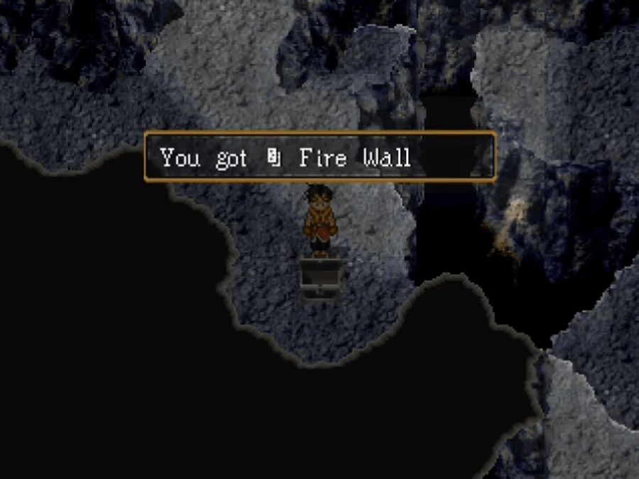
Receiving something new from a chest or from an enemy, means to go to the menu and search it in the different lists the game provides such as items, swords, shields, etc. Having just the name of the new acquisition makes the player spend some of his/her time on finding where it was added and, even more, if the name doesn’t contain descriptive words. This little action can become annoying after repeating it many times. The way to reduce the number of steps to improve this activity is to add icons to the name of the obtained. This resource allows knowing where to look for, avoiding going through all the lists.
In “Suikoden II”, it’s possible to see this way of using the icons since the names of the runes are always accompanied by the icon that represents them, which in this case is the abstraction of a sphere. Here, the icon is necessary in view of some runes share name with other items and it would be complicated to note the difference.

In fact, there are consumable items known as Rune Scrolls that have the same name and effect of the spell with whom they share name. These items also have an icon to identify them and thus avoid confusion.
EASIER DECISIONS
A primordial skill player develops when playing a JRPG is the creation of battle strategies and for which fast and precise decisions need to be made. This can get difficult when the lists of items, abilities and magic are so long that remember how each one works become a hard task. So, one way to facilitate this work is through visual elements that allow grouping and discarding information. We are talking about the icons.
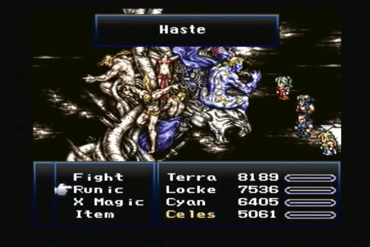
To check the veracity of the mentioned before, let’s present some examples. First, let’s take the ATB (Active Time Battle) games, where one can’t afford to take a lot of time to choose the next action of the characters. I decided to pick the video game “Final Fantasy VI” since in it, almost all the characters can learn all the magic possible, provoking a very long list of magic in a 100% finished character.
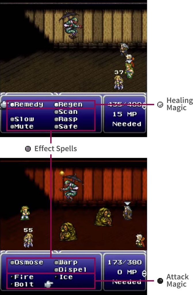
Just to get into context and to learn how the FFVI icons works, it’s necessary to know that in this game the magic is divided in three categories: attack magic (as Fire, Thunder and Meteor), which principal objective is to cause damage to the target; healing (as Cure, Life or Remedy), which serves to cure a companion from damage or for any kind of status aliment; and effect spell (as Slow, Protect and Sleep), that are for support. In the game, each of these is represented by a colored dot: black for attack magic, white for healing and gray for effect spell. The dots appear before the name of a spell according to its type. The use of this simple icon helps not just to reduce the exploration area when searching a determined magic during the battle, but also to guess its possible effect when a new one is learned.
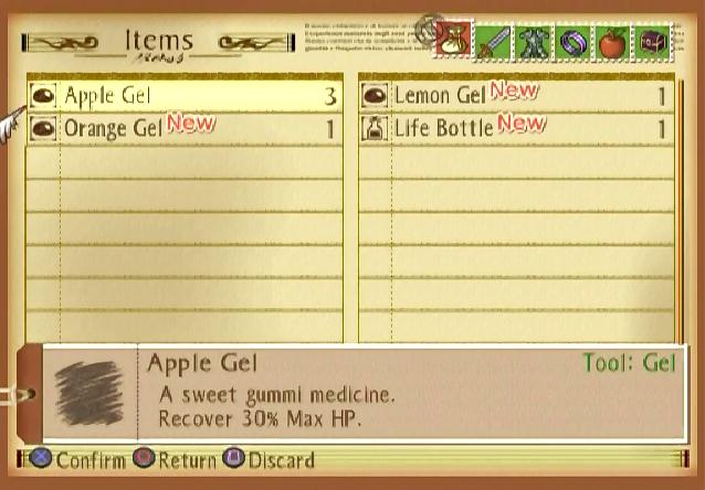
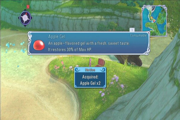
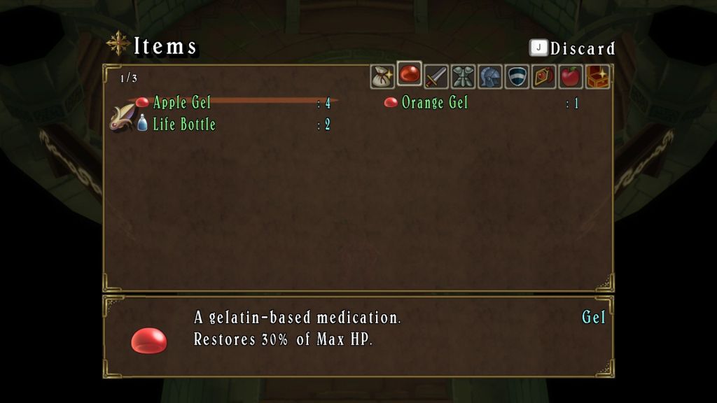
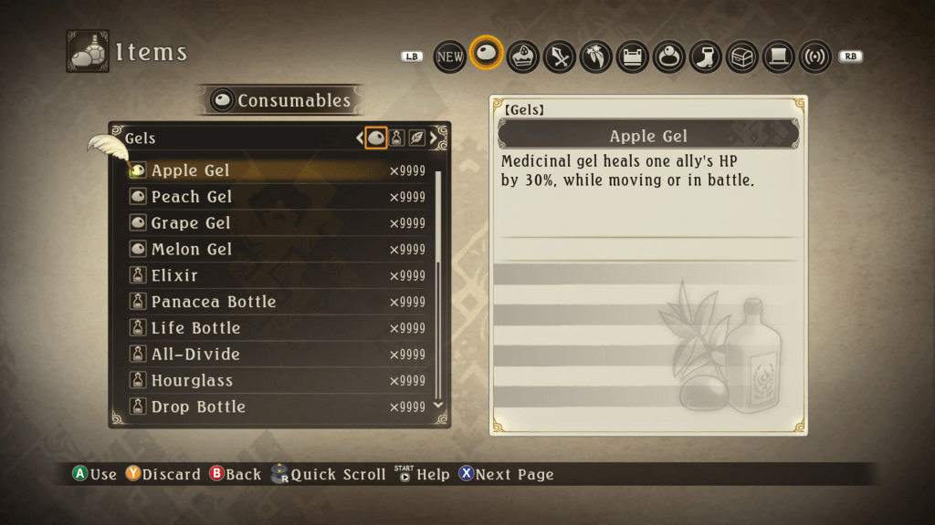
The same happens with the consumable items. For example, in the “Tales of” series, the items with a gel icon serve to recover HP, facilitating its identification during combat. The icons for consumable items are more common in the video games that the ones for magic.
Another case that works as an example on how the icons help in a fight, it’s when they accompanied the name of weapons, armors and accessories. This occasion I’m going to talk about a game I’m playing right now: “Dragon Quest XI”.
One feature that this one has, is the possibility of changing equipment during a battle, but with the condition of not exceeding the number of items the character can carry. This is due to the skills are specific to each weapon. This means, if the character needs to use a knife’s ability and he/she has a boomerang equipped, it’s necessary to replace it with a knife. However, it doesn’t happen that all the knives have “knife” in his name, making difficult to know what to choose.
The problem here does not lie in the time to take a decision but in the limited inventory. Then, if the character has three free slots, three mistakes mean a total mess. So, the icons work to locate the weapon type, remaining only to compare the stats to select the best option.

LITTLE SPACE, LET’S ICONIZE IT!
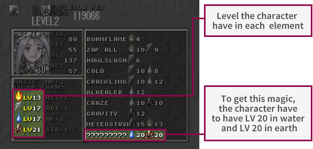
In contrast with “Final Fantasy VI”, there are video games where the use not just of certain types of magic, but also of equipment is limited depending on the character. This restriction can be established by the same game or be customized by the player. Either way, there has to be a way to notify this kind of information.
A simple way to do it would be to list in a written form all the kind of magic or equipment available for a character, still this can be impractical if the list is large or if there are more stats to show. Then, as the saying goes, “an image paints a thousand words”. The resource that many video games use is to take advantage of the icons they already employ next to the names of magic and equipment to indicate their type and place them on the stats screen for indicating what a character can use.
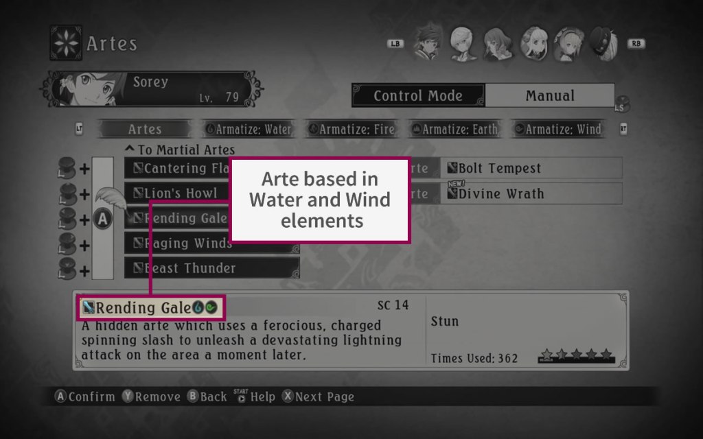
For example, in “Final Fantasy Brave Exvius (FFBE)”, this resource is not just applied for specifying the equipment and magic type, but also the element and status resistance.
This form to take advantage of space is appreciated also in other ways like:
- To indicate the properties of abilities and weapons.
- To represent what a character can use the selected object.
- To replace text to represent categories or places.

TO HAVE SOME FUN!
Just to finalize with the icons use, there are games where the designers prefer to use an icon to show or to emphasize the sentiment of one character. Before, this was because of the consoles limitations, now are just design decisions.
So, this is how this post end. I hope you liked it!
And you, what others use you have seen for the icons inside the JRPG. Please tell me in the comments. Until then, see you in my next post!!!

with ffbe… why did you not say holy instead of ‘before dark’ while listing the resistances?
LikeLike
Hello! Sorry, I didn’t realize there was a mistake in that image! O.O I already made the correction, thanks!! I hope you still liked the article 😀
LikeLike