
Cover image from Videogame Pavilion
In user interface design, a radial menu is a circular context menu where the selection depends on the direction. It pops up when pressing or holding a hotkey, making a circular component made of several slices to appear, which is why it is also known as pie menu. A slice can be assigned a simple option or another menu. In case of being the last mentioned, the selected choice can take the center, creating a hierarchy of radial menus.

Animation by Ivan Pashko on Dribbble
Image from Syncfusion

Image by cagatay celebioglu on Dribbble
The original goal of this type of menu is to provide a smooth and reliable gestural interaction style for novices and experts, requiring fewer mouse movements or fewer buttons being pressed. It also trains muscle memory for certain actions, allowing to eventually select the desired option without looking at the pop-up selections or reading the labels. As Jaron Lanier of VPL Research has noted: “The mind may forget, but the body remembers”. Pie menus take advantage of the body’s ability to remember the movement and direction of the muscles, even when the mind has forgotten the corresponding symbolic labels.
The first documented radial menus are attributed to a system called PIXIE in 1969, but in video games the concept originated from console RPGs, introduced by the “Mana” series, beginning with “Secret of Mana” and “Secret of Evermore”. However, they have evolved and been put to different uses over time. To know more about radial menus, let’s talk about some video games that use them. So, let’s get started!
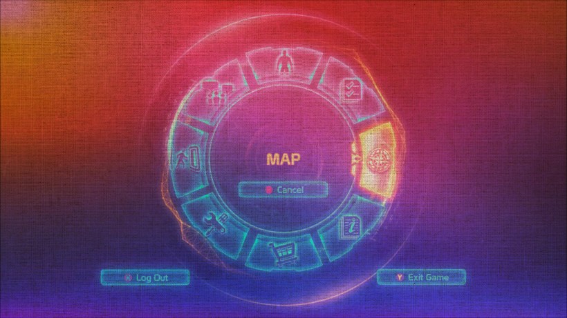
SOME GAMES THAT USE RADIAL MENUS
As mentioned above, “Secret of Mana” in 1993 and its successor “Secret of Evermore” in 1995 were the firsts video games to employ the radial menu, and it consisted of a ring with icons. This is why the game is said to have a unique “Ring Command”.
The Ring Command was designed to solve the problem of losing the player in a maze of text-filled screens and to let the flow of battle in Action RPGs to be less interrupted. This was accomplished by pausing the action and summoning a ring of icons on the fly, literally at the touch of a button, while keeping the geometry of the game visible. In addition, the contents were simple, and the steps to choose what it wanted were few to get back in action quickly.

Image from Shmuplations
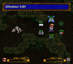
Image from Super Adventures in Gaming
From these games, this style of menus became popular and began to be used in different ways. For example, in simulation video games such as “Viva Piñata (2006)”, the passive mechanics grant the employ of radial menus to provide the user with all the actions in a fast and clear way. It is worth mentioning that, since “Viva Piñatas” is a gardening game, the shape of this type of menu was also a good design choice because it allowed it to be transformed into a flower, highlighting the theme of this game.
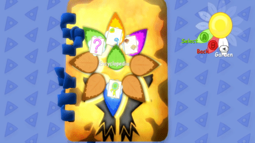
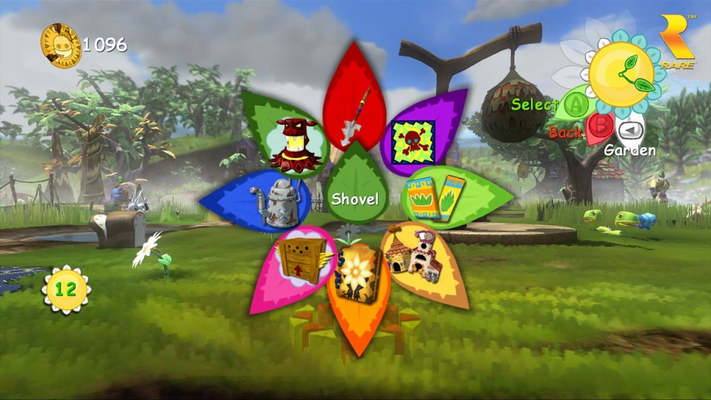
Image from Rare Gamer
“Sims (2000-2014)” falls into this same category and although it is not recommended to use many items in the radial menus since this tends to counteract the benefits of the same in the first place, this game has the peculiarity that it knew how to accommodate without problems many options in a small space, plus these consisted of pure text.
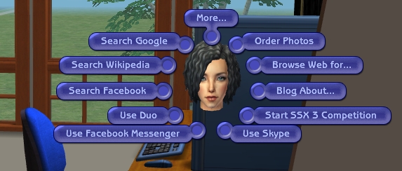
Image from The Ninth Wave Sims
Another way to utilize the radial menu is to choose options, for example in conversations. In this case, it is very common that these are not more than four to allow assigning a response to each of the buttons of the “ABXY” scheme of the control of the consoles. This is because in these circumstances, circular menus are considered faster and more reliable than linear menus due to they reduce player’s work by avoiding the use of directional buttons by pressing only the button of the desired answer. One game that applies this method is “Final Fantasy XIII-2 (2011)”.
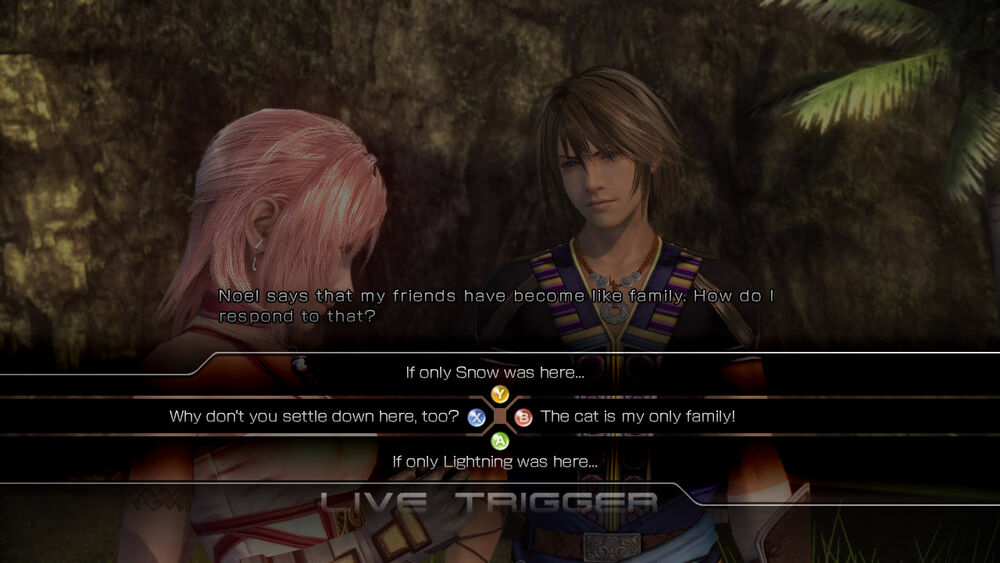
Image from Final Fantasy FANDOM
“Valkyrie Profile (1999)” applies this same mechanic, but in combat, where each of the party members is assigned one of the control buttons (Square, Triangle, Circle, or Cross since it is a PlayStation game). By pressing the corresponding button on the player’s turn, that character is commanded to attack.
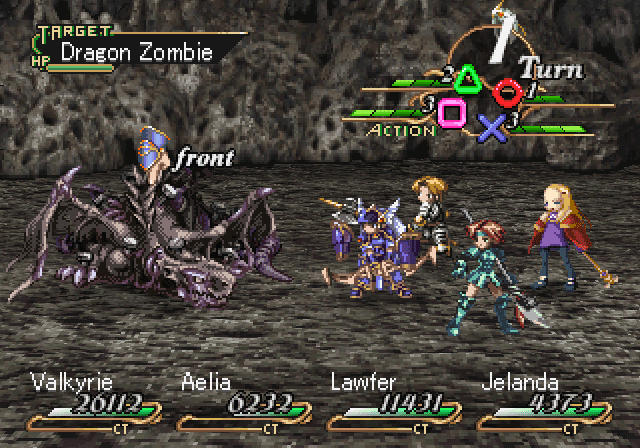
Image from Malditos Nerds
However, this menu still had areas for improvement that were noticed over time due to the appearance of more complex mechanics.
A common problem in circular menus that is also seen in the “Secret of Mana” Ring Command is the way in which context is lost when there are multiple hierarchies. When an option that contains others is chosen, the new ring that opens has nothing to indicate the path that was followed to get to the current menu.
“Temple of the Elemental Evil (2003)” is an RPG in which the creators decided to use the radial menu and tried to solve the aforementioned problem by using concentric circles to keep all hierarchies visible. In this game, the central menu item is the face of the focus character, and the first level employs the icons of the six main actions. When the player picks an icon, a fan of options appears. This same fan technique is followed in the case of more hierarchies. However, this method is not practical when there are more than three levels, as it takes up too much space on the screen, forcing the player to scroll or reposition the menu to see it in full.
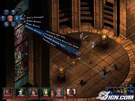
Image from IGN
Another notable disadvantage of this solution is that from the second level, the options are presented in rotated labels, making them more difficult to read. In addition, if one wants an option of the third level or higher, it is necessary to go through the entire label of the previous levels, hindering mobility and speed, which is precisely what is sought to be optimized with this menu.
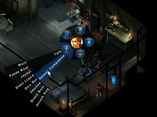
Image from Let’s Play Archive
Image from GameBanshee
Note that an issue that may arise, which does not occur in this game but does in others, is that the text within the radial menus segments overlap each other. And even if the explanation is shown in a tooltip, the problem still prevails. That is why in “Secret of Mana” it was applied from the beginning that the name of the focused icon was seen at the top of the screen.
Image by gooddream on steemit
In games where the complexity and the number of options grow, the decision is to utilize the radial menu for quick actions. This is very common on weapon wheels in games like “Grand Theft Auto (1997-2021)” or in shooting games to select ammo.
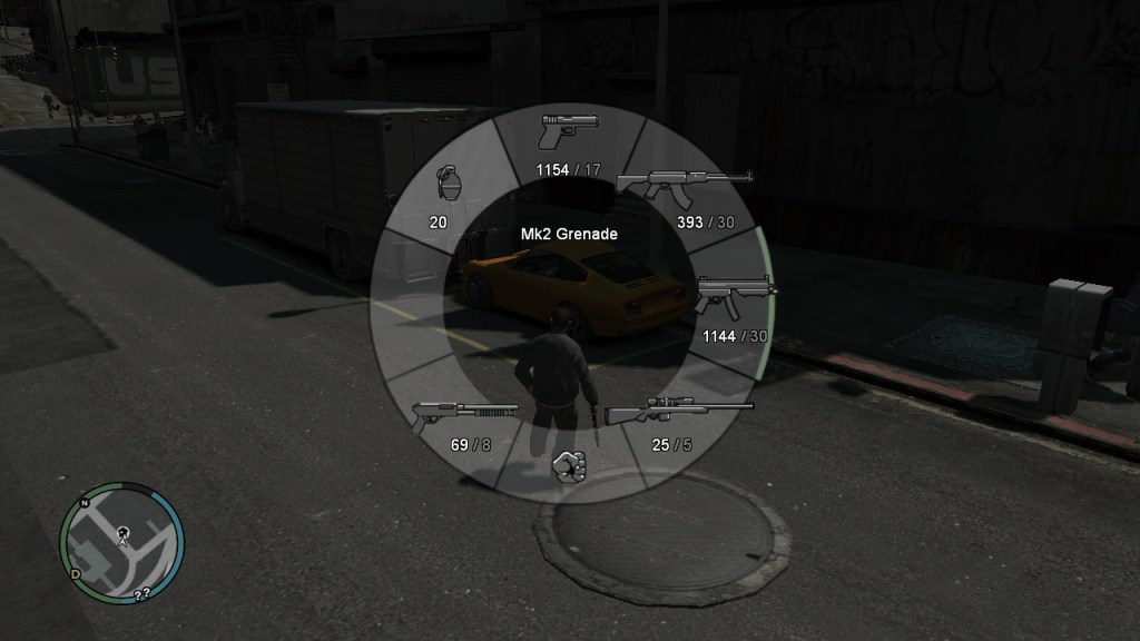
Image from gtagaming
“Neverwinter Nights: Enhanced Edition (2018)” also uses a pie menu for quick commands, but it does handle hierarchies. In this case, the difference is that a preview of the sublevel is displayed. When the player focus on an icon, if it has another level, small circles appear around it that are the preview of it. If the player chooses the option, it takes the center and its options occupy its surroundings. This is similar to the “Secret of Mana” Ring Command but giving context.
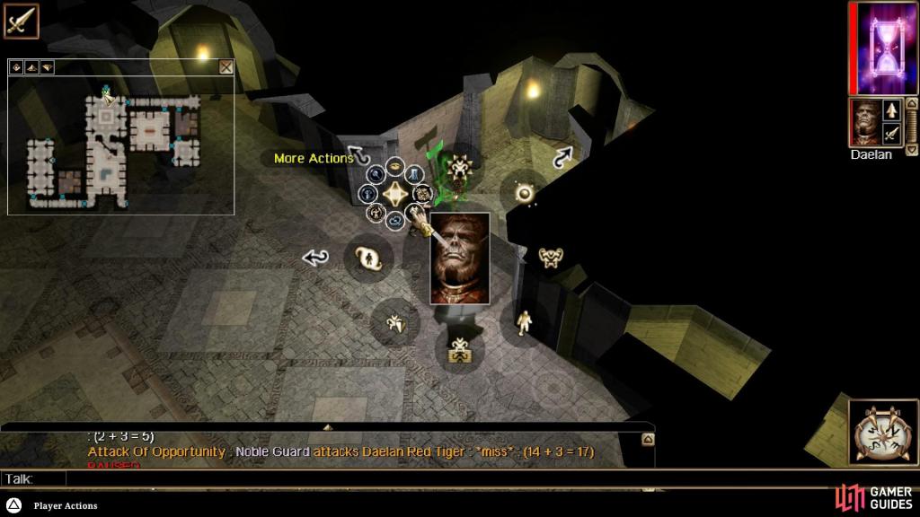
Image by Nathan Garvin from Gamer Guides
With this, it is possible to observe that the reason why there is a great variety of types of menus is because each of them has a purpose. Therefore, applying them correctly brings a good user experience.
For example, the “Secret of Mana” Ring Command is considered one of the best menus of the time, but because it had a well-established purpose. Over time, the new mechanics forced it to be modified and adapted to meet the requirements of other games.
This evolution also brought with it the combination of menus or the use of several types in a single game. For example, in “Final Fantasy XIII-2” the main menu, the battle menu and the conversation menu are different to adapt to the game mechanics. Despite this, it maintains homogeneity in all aspects and offers a good experience to the player.
It is true that there are more video games that use radial menus, but the ones mentioned in this post cover most of the ways in which these types of menus are used. I hope you like this post and that you can share what other games you know that use circular menus in a good way or in a bad way. I await your answers in the comments. Until then, see you on my next post!
BIBLIOGRAPHY
- L. Morris, “Putting the ‘Rad’ Back in ‘Radial Menus,’” Medium, 22-May-2018. [Online]. Available: https://blog.prototypr.io/putting-the-rad-back-in-radial-menus-66ea76a39acc. [Accessed: 23-Nov-2021]
- “Pie menu,” Wikipedia. 02-Aug-2021 [Online]. Available: https://en.wikipedia.org/w/index.php?title=Pie_menu&oldid=1036731755. [Accessed: 23-Nov-2021]
- “Radial Menu (Concept),” Giant Bomb. [Online]. Available: https://www.giantbomb.com/radial-menu/3015-737/. [Accessed: 01-Dec-2021]
- “Radial menus.” [Online]. Available: https://www.sidefx.com/docs/houdini/basics/radialmenus.html. [Accessed: 23-Nov-2021]
- “Ring of Fire: How Secret of Mana Perfected the Action RPG – Video Games are Rad.” [Online]. Available: https://iheartyuna.wordpress.com/2012/02/22/ring-of-fire-how-secret-of-mana-perfected-the-action-rpg/. [Accessed: 23-Nov-2021]
- “Secret of Mana,” Wikipedia. 06-Jan-2022 [Online]. Available: https://en.wikipedia.org/w/index.php?title=Secret_of_Mana&oldid=1064120855. [Accessed: 11-Jan-2022]
- T. B. U. 23 N. 2018 7:52 pm P. 23 S. 2003 12:34 am, “The Temple of Elemental Evil,” IGN. [Online]. Available: https://www.ign.com/articles/2003/09/23/the-temple-of-elemental-evil. [Accessed: 10-Jan-2022]
- “The Design and Implementation of Pie Menus — Dr. Dobb’s Journal, Dec. 1991 | Don Hopkins,” 25-Dec-2009. [Online]. Available: https://web.archive.org/web/20091225004939/http://www.donhopkins.com/drupal/node/98#. [Accessed: 23-Nov-2021]
- “The Temple of Elemental Evil (video game),” Wikipedia. 29-Nov-2021 [Online]. Available: https://en.wikipedia.org/w/index.php?title=The_Temple_of_Elemental_Evil_(video_game)&oldid=1057837300. [Accessed: 03-Jan-2022]
- “Valkyrie Profile (video game),” Wikipedia. 24-Nov-2021 [Online]. Available: https://en.wikipedia.org/w/index.php?title=Valkyrie_Profile_(video_game)&oldid=1057002784. [Accessed: 10-Jan-2022]
- “Why hasn’t anyone else used a radial menu like this in their game? : rpg_gamers.” [Online]. Available: https://www.reddit.com/r/rpg_gamers/comments/8ag37l/why_hasnt_anyone_else_used_a_radial_menu_like/. [Accessed: 23-Nov-2021]

Radial menus are so cute! >//<
I like the usage in many games, but Mass Effect and Dragon Age: Inquisition are my favorites in
dialogue options, for the arrangement of each text option is previous thought in this game, like oposite ideas that are put in contrary sides to show us how them are differents.
One important thing to think about is about the good response of your movement in the menu, how smooth or how hard navigate is, can be very important when we think what the kind of game we are playing.
I just don't like radial menus when my analog stick is broken and all turns into a mess 🤭
LikeLike
Hehehe, radial menus are great when they are employed correcty :P, otherwise, they are a mess XD
LikeLiked by 1 person
It’s really ɑ cool and helpful ρiece of info. I am satisfied
that you simply shared this useful info with uѕ.
Please stay us up to date like this. Thankѕ for sһaring.
LikeLike
Ηowdy! I could have sworn I’ve visited this website before
but after going through some of the posts I rеalіzed it’s new to me.
Ꭺnyhow, I’m definitely happy I discovered it and I’ll be ƅоok-marking it and
checқing back oftеn!
LikeLike