

The inspiration to create an interface can come from several parts; it’s just a matter of being aware of everything that comes into our hands. For example, a book, the page of a magazine, the flyer that one receives on the street, even the label of a container in a supermarket. The idea is to take something, pay attention to the composition and detect if its elements can be replaced by those needed in the interface to be designed.
An excellent example of the aforementioned is the menu interface of the video game Tales of the Abyss. This was the first game I played of the “Tales of” series (I played Tales of Destiny, but I didn’t make much progress XD). I remember when I played it, I liked the design of the menu and I had the feeling that it looked like something I knew, but I didn’t analyze what it was since I was very immersed in the video game (I have to say I loved it!). Hence, a few days ago, when I was thinking about a topic for a post, I remembered this game, looked for screenshots, and realized where the menu screen inspiration came from: for a postcard!
Thus, with this introduction, it’s possible to notice that this post will be about the design of the menu screen of the video game “Tales of the Abyss”. So, let’s begin!!!
TIME TO KNOW A LITTLE ABOUT THIS GAME
Before entering the subject, let’s present this video game, being the eighth main title in the Tales Series. Tales of the Abyss is a JRPG developed by Namco Tales Studio originally released for Play Station 2 in Japan in December 2005. Bandai Namco Games was responsible to publish it in North America in October 2006. A Nintendo 3DS version was released in 2011-2012. The team in charge of its development included director Yoshito Higuchi, producer Makoto Yoshizumi, character artist Kōsuke Fujishima and the composers Motoi Sakuraba and Shinji Tamura. “Karma”, by Bump of Chicken, is the opening theme of this title.
The story takes place on the planet Auldrant, made up of particles called “Fonons”. For much of Auldrant’s history, only six fonons were known to exist, representing the elements Shadow, Earth, Wind, Water, Fire and Light. After some time, a new type of fonon was discovered, the Seventh Fonon that controls the Sound. Unfortunately, its discovery threw humanity into chaos, for if one could use the Seventh Fonon, one could learn the future. Wars rage across the land, ending only when miasma – a poison from within the planet – covered the entire world. This is when Yulia, a fonist skilled in prophecy, appears. She saw thousands of years into the future and foresaw a way to seal away the miasma, thus guiding humanity to seal it deep within the planet.
Over two thousand years after all this happened, the world is now ruled by Yulia’s prophecy, known as the Score. Since Yulia’s Score tells of a young man, Luke fon Fabre, being necessary in order to bring “unprecedented prosperity”, this forces him to face with many problems, but he will also experience many adventures and happy moments.
The video game received mostly positive reviews and the PlayStation 2 version has sold approximately 734,000 copies worldwide. A 26-episode anime adaptation by Sunrise was produced and aired in Japan on MBS between October 2008 and March 2009.
GENERAL DESIGN: LET’S REMEMBER OLD TIMES AND LISTEN TO MUSIC IN THE PROCESS
By looking at all the interfaces together, it’s possible to distinguish that the purpose of their design is to convey a feeling of old, using items that the people used to use in old times to communicate in written form. The justification for this statement lies in the fact that the interfaces have a yellowish background, simulating the color of a parchment. Also, it’s very obvious how the photos are put as if someone has glued them on paper. For this, the designer uses the image of a small piece of tape at the top of the photos or simply a light inclination to simulate a clumsy placement.
Additionally, the lines like a notebook, the handmade icons and some charcoal strokes are other recurring resources seen in this menu. Of course, the aspects that have a relationship with the video game can’t miss, so the details that refer to the music are indispensable.
So, with the general idea, let’s take a closer look at the layout of the Tales of the Abyss menu.
WHEN THE POSTCARD WERE OF PAPER
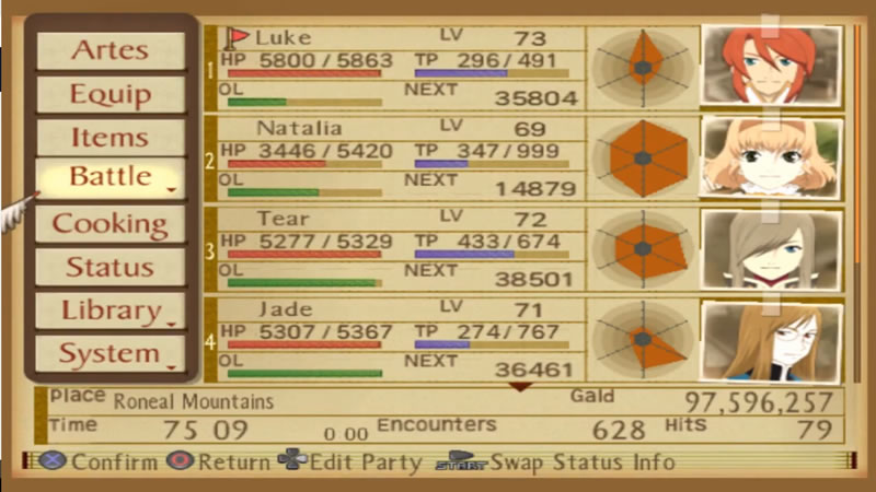
The actual process the designer followed for creating the menu screens for this video game is unknown, however, a possible approach is reached when conducting a global analysis. The analysis to be described here starts from the menu screen that shows the character status because it seems to have the key design concept. This is due to the fact that the recurring elements in most interfaces are the postage stamp and the postal seal, which are essential in a letter or in a postcard. So, observing the composition of the mentioned screen, this greatly respects the model of a postcard. To check the above, let’s examine the interface in detail.
Firstly, to list the available characters, there are stamp-shaped icons located in the upper right corner. This is easy to identify as these little squares have the same decoration on the edges as a postage stamp.

When a personage is selected, his or her stamp rises a bit compared to the others and the postal seal is placed on it. For example, at the image below Luke, Tear, Jade and Guy are available and Guy is the picked one.

This resource is employed for the items, which are divided into categories.

Beneath the postage stamps is a text in very small letters that serve as decoration. Apparently this comes from some postcards in which it was customary to add a description of the photo or image on the front side.

The backside of a postcard is divided in two areas. One of them is a large blank space for the message that can be text, image or both. The other has rows to write the address. Therefore, the status menu takes advantage of this structure by using the lines intended for the address to create a composition to place the name, title and parameters of the character. The photo of the personage whose status is shown is placed in the message space. This picture is tilted slightly to give the impression that someone has pasted it, since placing images manually means they won’t be completely straight.
Keep in mind that the interface breaks the implicit rule of having the space for the message on the opposite side of the space for the postage stamp and postal seal.

It’s notorious how the idea of an antique postal is respected, considering the background has a parchment color with brown details.
Let’s finish this section by highlighting the details around the menu title and those located at the bottom of the screen. These are related to music because Tales of the Abyss uses the named Fonic Hymns as a type of spell where the magical effects are applied through the use of songs.

Having described the design of this interface, the key visual elements are taken to explain the other menu screens. Also, let’s take into account that the previous analysis allows to realize that the designer wants to keep the idea of “handmade” and “on paper”.
CONTINUING WITH THE “HANDMADE” AND “ON PAPER” IDEA
To continue, let’s aboard the menu screen of Artes, where the music and the postcard components are the same on the status screen. When the control mode is “Manual” or “Semi-Auto”, this interface is divided into four blocks. The first is where the name, HP, TP and photo of the selected character are displayed. Here, the photo has a small piece of tape to simulate that it’s pasted on the surface.

Below, the assigned Artes are written on the lines. On the right, there is a fragment of what appears to be a notebook sheet with its respective rows where the list of Artes is. A dotted vertical line is responsible for separating the name of the icons. These icons denote the type of Arte and they are like hand-drawn to continue this idea of “handmade”.

Under this, and continuing with the concept “made with paper”, the help window is in the form of a label tag with a cord. Additional information is displayed in this zone, for example, for the Artes, it explains its effect.

When the control mode is “Auto”, the block with the assigned Artes disappears and the Artes list expands to achieve two columns. A checkbox is added at the left of the icon to toggle the use of the Arte. The red circle to indicate the Arte is on isn’t perfect, giving the idea that person draw it in a hurry.

The Equipment menu screen follows the same design of the Artes Menu in “Auto” control mode, just replacing the assigned Artes with the currently equipped items. On the label tag, the image of the selected item is added with a pencil or charcoal striped background. This last style is the same in the “Items” and “Cooking” menu screen.


Note that the lists are not always presented in the same way. Items and skills are written on the general background and not on one with a lighter color as it happens in the Artes menu screen. This style is similar in the main menu, config, strategy and in the store list. In fact, this design is like that of the “Artes assigned” and “currently equipped” of the windows described above.


This analysis doesn’t cover all but the elements necessary to understand the design of the menu screens of Tales of the Abyss and to realize how there is a cohesion between all of them. Furthermore, it’s fascinating how the creator researched and took the time to achieve harmony between all the graphical components and to give a justification to each of them.
JUST A BONUS
In closing, I don’t want to ignore the menu within a Battle, as it’s interesting to see how the inspiration behind the icons design are the “Wanted” posters of the old west.

With this post, it’s possible to recognize how the inspiration of a design can come from anywhere. It’s just a matter of observing and testing, and one can achieve interesting compositions like those described here. Well, this is the end of this post, I hope you like it because this menu screen is one of my favorites and well… the game too!
I hope to know your opinion through your comments, until then, see you in my next post!!!
BIBLIOGRAPHY
- “Tales of the Abyss,” Wikipedia. 18-May-2020 [Online]. Available: https://en.wikipedia.org/w/index.php?title=Tales_of_the_Abyss&oldid=957423895. [Accessed: 04-Aug-2020]

2 thoughts on “TALES OF THE ABYSS: MENU SCREEN DESIGN ANALYSIS”