
As I promised in my latest post, the series of the design of the five principal male characters of “Code: Realize – Guardian of Rebirth (コードリアライズ Code: Realize ~創世の姫君~)” is going to continue. This time is the turn of the handsome “Human Weapon” Abraham Van Helsing.
Before anything else, I want to recommend, as I did in the post about Victor Frankenstein, to read the first part of this series to understand better some references about steampunk that are going to be mentioned in here.
So, without further delay, let’s begin the third part of “Code: Realize – Character Design Analysis!”
ABRAHAM VAN HELSING: FROM PROFESSOR TO VAMPIRE HUNTER
Abraham Van Helsing is a fictional character introduced as a polymath Dutch in the 1867 gothic horror novel “Dracula” written by Bram Stoker. The most curious feature of this personage is his evolution through all the adaptations created from him. He originally started as a professor who had to lead a group of people to kill Dracula. Now, he’s known as a vampire hunter who is also the archenemy of Count Dracula. The above applies to the Otome “Code: Realize” too, since there are not just characteristics that come from the original novel, but also from adaptations of other media such audio dramas, comics, films and other fictional books.
Knowing this, to describe the design of the Abraham Van Helsing of “Code: Realize” is necessary to keep in mind the Bram Stoker literary work and other of its well-known adaptations. Obviously, the aspects that have to do with the steampunk culture cannot be missing considering that they are the principal inspiration of this Otome.
THE PHYSICAL APPEARANCE OF THIS HANDSOME GUY
To start, let’s take a fragment for the book “Dracula” where the character Mina Harker describes Abraham Van Helsing:
“…he came towards me, a man of medium height, strongly built, with his shoulders set back over a broad, deep chest and a neck well balanced on the trunk as the head is on the neck. The poise of the head strikes me at once as indicative of thought and power. The head is noble, well-sized, broad, and large behind the ears. The face, clean-shaven, shows a hard, square chin, a large resolute, mobile mouth, a good-sized nose, rather straight, but with quick, sensitive nostrils, that seem to broaden as the big bushy brows come down and the mouth tightens. The forehead is broad and fine, rising at first almost straight and then sloping back above two bumps or ridges wide apart, such a forehead that the reddish hair cannot possibly tumble over it, but falls naturally back and to the sides. Big, dark blue eyes are set widely apart, and are quick and tender or stern with the man’s moods.”
Mina Harker’s Journal, chapter 14, Dracula [1]
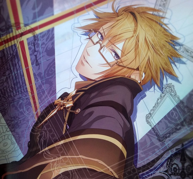
Contemplating Van Helsing illustration, his appearance mostly adheres to the description above, but still there are some modifications in the face. The square chin and the big bushy brows are not used because the drawing style of this Otome manages pointed chins and thin eyebrows. Likewise, the hair is not like the original author described it. First, it isn’t reddish but blond. I imagine this is because when visualizing a Dutch person, the common idea is to think of a European person who is blonde. Secondly, its style is tousled. In the official Art Book, there are a lot of sketches showing different hairstyles and I guess this was the chosen one due to it reflects the personality of Van Helsing that is handled in the game.

Just to give a final touch, the eyes respect the blue color but they are tinted with some violet to achieve a more distinctive tone.
AN ELEGANT VAMPIRE HUNTER
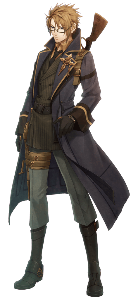
In “Code: Realize”, Abraham Van Helsing is a former member of the British Army who is mostly seen in a military-like clothing. The mentioned above, lead to research how the soldiers’ uniforms were in the Victorian Era in order to find out why this ex-soldier’s wardrobe.
After an exhaustive research, the uniforms that most closely resembles the way of dressing of this character are the ones used by the Royal Navy, the United Kingdom’s naval warfare force.

Source: The Anne S.K. Brown Military Collection, Brown University in Victorian Web
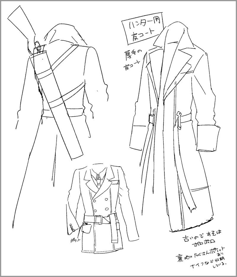
To achieve an outfit that gave the sensation of a military uniform without leaving the casual style, it’s decided to separate the uniform type details between the blazer and the coat.
Initially, seeing the Sub-Lieutenant, the Captain and the Commander clothing in the photo, it’s possible to see how Van Helsing’s blazer applied the same double-breasted style, length and the way how the belt is putted in the waist. As well, the form of the jacket is taken to permit the visibility of the shirt and the black tie. The casual touch is given with the unbuttoned shirt in gold color, the notch lapels and the patch pocket on the hip.
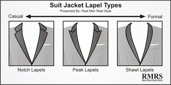
Photo from Real Men Real Style

Photo from Real Men Real Style
Another military garb in this character is the raincoat, which was an item of clothing that Thomas Burberry created for the Army officers in 1901. The original coat design had buttons and khaki color. In this video game, the raincoat hasn’t buttons and it applies the characteristic navy blue color with golden details of the Royal Nava uniform.
Finally, for the bottom, the shoes give the sensation of combat boots to represent how this character is an ex-soldier who is ready for any confrontation.
READY FOR BATTLE!
As an ex-soldier searching vengeance, Abraham Van Helsing needs to always carry weapons. In the novel “Dracula” from Bram Stoker, there is a paragraph in chapter 19 where it mentioned the weapons to fight the vampires and other enemies ‘more mundane’, the people in the book carried revolvers, knifes, crucifixes and wreath of withered garlic blossoms [2]. In “Code: Realize”, the vampire hunter put the knife in the internal part of his coat.

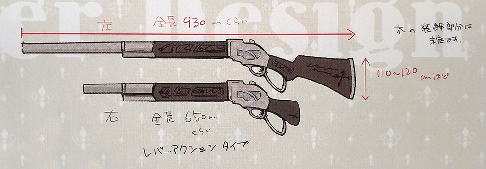
The idea of the revolver is transformed into shotguns. He’s an expert in dual-wields shotguns who uses a 930 mm one on his left hand and a 650mm one on the right.
STEAMPUNK ACCESSORIES!
A basic feature all the male protagonists of “Code: Realize” have is that they possess a representative symbol that they use as an accessory: the key as a pin for Lupin, the flask as a belt buckle for Victor and now for Van Helsing the crucifix as a lapel pin. This adornment is taken from the original story of Dracula, where it is mentioned how this character carried a crucifix. However, it is up to chapter 13 where the material is specified [3]. Then, the designer takes this description, resulting in a pin formed by two golden crucifixes: a small one on top of a larger one. The steampunk detail is applied with the gear behind them and the one that hangs from one of the two chains that are part of the design.
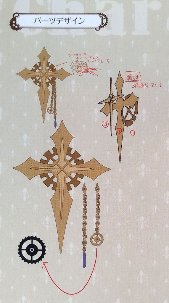
It’s worth mentioning that the other chain has at the end a small blue stone to match with the one in the glasses. According to the Art Book, the stone in the glasses is a jewel that his little brother gave to Van Helsing (thanks to my friend Mike that translate this fragment for me).
As last touches, there are some gears in the boots to emphasize the steampunk culture and two little crosses in the leg holster belt for more “Abraham Van Helsing style”.
Well, this is the end of the third male protagonist of “Code: Realize – Guardian of Rebirth”, just two missing!! I hope you like this post as I like to write. What you think about this series of post. Have you seen details I didn’t mention? Please comment to talk about them but for now, see you in my next post!!
REFERENCES
[1] Stoker, Bram. Dracula (PDF). Chapter 14, Mina Harker’s Journal, 25 September. p. 259.
[2] Stoker, Bram. Dracula (PDF). Chapter 19, Jonathan Harker’s Journal, 1 October. p. 356.
[3] Stoker, Bram. Dracula (PDF). Chapter 13, Dr. Seward’s Diary, 20 September. p. 238.
BIBLIOGRAPHY
- “10 Suit Jacket Style Details Men Should Know | Suit Jackets Silhouettes Buttons Single Vs Double Breasted,” Real Men Real Style, 11-Aug-2015. [Online]. Available: https://www.realmenrealstyle.com/10-suit-jacket-details/. [Accessed: 30-Jan-2020]
- “Abraham Van Helsing,” Code: Realize Wikia. [Online]. Available: https://code-realize.fandom.com/wiki/Abraham_Van_Helsing. [Accessed: 10-Feb-2020]
- “Abraham Van Helsing,” Wikipedia. 08-Feb-2020 [Online]. Available: https://en.wikipedia.org/w/index.php?title=Abraham_Van_Helsing&oldid=939826897. [Accessed: 10-Feb-2020]
- Claire, “History Of The Trench Coat: Military Necessity To Fashion Accessory,” Contrado Blog, 20-Dec-2017. [Online]. Available: https://www.contrado.co.uk/blog/history-of-the-trench-coat/. [Accessed: 30-Jan-2020]
- “Royal Navy,” Wikipedia. 10-Feb-2020 [Online]. Available: https://en.wikipedia.org/w/index.php?title=Royal_Navy&oldid=940011488. [Accessed: 10-Feb-2020]
- “‘The Officers of the Royal Navy’ by Frank Dadd (1851-1929).” [Online]. Available: http://www.victorianweb.org/history/navy/3.html. [Accessed: 10-Feb-2020]
- “Trench coat,” Wikipedia. 08-Jan-2020 [Online]. Available: https://en.wikipedia.org/w/index.php?title=Trench_coat&oldid=934815457. [Accessed: 30-Jan-2020]

Hi nicce reading your blog
LikeLike
Thank you!! ^^
LikeLike