
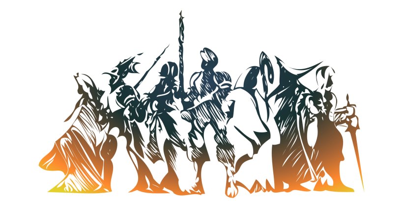
Final Fantasy Tactics (FFT) is considered a jewel in the video game world. This is not just for its beautiful music, its interesting story and its lovely art, but also because it has an elaborate job system and a well-worked battle system which combines the grid-based movement with the traditional strategy mechanics.
In its time, this video game was acknowledged by incorporating new elements to the RPGs. Today, many of these components are applied in actual games, and that’s one of the reason Final Fantasy Tactics is still considered one the best games of all times.
Talking about Final Fantasy Tactics is bringing up a lot of topics as: a story full of intrigues and twist, a profound character customization, the incorporation of new jobs in the JRPG world, a grid-based movements in battle and so on. However, for this post I’m going to focus on my main area of interest and talk about the visual interface design, which has interesting details I want to discuss. So, with this established, let’s begin!!!
AS ALWAYS, FIRST THINGS FIRST: ABOUT “FINAL FANTASY TACTICS”
Final Fantasy Tactics is a video game classified as a tactical role-playing game (TRPG). It was developed by Squaresoft (now Square Enix) and released in June 1997 in Japan and January 1998 in the United States for the Play Station game console.
Final Fantasy Tactics take place in a fictional medieval kingdom called Ivalice, created by Yasumi Matsuno. The game follows Ramza Beoulve, a highborn cadet who is involved in the middle of a military conflict known as The Lion War, where the opposing noble factions fight for obtaining the throne of the kingdom.
FFT uses a 3D, isometric style and it’s considered a cult classic, cited as one of the greatest video games of all time because the story, the battle system, and a simple but cute character design.
A LITTLE INTRODUCTION
For anyone that had played JRPG’s in the “90s”, especially all the Final Fantasy at that time, will have seen a pattern in the main menu design: most of the time follows a static grid. This grid basically is formed by three main blocks. The first one is for the characters general status, where the name, level, HP, MP are shown. Next to this, one for the list of the menu’s options like: items, magic, equip, etc. And the last one for the time played, the gil and sometimes, the steps.
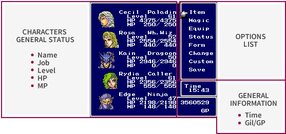
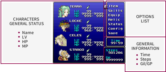
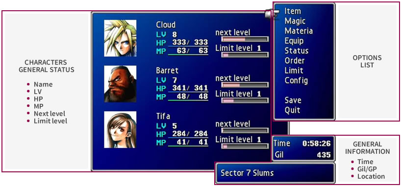
All this written in a sans-serif font.
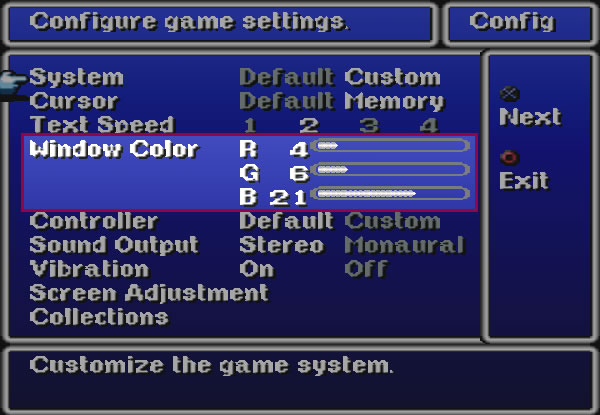
Another evident feature in all the Final Fantasy video games of that epoch was the default blue color as the background that could be change manipulating the RGB channel inside the “Config” option. There were games where it was possible to change the texture too.
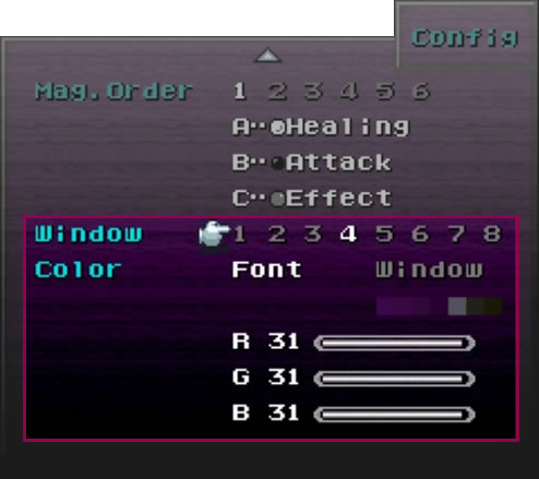
Final Fantasy Tactics came to change all these concepts for introducing a main menu design in line with the thematic of the game. So, the following paragraphs are to provide evidence of this.
TEXTURE WITH CONTEXT
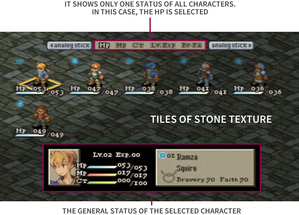
As said before, FFT takes place in a medieval world, meaning that the sceneries have that kind of atmosphere. In view of the above, it seems the game artist realized that during the Middle Age the stone was a common construction material that it was seen on walls and floors. This is why the main menu texture, where the characters are standing, is a simulation of a floor made of tiles of stone.
Note that from here, the classical grid of the other Final Fantasy changed to show 3d isometric characters inside a grid of five columns and infinite rows, displaying only one kind of status of all characters. Above, the selected character general status is indicated.
A VERY MEDIEVAL COLOR
Continuing with the medieval concept, the color used for most of the information containers is beige, a very common tone in old parchment. In fact, it’s not just the color, but the texture also is similar to the substrate on which it was written in the Middle Ages. This color and texture are a consequence of the treatment applied on the animal skin with which it was difficult to obtain a pure white.
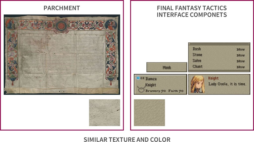
Comparison between a parchment and the elements of the interface of the video game.
Left image: State Archive in Poznán [CCo] via Wikimedia Commons
THE FONT ALSO MAKES SENSE!
Ah yes, quite so, the typography chosen has a historical meaning as well!
It’s true that in the Middle Ages existed many calligraphy and writing styles, but also it’s true not all of them had appropriate features to be used in the digital media of the 90s since the technology was not so advanced like now to achieve a detail typography.
This made necessary to found typography that was not only given the medieval sensation, but also had appropriate characteristics for the technology of those days. To reach this objective, first the designer took as inspiration the “Roman Type” since coming from a European scribal manuscript style in the 15th century, based on the pairing of inscriptional capital used in ancient Rome.
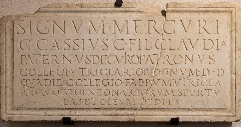
© Jérémie Silvestro / Wikimedia Commons, via Wikipedia Commons / [CC BY-SA 4.0]
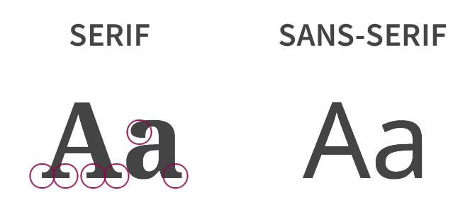
The singularity of this typography is the serifs, an element that can hamper the reading. That’s why in the game, the lowercases don’t use serifs, and therefore they don’t follow the “Roman Type” style. The uppercase and the numbers are another story, because the low use of them unable to use the Roman Style to the point of maintaining a medieval atmosphere without sacrificing legibility.
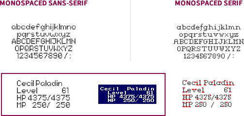
To do a better analysis, let’s see some letters singularities and use some graphical examples. For these, the font “Garamond” is selected for being known as a serif, old style and Roman type font. Then, let’s describe come examples:
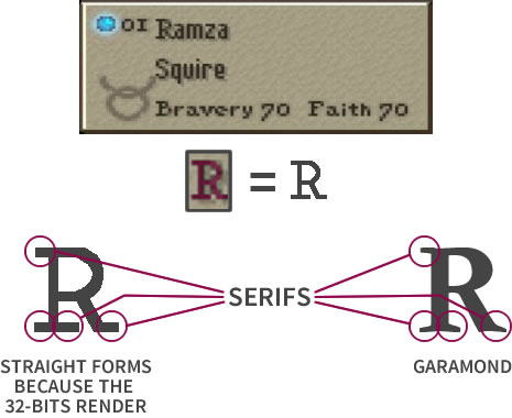
- The capital letters present the distinctive serifs of the Roman Type just with a more squarer structure because the 32-bits architecture. As an example, the letter “R” has the head serifs, the foot serif (or bilateral serifs) and the serif at the leg.
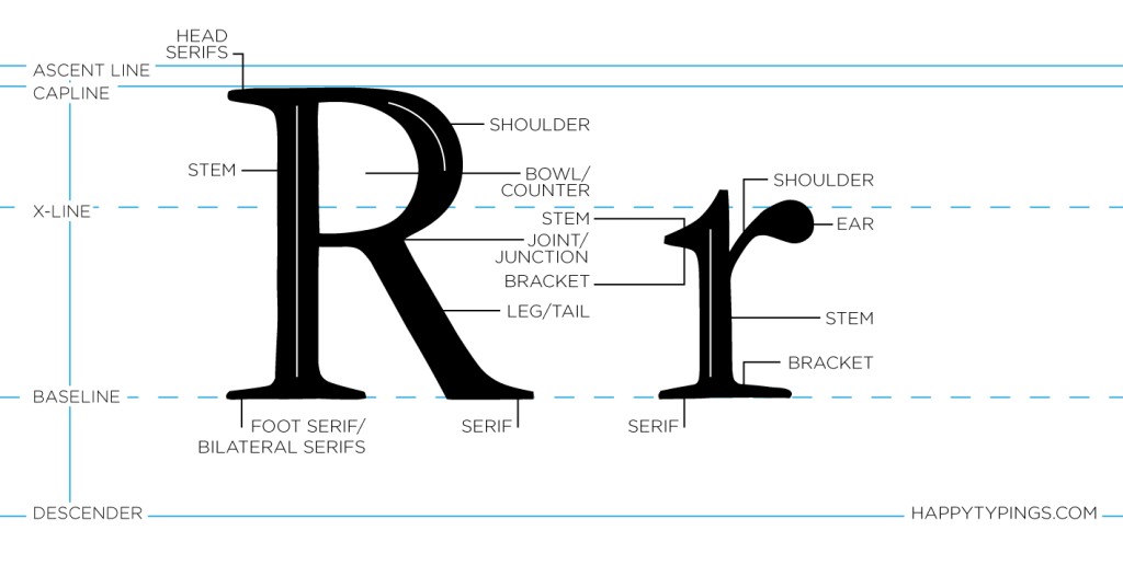
The serif also is seen at the “B” of Bravery, “F” of Faith, “L” of Lv, “H” of HP, etc.
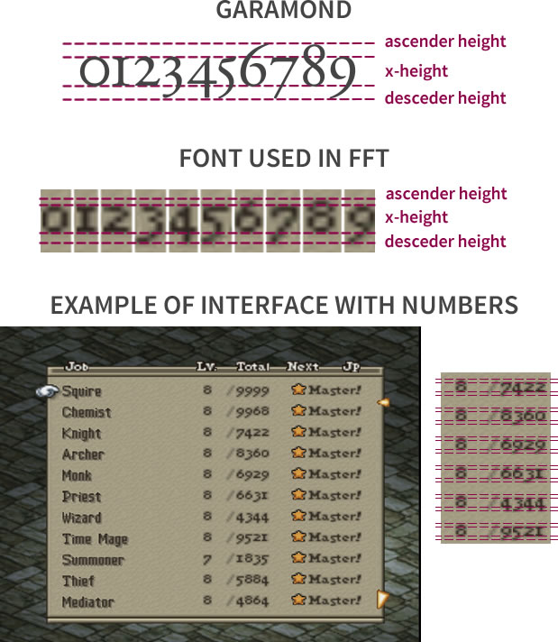
- Another obvious visual detail is the way the numbers have varying heights and alignments. These properties are specific of the oldstyle figures. They are similar to the lowercase characters in that they share the same x-height and have ascenders and descenders. Inside the game, all numbers replicate this rule.
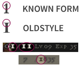
- Lastly, and continuing with the numbers, one aspect very representative of the Roman Type is the number one form. The number one has a similar form to the uppercase “I”, having a bilateral serif at the head and at the foot instead of just at the foot.
NOT JUST BEIGE
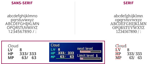
The colors are very important in interfaces because they give soul to the design and permit communicating something in a clearer way. To maintain the medieval theme, the colors applied are the ones that were common in this period. Then, the video game shows shades of reds, greens, yellows, blues, black and white.
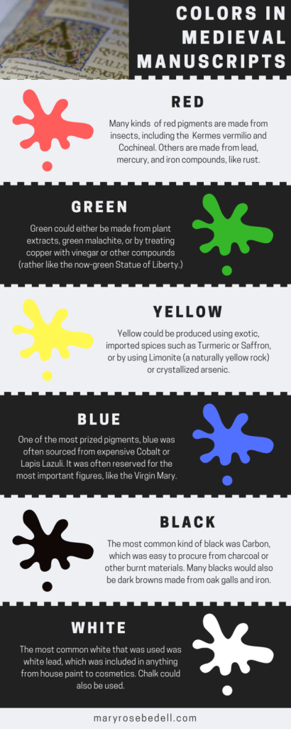
This palette is employed in the HP, MP y CT bars, where there are gradient from blue, red and green to white. The black is for the general text and the white, with the black border, is for the status and some titles.

THE LAST DETAIL
Finally, the icing on the cake, the sword icon used to select a character for and in battle, a weapon that comes into mind when we think about middle age, knights and castles.
(Sword image from swordsform)
Well, this was an analysis of one component that make this video game so marvelous. I hope I bring to you more about it but, for now, I end my post here. I hope you like it and do a lot of comments!!
See you in my next post!
BIBLIOGRAPHY
- “Oldstyle Figures – Fonts.com,” Fonts.com. [Online]. Available: https://www.fonts.com/content/learning/fontology/level-3/numbers/oldstyle-figures. [Accessed: 09-Oct-2019].
- R. Bringhurst, The elements of typographic style. Hartley & Marks, Publishers, 2004.

I love how much detail is put into every aspect of game design.
LikeLike