A passion I had since I was very little is to play JRPG. It’s one of the activities I don’t leave despite the work, even if it’s mean I only can play two or three hours a week and I delay various months to finish a JRPG, I love them so much that I will never leave them.
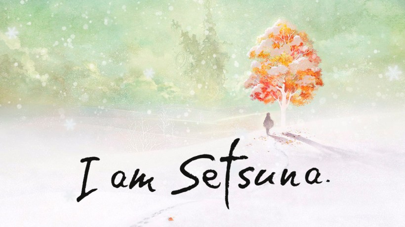
I recently finished one called “I am Setsuna”. I decided to play it when I read about how it was inspired in “Chrono Trigger”, one of the best games I ever played. In general, I loved the video-game, but what I found very inspiring was the interface design and about what I’m going to talk about in this post. Then, let’s begin!! (Sorry, but I couldn’t avoid some minor spoilers TT.TT)
FIRST THINGS FIRST: ABOUT “I AM SETSUNA”
“I am Setsuna” is a Japanese Role-playing video game developed by Tokyo RPG Factory and published by Square Enix. The game was released in Japan in February 2016 and worldwide in July 2016. The story follows a mercenary who decided to accompany Setsuna, a maiden who must offer herself as a sacrifice at a sacred shrine to appease the demons.
WINTER ALL THE TIME!!
The story takes place in a land plunged into a perpetual winter. According to Jun Susuki, Tokyo RPG Factory Art Director, this type of landscape is to express the video game central theme: the melancholia (there are a video and a written interview with more information about this). Then, it’s correct to conclude that winter is the central idea not just for landscapes and characters, but also for all the visual elements in the game.
Based on this, I’m going to talk about the interfaces and its components comparing them with all the concepts related to snow and ice.
HEXAGON: THE SNOWFLAKE ESSENCE
The snowflakes have the characteristic of existing in an innumerable shapes, that’s why the old saying: “no two snowflakes are alike”. In spite of this, the basic form is always the same: the hexagon.
This figure is the snowflake’s purest abstraction because… just because… the chemistry says it!! As didactic information, the snowflake contains six sides or points since the molecules in ice crystals joined to one another in a hexagonal structure. This arrangement allows water molecules to form in the most efficient way (More about snowflakes here).
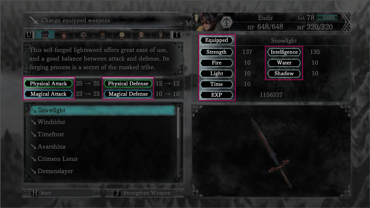
Due to the above, the hexagon is a visual element recurrent inside “I’m Setsuna” interfaces. Below I have listed some uses of the component described:
- As an envelope to the icon that indicates the element used by the character. I read the comment of one guy here, who says the icons are approximations of the kanji character of the element that represent. He’s right, but for the most of us that don’t know kanji, it’s a little difficult to notice this at first glance:
x(無) – None
- 天 – Heaven/Sky (Light)
- 時 – Time
- 火 – Fire
- 氷 – Ice
- 冥 – Dark (Shadow)
- 全 – All/Complete
- As an envelope for the options in the settings interfaces.
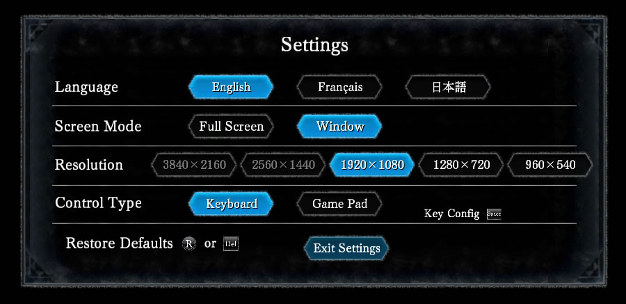

- As an envelope for some icons and names inside of “Snow Chronicles” option.

- To envelope the labels of some titles inside the status, equipment, skills, etc. interfaces.


- As a texture. It’s less obvious, but the patron used for some interface elements it’s derived from a hexagon. Here I present an example.

SNOWFLAKE ICONS
The snowflakes are exploited as icons too. The first case is the loading screen, where it’s possible to contemplate an evident snowflake rotating.
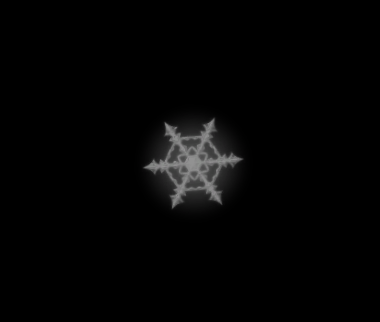
There are cases where it’s possible to see icons that are based on the snowflake idea with the only exception that the point quantity changes from six to eight. They are:
- The icons that work like slider in the Settings menu.
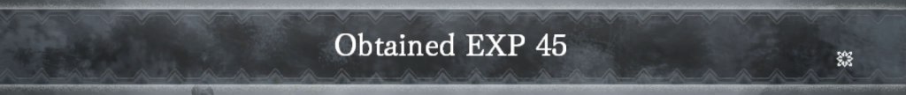
- To indicate the fluxes a tech has.

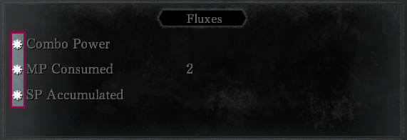
- As indicator to press the button to continue. For example, in a dialog with a character when there is more text.

SNOW AND ICE
Other two recurrent elements that have a close relationship with the winter is the snow and the ice. These two elements can be presented as texture or like a detail to add a nice touch. Here are some examples:
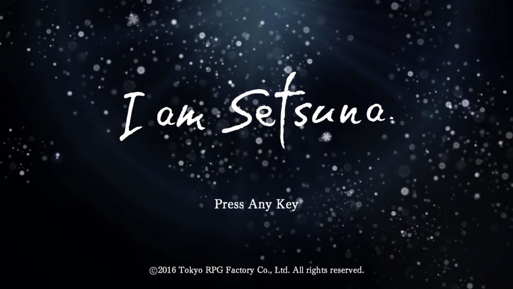
- Snow to create the first impression. When the player enters into the game, the initial screen has the title in a snowing landscape. The intention is to give a clue of what to expect.
- Snow to indicate a selection. When an option is selected in the principal menu, there is a fast animation of snow appearing.

- Ice as texture. The use of a texture like fragile ice is applied principally in the principal menu interfaces.


THE FINAL TOUCH
To maintain concordance inside all the video-game, the snowflakes are used in many places. One, outside the menu, it’s as fluctuation indicator and as the characters’ aura when they invoke a technique. The symbol includes not just a snowflake concept, but also incorporates parts of the personality of each character.
Although the initial idea is to create symbols that seems like a snowflake, some rules are broken in order to achieve the incorporation of the characters particularities. Now, let’s analyze each character mark to realize the above.
For this, I took as a graphical reference the photos from Wilson Bentley, known for his snow crystals’ photography, and the images from Israel Perkins Warren’s book: “Snowflakes: a chapter from the book of nature”.
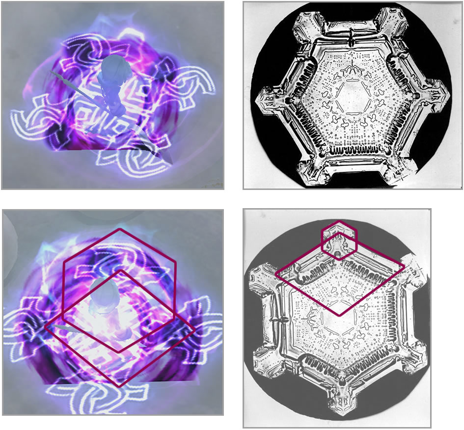
- SETSUNA
I imagine this symbol has two inspirations. The first one is a photo of Wilson Bentley. As we can see below, Setsuna’s casting symbol has, as center, a six petal flower like the snowflake. Also, the external peaks figure is formed by three spikes, very similar to the case of Setsuna’s aura, where the idea is similar but adding an important concept: her role in the battle.

Setsuna is principally the healer and because of that, the group’s caregiver. I believe the designer wanted to represent the concept with the abstraction of two hand protection an object, like the classic icon of caring.
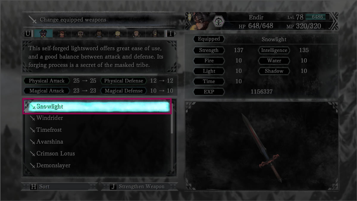
- ENDIR
Endir is one of the characters who has a symbol with many peaks, eight to be exact. It is formed of the combinations of two types of snowflakes.
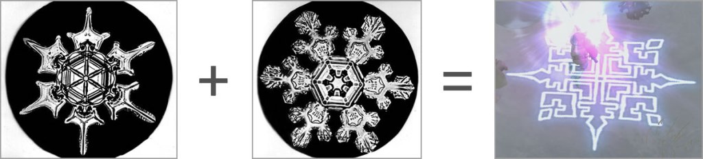
One can notice how the peaks of the cross in Endir’s aura are very similar to the first snowflake and the peaks of the square have a rhomboidal idea as the second snowflake. I think the points of the cross are also to give the suggestion of the protagonist weapon: the sword.
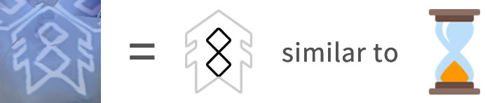
- AETERNA
Aeterna was a difficult case to discover since it has just four peaks. Finally, I identified an image inside Israel Perkins Warren’s book very similar where the peaks are like arrows going to the center.

After this, I see the form inside the arrow and I discover an hourglass, an object that has a relationship with the magical element Aeterna use. I imagine that, to reinforce the concept, the idea of the four peaks is more like two hourglasses crossed.

- JULIENNE
Julienne has the particularity of having as dominating element the one that is the principal of the game: the ice. That’s why her symbol comes from pure snowflakes. Searching, I found the two that are the possible generators of this symbol.
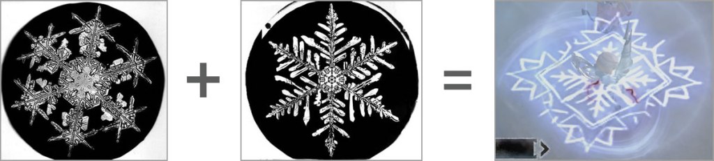
It’s possible to note that the external design is similar to the first snowflake in the way of use five points in each peak. The center is very similar to the second one in the way the peaks have various branches as a tree limb. I believe there are four peaks and not six, like one snowflake has to have, to avoid the use of many lines and to gain more detail.
- KIR
The case of Kir’s symbol is the same as that of Setsuna in the fact that the two have as inspiration a snowflake and a particular characteristic of the character. First, the snowflake’s model I took for Kir is coming from Israel Perkins Warren’s book, where the center is a flower with six petals and a small decoration emerging by the tips of the petals. The designer uses this resource to expand the decoration and transform it to an abstract form of a flame, Kir’s dominant element.

- FIDES
The symbol of Fides, just like Aeterna’s one, has four peaks. This made difficult to find the snowflake that worked like inspiration to design it. I have to confess that the only one I found it just similar in the way the points emerge from the center. Even so, it’s not very convincing.
However, the visual element that seems like a real source of inspiration is the scythe, the principal weapon of Fides “The Reaper”!! It’s possible to see how the four points of the symbol are the abstraction of this weapon.
- NIDR
Well… this is the moment I feel very ashamed. Not only I couldn’t find a snowflake for Fides, but also…I really, really tried hard but… I couldn’t find from where Nidr’s symbol come from TT.TT
Just to defend myself a little, one thing I could observe was that this symbol has its base on a square and, in comparison with the others, has less curves. I imagine this is to denote the firmness and hardness, adjectives that describe Nidr in battle in the way he’s like the shield (or tank) of the group.
Well, this is all for this post! I hope you enjoyed it! I really worked hard to give detailed explanations and to use a lot of images to illustrate all I said. What do you think?? Did you notice another visual element that I didn’t?? Or maybe possible sources of inspiration I couldn’t find?? I look forward to hearing your comments!! Until then, see you in my next post!!

This was absolutely spectacular! Well researched and written. I Am Setsuna is one of the most thematic games I’ve ever played. Thank you for this post!
LikeLike
Thank you!! It makes me very happy that you liked it!! 😀
LikeLike
I Am Setsuna is one of the most thematic games ever made and this was so well written. Thank you for it! The whole story revolves around the snowflakes too. Bookmarked this so fast!
LikeLike