On this occasion I’m going to talk about the Otome “In Search of Haru: Sweet Love Story”, which is a mobile game you can find at Google Play or at the Apple Store. It’s a free game created by SEEC Inc. and has a Japanese and an English version. I choose to discuss this Otome because I realized the two versions differ, and I’m not talking about the language, but the interface structure. I’m going to focus on the differences and what are the advantage and disadvantage of each design decision. Then, let’s begin!
GENERAL COMPOSITION
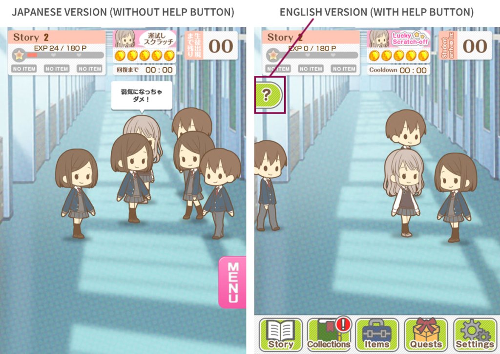
At first glance, it’s possible to see obvious differences on the interface composition as: the position of the menu and the apparition of a “Help” button in the English version which isn’t in the Japanese one.
The experience bar, the “lucky scratch-off” and the time that indicates the students’ arrival is the same.
THE TUTORIAL
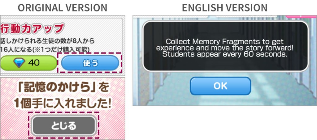
To do a deep analysis, the best is to go step-by-step commencing with the tutorial. By starting, inside black boxes with some transparency there is text that explains the mechanics and objectives of the video game. To make easier to understand, there are pink arrows that point the component of which the box referrers to.
The first two boxes disappear at the moment we accomplish the instruction given. The variation between versions begins when the box is just informative, not having an action to accomplish to close the dialog. To resolve this, in the Japanese version it’s necessary to tap inside the box, and in the English one, a blue button appears to do the same action.
The two ways are intuitive if we’re accustomed to use a mobile app, on case contrary, the button would be a best choice. Bearing this in mind, I think that for most of the people will take less time to understand how to close the box in the English version.
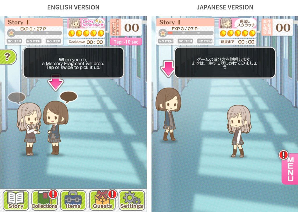

However, as designer, I have to criticize how the blue button doesn’t respect the identity of the original game. The reason I do the previous affirmation is in view of the way the Japanese game applied total round edge with the blue buttons and round edges just in the “Exit” and gray ones. Then, we can see the English version use an incorrect design for the blue buttons when using just round corners.
HELP BUTTON
The help button is one element that appears in the English but not in the Japanese version. This is presented like a tab with an interrogation mark that, when is taped, some dialogs emerge explaining each interface component, like the tutorial did in the beginning.
I consider this is a useful function since it exists the possibility the user stop playing the game for some time and wanted to resume it later. This option permits retake the game without go thought the tutorial again. Also, as the button doesn’t pose an invasive, I choose to have it.
MENU
Now, the most notorious distinction: the principal menu. Aforementioned contains options to see the game’s flow, the image gallery, the characters recollected, the items store, the settings, the list of the awards and achievements.
The original version managed a tab with the word “MENU” that, after tapping it, the options slide left with their name in katakana and a little description. In the English version they are always visible presenting them with its respective name along with a representative icon.
This composition not just mean a variable appearance but also a different way manipulate the interface. Let’s do a comparison evaluating the next characteristics:
- Learnability: In both cases, the menu presents familiar components for a person who is accustomed to a mobile interface. Also, the tutorial and the help texts cooperate to understand the flow of game. Maybe one point in English version’s favor are the options’ icons, which give a more obvious idea of its functionality best that the description of the Japanese version. Here, we can apply the phrase “A picture speaks a thousand words”.
- Error tolerance: Because the menu is a float tab, the lack of a restrictive zone can take us to tap it without realize it. This problem is also remarkable in the help tab in the English version. Besides, one detail I can’t ignore is that, when the pop-up menu is open, the exit option has a gray color that make it seems like disabled, confusing the user.
- Design Flexibility: If the developer wanted to add more options, the composition of the English version can give more considering there is the risk to lose space for the characters to move. In the Japanese version the pop-up menu avoids that possibility in view of this is invisible until the user wants.
- Space: Repeating a little the previous point, the bottom menu eat space to play and even more when the mobile screen has low height. I played the game in a mini iPad and in an android with more height and I feel the iPad interface more squeeze.
- Access: The Japanese version required an extra action in the principal menu because they are necessary at least two taps to enter an option. For the English version, one is enough.
In the next table I evaluate the previous attributes from 1 (Bad) to 3 (Good) to do a fast evaluation of the interfaces.
| Attribute | Japanese Version | English Version |
|---|---|---|
| Learnability | Moderate (2) | Good (3) |
| Error tolerance | Moderate (2) | Good (3) |
| Design Flexibility | Good (3) | Bad (1) |
| Space | Good (3) | Bad (1) |
| Access | Bad (1) | Good (3) |
| TOTAL | 11 | 11 |
As we can see, the total points tell us both menus designs have advantages and disadvantages in a same level.
THE LITTLE DETAIL TO TAKE ACCOUNT
At the beginning, I thought the variants between versions due the writing characteristics of each place, however I had to discard this theory when I played another video game of the same company: Jimi-Kare: My quiet Boyfriend. As I did with the game I already talked about, I searched the Japanese version. Surprisingly I realized the help button and the menu were the same as the English version of “In Search of Haru: Sweet Love Story”. That’s when I began to question myself why the interface change dramatically from one game to another if the two of them have similar structure, mechanics, they were created by the same company, and were released almost at the same time.
With my previous analysis, I reach one conclusion: the company is trying to discover which of both design can bring more benefits through the time. For the moment we can say is a tie, still this was an initial evaluation because it needed to do other type of test like one of usability for example. But, what do you think? What interface you like the most? I hope you tried the two video games I mentioned here to answer these questions and of course, to have fun!
See you next time!!
