
As I said in one of my first post, I entered into the “Otome” world thanks to the adaptation of “Amnesia (アムネシア Amuneshia)” video game to anime. I also mentioned how I fell in love with the illustrations. The main reason this happens to me, apart from the beauty of the drawings, it’s because I admire the way the illustrator achieves all characters seem to belong to the same game and, at the same time, keep their singularity.
This is why I think it’s worth analyzing the character design of this Otome. Then, let’s begin!
FIRST THINGS FIRST: ABOUT “AMNESIA” (MINOR SPOILERS)
Amnesia is a Japanese visual novel series developed by Idea Factory and classified as an Otome game. I’m going to centralize my article to the first one, entitled “Amnesia: Memories”, since it’s the only one translated into the English language. This video game was released in 2013 in Japan and in 2015 in EUA.
Inside the game, it’s necessary to choose a route based on the symbolic suit symbol from the standard French card deck, having five storylines in total: Heart, Spade, Clover, Diamond and Joker. Inside all the storylines, the heroine wakes up one day with, as the game’s title says, amnesia. Since this day, a spirited called Orion has been attached to her to help the heroine because it’s the only way he can depart and return to his own word.
WHERE DO THE VISUAL ELEMENTS COME FROM?
From the initial screen and from the first choice one has to do in the game, the creators communicate that the design is primordially based in the visual elements that has a relationship with the card deck.

So, in this post I’m going to mention all the visual inspirations taken in making this game, focusing the attention on the five principal male characters, since they are the representatives of the icons of each card of the standard French card deck.
First, I’m going to mention the recurrent component in all characters costumes. Subsequently, I will talk about them in a particular form.
LET’S CHOOSE A TEXTURE! (MINOR SPOILERS)
The recurrent visual element that is presented, not just in the character’s clothing, but also in some interface components and on the official site page of the game, it’s the texture formed by diamonds. Observing the official site page, this texture is drawn on the backside of the cards. Then, this was my first clue to find the inspiration of this texture.
Seeing a lot of photos, I realized the majority of backside cards design have a thing in common: the resulting of its abstraction are diamonds.


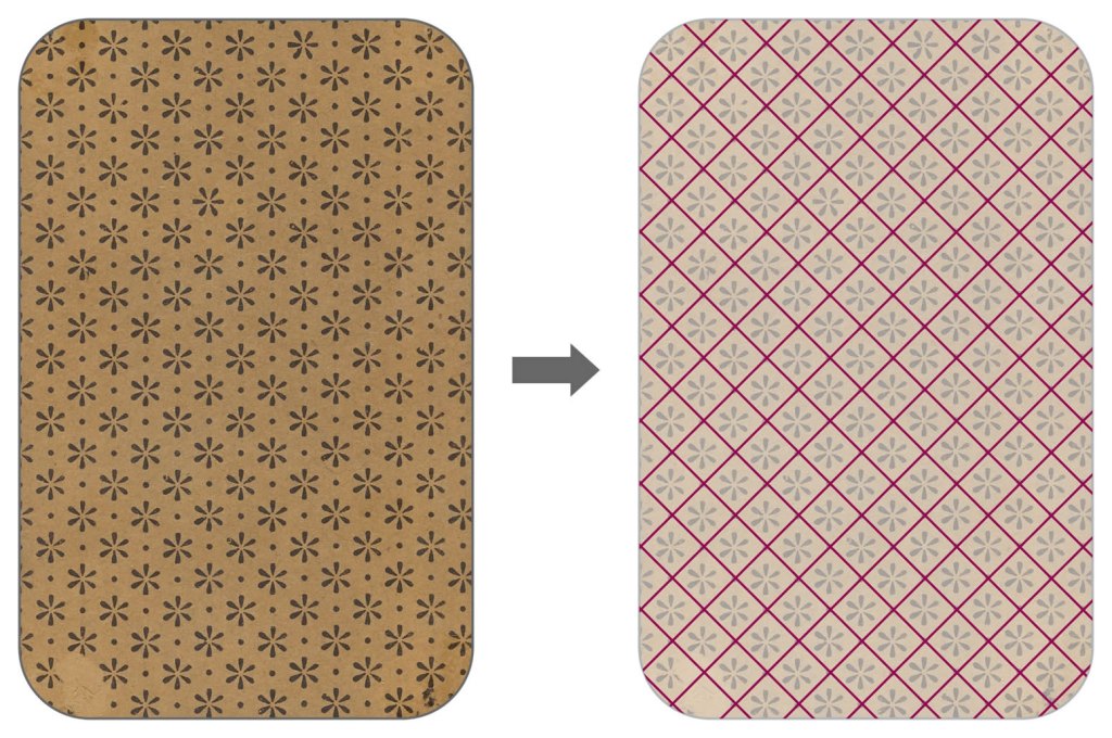
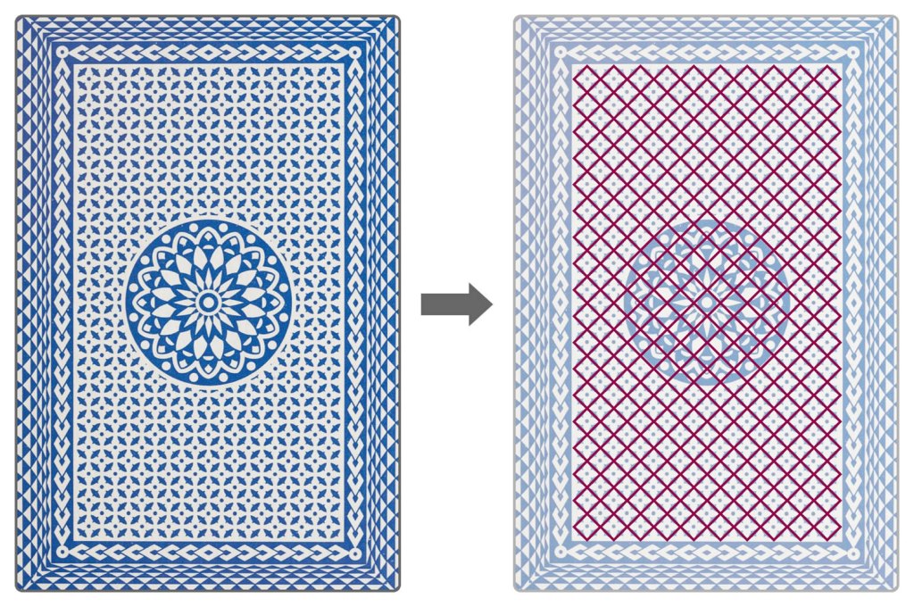
And, just to give the final touch to the simplification, the use of two colors brings a simple but representative texture.
Achieving to understand the inspiration of the design that makes the gamer to evoke the deck card theme each time s/he played, it’s time to show where this is presented through the images below.

Probably right now you’re thinking “Wait a minute, someone’s missing!!” That’s right, Shin is not listened, but I will give my guesses in his section.
NOW, ONE BY ONE
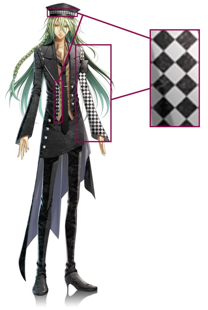
The belts, the black color, the metal studs and the drawing style are visual components that provide unification between characters, however, in this article I just want to focus on the ones that has a relation with the card deck. So, I have already talked about in a general way, now it’s time to see the particularities of the characters that are the representation of the card symbols.
FOUR SYMBOLS FOR FOUR LOVES
The most common deck played today is the French, which includes four suits: hearts (♥), spades (♠), clubs (♣) and diamonds (♦). Amnesia resorted to this resource to create the four characters that the heroine can choose, having a route for each one. In the next lines there is the description of how each character wears his respective symbol.
HEARTS ♥
In a way, the video game’s principal route since the character that is used to represent it appears on the cover of the game box, in the icon of the steam’s game and on the cover of the first volume of the Amnesia “Art Works” (Yes, I bought it and I love it!!!). Maybe it’s because the heart represents love, the main topic of an Otome.
The character of this route is Shin, one of the protagonist’s childhood friends. One characteristic the majority of the outfits have is the use of the black color. However, Shin’s case is special because adding the red, representative heart color, it simulates the classic card deck colors. This is the main reason I guess he doesn’t use the diamond texture I mention before.
From here on, it will be notable how each character has his respective symbol on his clothes. In Shin case, the heart is sketched with free strokes on his shirt and, as a final detail, the word “HEART” is written on it.

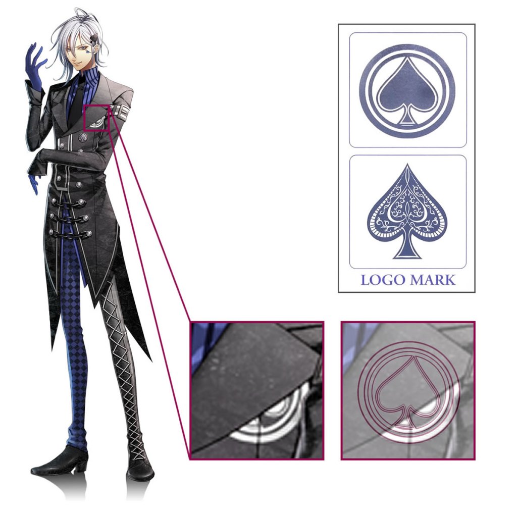
SPADES ♠
Our charming Ikki is the one who represents the spades of the deck. It was easy to guess why the color red was the chosen one for the heart, but the blue spade can be a little weird if we take as a base the common bicolor deck.
Obviously the designer wanted to inject more color details to: achieve more visual attractiveness, to create more material with which to design clothing and accessories, and to have another particularity for each character. The color wasn’t picked at random, in fact, the four colors selected to represent each character came from the playing card set designed by James Y. Humphreys in 1819 in Philadelphia to commemorate the first Seminole War [1]. This deck, called “Seminole Wars Deck”, is considered the first four color deck and it introduced yellow Diamonds, green Clubs, blue Spades, and red Hearts [2]. Having made this clear, it’s time to make the symbol count on Ikki’s clothes.
Ikki has the particularity to have his symbol more times than any other character. The more notorious accessories that have spade form is his hair pin and his cheek tattoo. Another, where the symbol has more ornamentation, it’s the button on the inferior left part of his jacket.

Finally, almost imperceptibly, the decoration behind the jacket flap. This symbol’s design is the same that the art book indicates as the character’s logo mark. If we draw the mark over the jacket, we can see how it fits.
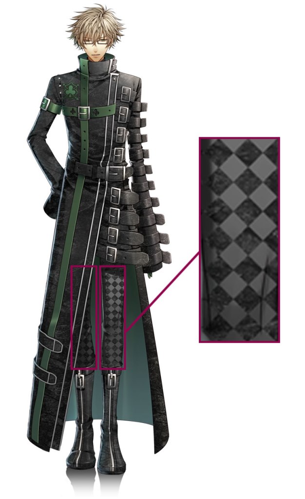
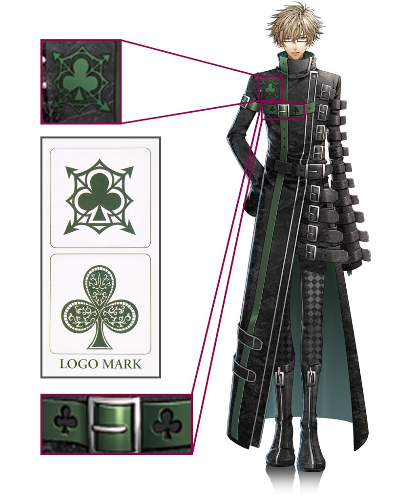
CLUBS (OR CLOVERS) ♣
Kent, the smart guy (and my favorite, I have to say) is who dress the clubs’ symbol. His color is the green for the cause I clarified before. Although a reason less complex is to think simply in nature, where the clover is green.
Kent has the clover with the design of his logo mark on the chest, on the right side. Very close, to finish the count, there is a belt with two clovers as decoration.
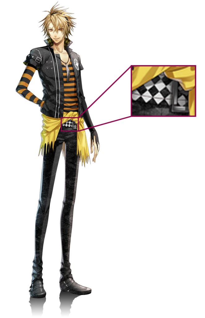
DIAMONDS ♦
Lastly, our blonde guy is the diamond person. His color: yellow. I already explained why the yellow color, however I want to remark another reason that for me was an interesting historical detail. According to Wikipedia [3], French deck primarily utilized the suit called denier or penny, a medieval coin. Since it’s very common to think in gold when we hear “coin”, it’s also popular to use yellow for coloring this object. It was later that the coin was replaced by the suit of diamonds, but it seems the yellow color return time after.
Toma wears his symbol on the left part of his chest, with the design the creator affirms as his logo mark in the art book. The tiara is another site where the diamonds are found. For this, I put some other images where the details are clearer, but these are cut so not give more spoilers.

MORE LOVE FOR ME! (MINOR SPOILERS)
Yes, this game offers a last one love, the Joker! Taking the same idea as the original French Deck, the Joker is an additional and secret route. Ukyo is the character who represents it, but he doesn’t wear it. I mean, I don’t see any symbol on Ukyo’s attire that seems like a Joker. This suit card deck doesn’t have any standardized appearance across the manufacturing industry, then I suppose, because the Joker doesn’t have an established form, the designer decided not to put any symbol on Ukyo’s clothes. Another possibility is that, since Ukyo appears in all routes as the bad guy, the creator doesn’t want to give a clue about how he becomes the heroine’s choice in the secret and last route.
Well, here it is the end of my post about the five good-looking guys of Amnesia Memories. Their design can confirm how just a concept –the French card deck in this case – can give a lot of material to create a unique word inside a video game where the characters have a lot in common, but also have their own particularities.
I hope you enjoyed this post!! Please tell me your opinion and comment! See you in my next post!!
REFERENCES
[1] M. Harris, Poker and Pop Culture: Telling the Story of America’s Favorite Card Game. D & B Publishing, 2019.
[2] “アップデート 2: The Founding of the Founders · Founders Playing Cards,” Kickstarter. [Online]. Available: https://www.kickstarter.com/projects/dodsr/founders-playing-cards/posts/410036. [Accessed: 12-Aug-2019]
[3] “Coins (suit),” Wikipedia. 09-Aug-2019 [Online]. Available: https://en.wikipedia.org/w/index.php?title=Coins_(suit)&oldid=910091973. [Accessed: 13-Aug-2019]
